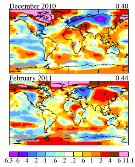
The Arctic is getting so warm in winter that James Hansen had to add a new colour to the standard legend – pink, which is even warmer than dark red:
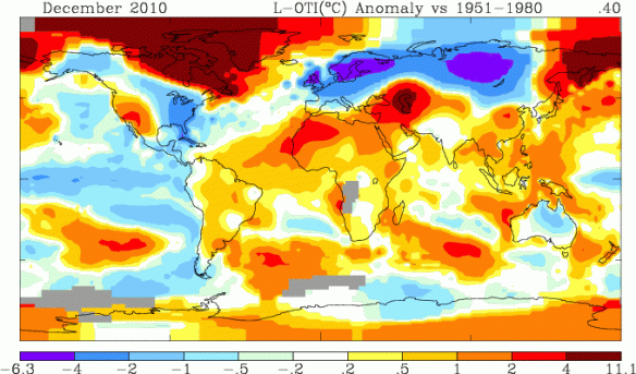
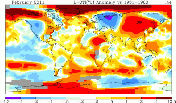
The official NASA maps – the ones you can generate yourself – didn’t add this new colour, though. They simply extended the range of dark red on the legend to whatever the maximum anomaly is – in some cases, as much as 11.1 C:
The legend goes up in small, smooth steps: a range of 0.3 C, 0.5 C, 1 C, 2 C. Then, suddenly, 6 or 7 C.
I’m sure this is a result of algorithms that haven’t been updated to accommodate such extreme anomalies. However, since very few people examine the legend beyond recognizing that red is warm and blue is cold, the current legend seems sort of misleading. Am I the only one who feels this way?


“… the current legend seems sort of misleading. Am I the only one who feels this way?”
From where I sit there’s a least two of us. Problem is, nobody at the helm is paying any attention.
I agree that it would be good to have more steps for the higher temperature anomalies. In addition I do wish that the GISS documents would include “polar” views which would have less distortion for the areas in the far north and south of the globe which have the most warming.
Cheers
That brings the count to 3. The interesting bits for me are the 1,000’s of sq \km’s with no reporting stations, and nothing to indicate the long term mean temps for those areas in that reporting time frame. If it is normally -40 in Dec then an 11 degree rise for a month may not be a concern. I did not the a large part was 2 degrees colder then the norm in Feb. an 11 degree rise in Oct, in Hudson Bay, would be a concern.
I’d love to see more information and more detail. I’d agree about the northern view, but it should be accompanied by information about how reliable the information might be, as I know measurements at the poles are few and far between.
Thanks for posting this; Dr. Hansen is one of my heroes (as are you).
There are polar views of the GISS site
Dec 2010 (250 km radius)
http://data.giss.nasa.gov/cgi-bin/gistemp/do_nmap.py?year_last=2011&month_last=02&sat=4&sst=1&type=anoms&mean_gen=12&year1=2010&year2=2010&base1=1951&base2=1980&radius=250&pol=pol
Dec 2010 (1200 km radius)
http://data.giss.nasa.gov/cgi-bin/gistemp/do_nmap.py?year_last=2011&month_last=02&sat=4&sst=1&type=anoms&mean_gen=12&year1=2010&year2=2010&base1=1951&base2=1980&radius=1200&pol=pol
I agree the legend is misleading. I would also want 0 to be the middle. Is their a solution that meets both criteria?
Hi Kate,
Thanks for all that you are doing to build awareness on climate change. I have a few post that you and your readers may find of interest. See:
http://8020vision.com/category/global-challenges/climate-change/
I include some articles on how warming temperatures are impacting protein levels in grain production, and I try to provide info that the business community might find persuasive to help get momentum building in the business world. Seeing the opportunity to make a difference, transition the world to renewable energy, and build a healthy cleantech economy.
Jay Kimball
8020 Vision