Climate Change and Heat Waves

One of the most dangerous effects of climate change is its impact on extreme events. The extra energy that’s present on a warmer world doesn’t distribute itself uniformly – it can come out in large bursts, manifesting itself as heat waves, floods, droughts, hurricanes, and tornadoes, to name a few. Consequently, warming the world by an average of 2 degrees is a lot more complicated than adding 2 to every weather station reading around the world.

Scientists have a difficult time studying the impacts of climate change on extreme events, because all these events could happen anyway – how can you tell if Hurricane Something is a direct result of warming, or just a fluke? Indeed, for events involving precipitation, like hurricanes or droughts, it’s not possible to answer this question. However, research is advancing to the point where we can begin to attribute individual heat waves to climate change with fairly high levels of confidence. For example, the recent extended heat wave in Texas, which was particularly devastating for farmers, probably wouldn’t have happened if it weren’t for global warming.

Extreme heat is arguably the easiest event for scientists to model. Temperature is one-dimensional and more or less follows a normal distribution for a given region. As climate change continues, temperatures increase (shifting the bell curve to the right) and become more variable (flattening the bell curve). The end result, as shown in part (c) of the figure below, is a significant increase in extremely hot weather:

Now, imagine that you get a bunch of weather station data from all across the world in 1951-1980, back before the climate had really started to warm. For every single record, find the temperature anomaly (difference from the average value in that place and on that day of the year). Plot the results, and you will get a normal distribution centred at 0. So values in the middle of the bell curve – i.e., temperatures close to the average – are the most likely, and temperatures on the far tails of the bell curve – i.e. much warmer or much colder than the average – are far less likely.

As any statistics student knows, 99.7% of the Earth’s surface should have temperatures within three standard deviations of the mean (this is just an interval, with length dependent on how flat the bell curve is) at any given time. So if we still had the same climate we did between 1951 and 1980, temperatures more than three standard deviations above the mean would cover 0.15% of the Earth’s surface.

However, in the past few years, temperatures three standard deviations above average have covered more like 10% of the Earth’s surface. Even some individual heat waves – like the ones in Texas and Russia over the past few years – have covered so much of the Earth’s surface on their own that they blow the 0.15% statistic right out of the water. Under the “old” climate, they almost certainly wouldn’t have happened. You can only explain them by shifting the bell curve to the right and flattening it. For this reason, we can say that these heat waves were caused by global warming.

Here’s a graph of the bell curves we’re talking about, in this case for the months of June, July, and August. The red, yellow and green lines are the old climate; the blue and purple lines are the new climate. Look at the area under the curve to the right of x = 3: it’s almost nothing beneath the old climate, but quite significant beneath the new climate.

Using basic statistical methods, it’s very exciting that we can now attribute specific heat waves to climate change. On the other hand, it’s very depressing, because it goes to show that such events will become far more likely as the climate continues to change, and the bell curve shifts inexorably to the right.

References:

Advertisement

Climate Change Denial: Heads in the Sand

I recently finished reading Climate Change Denial: Heads in the Sand by Haydn Washington and Skeptical Science founder John Cook. Given that I am a longtime reader of (and occasional contributor to) Skeptical Science, I didn’t expect to find much in this book that was new to me. However, I was pleasantly surprised.

Right from Chapter 1, Washington and Cook discuss a relatively uncharted area among similar books: denial among people who accept the reality of climate change. Even if a given citizen doesn’t identify as a skeptic/contrarian/lukewarmer/realist/etc, they hold information about global warming at arm’s length. The helplessness and guilt they feel from the problem leads them to ignore it. This implicit variety of denial is a common “delusion”, the authors argue – people practice it all the time with problems related to their health, finances, or relationships – but when it threatens the welfare of our entire planet, it is a dangerous “pathology”.

Therefore, the “information deficit model” of public engagement – based on an assumption that political will for action is only lacking because citizens don’t have enough information about the problem – is incorrect. The barriers to public knowledge and action aren’t scientific as much as “psychological, emotional, and behavioural”, the authors conclude.

This material makes me uncomfortable. An information deficit model would work to convince me that action was needed on a problem, so I have been focusing on it throughout my communication efforts. However, not everyone thinks the way I do (which is probably a good thing). So what am I supposed to do instead? I don’t know how to turn off the scientist part of my brain when I’m thinking about science.

The book goes on to summarize the science of climate change, in the comprehensible manner we have come to expect from Skeptical Science. It also dips into the site’s main purpose – classifying and rebutting climate change myths – with several examples of denier arguments. I appreciate how up-to-date this book is, as it touches on several topics that are included in few, if any, of my other books: a Climategate rebuttal, as well as an acknowledgement that the Venus syndrome on Earth, while distant, might be possible – James Hansen would even say plausible.

A few paragraphs are dedicated to discussing and criticizing scientific postmodernism, which I think is sorely needed – does anyone else find it strange that a movement which was historically quite liberal is now being resurrected by the science-denying ranks of conservatives? Critiques of silver-bullet approaches to mitigation, such as nuclear power alone or clean coal, are also included.

In short, Climate Change Denial: Heads in the Sand is well worth a read. It lacks the gripping narrative of Gwynne Dyer or Gabrielle Walker, both of whom have the ability to make scientific information feel like a mystery novel rather than a textbook, but it is enjoyable nonetheless. It adds worthy social science topics, such as implicit denial and postmodernism, to the discussion, paired with a taste of what Skeptical Science does best.

Models and Books

Working as a summer student continues to be rewarding. I get to spend all day reading interesting things and playing with scientific software. What a great deal!

Over the weekend, I ran the “Global Warming_01” simulation from EdGCM, which is an old climate model from NASA with a graphical user interface. Strangely, they don’t support Linux, as their target audience is educators – I doubt there are very many high school teachers running open-source operating systems! So I ran the Windows version on my laptop, and it took about 36 hours. It all felt very authentic.

Unfortunately, as their Windows 7 support is fairly new, there were some bugs in the output. It refused to give me any maps at all! The terminal popped up for a few seconds, but it didn’t output any files. All I could get were zonal averages (and then only from January-March) and time series. Also, for some reason, none of the time series graphs had units on the Y axis. Anyway, here are some I found interesting:

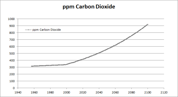
CO2 concentrations increase linearly from 1958 to 2000, and then exponentially until 2100, with a doubling of CO2 (with respect to 1958) around 2062. (This data was output as a spreadsheet, and I got Excel to generate the graph, so it looks nicer than the others.)

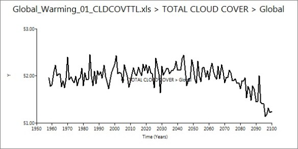
Global cloud cover held steady until around 2070, when it decreased. I can’t figure out why this would be, as the water vapour content of the air should be increasing with warming – wouldn’t there be more clouds forming, not less?

Global precipitation increased, as I expected. This is an instance where I wish the maps would have worked, because it would be neat to look at how precipitation amount varied by location. I’ve been pretty interested in subtropical drought recently.

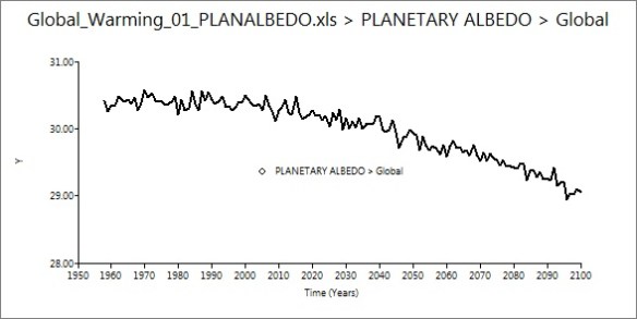
Albedo decreased about 1% – a nice example of the ice-albedo feedback (I presume) in action.

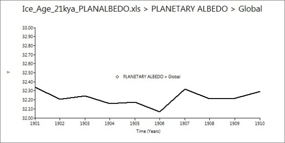
I also ran a simulation of the Last Glacial Maximum, from 21 thousand years ago. This run was much quicker than the first, as (since it was modeling a stable climate) it only simulated a decade, rather than 150 years. It took a few hours, and the same bugs in output were apparent. Time series graphs are less useful when studying stable conditions, but I found the albedo graph interesting:

Up a few percent from modern values, as expected.

It’s fairly expensive to purchase a licence for EdGCM, but they offer a free 30-day trial that I would recommend. I expect that it would run better on a  Mac, as that’s what they do most of the software development and testing on.

Now that I’ve played around with EdGCM, I’m working on porting CESM to a Linux machine. There’s been trial and error at every step, but everything went pretty smoothly until I reached the “build” phase, which requires the user to edit some of the scripts to suit the local machine (step 3 of the user guide). I’m still pretty new to Linux, so I’m having trouble working out the correct program paths, environment variables, modules, and so on. Oh well, the more difficult it is to get working, the more exciting it is when success finally comes!

I am also doing lots of background reading, as my project for the summer will probably be “some sort of written something-or-other” about climate models. Steve has a great collection of books about climate change, and keeps handing me interesting things to read. I’m really enjoying The Warming Papers, edited by David Archer and Ray Pierrehumbert. The book is a collection of landmark papers in climate science, with commentary from the editors. It’s pretty neat to read all the great works – from Fourier to Broecker to Hansen – in one place. Next on my list is A Vast Machine by Paul Edwards, which I’m very excited about.

A quick question, unrelated to my work – why do thunderstorms tend to happen at night? Perhaps it’s just a fluke, but we’ve had a lot of them recently, none of which have been in the daytime. Thoughts?

What Can One Person Do?

Next week, I will be giving a speech on climate change to the green committee of a local United Church. They are particularly interested in science and solutions, so I wrote the following script, drawing heavily from my previous presentations. I would really appreciate feedback and suggestions for this presentation.

Citations will be on the slides (which I haven’t made yet), so they’re not in the text of this script. Let me know if there’s a particular reference you’re wondering about, but they’re probably common knowledge within this community by now.

Enjoy!

Climate change is depressing. I know that really well, because I’ve been studying it for over two years. I’m quite practiced at keeping the scary stuff contained in the analytical part of my brain, and not thinking of the implications – because the implications make you feel powerless. I’m sure that all of us here wish we could stop global warming on our own. So we work hard to reduce our carbon footprints, and then we feel guilty every time we take the car out or buy something that was made in China or turn up the heat a degree.

The truth is, though, the infrastructure of our society doesn’t support a low-carbon lifestyle. Look at the quality of public transit in Winnipeg, or the price of local food. We can work all we want at changing our practices, but it’s an uphill battle. If we change the infrastructure, though – if we put a price on carbon so that sustainable practices are cheaper and easier than using fossil fuels – people everywhere will subsequently change their practices.

Currently, governments – particularly in North America – aren’t too interested in sustainable infrastructure, because they don’t think people care. Politicians only say what they think people want to hear. So, should we go dress up as polar bears and protest in front of Parliament to show them we care? That might work, but they will probably just see us as crazy environmentalists, a fringe group. We need a critical mass of people that care about climate change, understand the problem, and want to fix it. An effective solution requires top-down organization, but that won’t happen until there’s a bottom-up, grassroots movement of people who care.

I believe that the most effective action one person can take in the fight against global warming is to talk to others and educate others. I believe most people are good, and sane, and reasonable. They do the best they can, given their level of awareness. If we increase that awareness, we’ll gain political will for a solution. And so, in an effort to practice what I preach, I’m going to talk to you about the issue.

The science that led us to the modern concern about climate change began all the way back in 1824, when a man named Joseph Fourier discovered the greenhouse effect. Gases such as carbon dioxide make up less than one percent of the Earth’s atmosphere, but they trap enough heat to keep the Earth over 30 degrees Celsius warmer than it would be otherwise.

Without greenhouse gases, there could be no life on Earth, so they’re a very good thing – until their concentration changes. If you double the amount of CO2 in the air, the planet will warm, on average, somewhere around 3 degrees. The first person to realize that humans could cause this kind of a change, through the burning of fossil fuels releasing CO2, was Svante Arrhenius, in 1897. So this is not a new theory by any means.

For a long time, scientists assumed that any CO2 we emitted would just get absorbed by the oceans. In 1957, Roger Revelle showed that wasn’t true. The very next year, Charles Keeling decided to test this out, and started measuring the carbon dioxide content of the atmosphere. Now, Arrhenius had assumed that it would take thousands of years to double CO2 from the preindustrial value of 280 ppm (which we know from ice cores), but the way we’re going, we’ll get there in just a few decades. We’ve already reached 390 ppm. That might not seem like a lot, but 390 ppm of arsenic in your coffee would kill you. Small changes can have big effects.

Around the 1970s, scientists realized that people were exerting another influence on the climate. Many forms of air pollution, known as aerosols, have a cooling effect on the planet. In the 70s, the warming from greenhouse gases and the cooling from aerosols were cancelling each other out, and scientists were split as to which way it would go. There was one paper, by Stephen Schneider, which even said it could be possible to cause an ice age, if we put out enough aerosols and greenhouse gases stayed constant. However, as climate models improved, and governments started to regulate air pollution, a scientific consensus emerged that greenhouse gases would win out. Global warming was coming – it was just a question of when.

In 1988, James Hansen, who is arguably the top climate scientist in the world today, claimed it had arrived. In a famous testimony to the U.S. Congress, he said that “the greenhouse effect has been detected, and it is changing our climate now.” Many scientists weren’t so sure, and thought it was too early to make such a bold statement, but Hansen turned out to be right. Since about 1975, the world has been warming, more quickly than it has for at least the last 55 million years.

Over the past decade, scientists have even been able to rule out the possibility that the warming is caused by something else, like a natural cycle. Different causes of climate change have slightly different effects – like the pattern of warming in different layers of the atmosphere, the amount of warming in summer compared to winter, or at night compared to in the day, and so on. Ben Santer pioneered attribution studies: examining these effects in order to pinpoint a specific cause. And so far, nobody has been able to explain how the recent warming could not be caused by us.

Today, there is a remarkable amount of scientific agreement surrounding this issue. Between 97 and 98% of climate scientists, virtually 100% of peer-reviewed studies, and every scientific organization in the world agree that humans are causing the Earth to warm. The evidence for climate change is not a house of cards, where you take one piece out and the whole theory falls apart. It’s more like a mountain. Scrape a handful of pebbles off the top, but the mountain is still there.

However, if you take a step outside of the academic community, this convergence of evidence is more or less invisible. The majority of newspaper articles, from respected outlets like the New York Times or the Wall Street Journal, spend at least as much time arguing against this consensus as they do arguing for it. They present ideas such as “maybe it’s a natural cycle” or “CO2 has no effect on climate” that scientists disproved years ago. The media is stuck in the past. Some of them are only stuck in the 1980s, but others are stuck all the way back in 1800. Why is it like this?

Part of it comes from good, but misguided, intentions. When it comes to climate change, most journalists follow the rule of balance: presenting “two equal sides”, staying neutral, letting the reader form their own opinion. This works well when the so-called controversy is one of political or social nature, like tax levels or capital punishment. In these cases, there is no right answer, and people are usually split into two camps. But when the question at hand is one of science, there is a right answer – even if we haven’t found it yet – so some explanations are better than others, and some can be totally wrong. Would you let somebody form their own opinion on Newton’s Laws of Motion or the reality of photosynthesis? Sometimes scientists are split into two equal groups, but sometimes they’re split into three or four or even a dozen. How do you represent that as two equal sides? Sometimes, like we see with climate change, pretty much all the scientists are in agreement, and the two or three percent which aren’t don’t really publish, because they can’t back up their statements and nobody really takes them seriously. So framing these two groups as having equal weight in the scientific community is completely incorrect. It exaggerates the extreme minority, and suppresses everyone else. Being objective is not always the same as being neutral, and it’s particularly important to remember that when our future is at stake.

Another reason to frame climate science as controversial is that it makes for a much better story. Who really wants to read about scientists agreeing on everything? Journalists try to write stories that are exciting. Unfortunately, that goal can begin to overshadow accuracy.

Also, there are fewer journalists than there used to be, and there are almost no science journalists in the mainstream media – general reporters cover science issues instead. Also, a few decades ago, journalists used to get a week or two to write a story. Now they often have less than a day, because speed and availability of news has become more important than quality.

However, perhaps the most important – and disturbing – explanation for this inaccurate framing is that the media has been very compliant in spreading the message of climate change deniers. They call themselves skeptics, but I don’t think that’s accurate. A true skeptic will only accept a claim given sufficient evidence. That’s a good thing, and all scientists should be skeptics. But it’s easy to see that these people will never accept human-caused climate change, no matter what the evidence. At the same time, they blindly accept any shred of information that seems to support their cause, without applying any skepticism at all. That’s denial, so let’s not compliment them by calling them skeptics.

Climate change deniers will use whatever they can get – whether or not it’s legitimate, whether or not it’s honest – as proof that climate change is natural, or nonexistent, or a global conspiracy. They’ll tell you that volcanoes emit more CO2 than humans, but volcanoes actually emit about 1% of what we do. They’ll say that global warming has stopped because 2008 was cooler than 2007. If climatologists organize a public lecture in effort to communicate accurate scientific information, they’ll say that scientists are dogmatic and subscribe to censorship and will not allow any other opinions to be considered.

Some of these questionable sources are organizations, like a dozen or so lobby groups that have been paid a lot of money by oil companies to say that global warming is fake. Some of them are individuals, like US Senator James Inhofe, who was the environment chair under George W. Bush, and says that “global warming is the greatest hoax ever imposed upon the American people.” Some of them have financial motivations, and some of them have ideological motivations, but their motivations don’t really matter – all that matters is that they are saying things that are inaccurate, and misleading, and just plain wrong.

There has been a recent, and very disturbing, new tactic of deniers. Instead of attacking the science, they’ve begun to attack the integrity of individual scientists. In November 2009, they stole thirteen years of emails from a top climate research group in the UK, and spread stories all over the media that said scientists were caught fudging their data and censoring critics. Since then, they’ve been cleared of these charges by eight independent investigations, but you wouldn’t know it by reading the newspaper. For months, nearly every media outlet in the developed world spread what was, essentially, libel, and the only one that has formally apologized for its inaccurate coverage is the BBC.

In the meantime, there has been tremendous personal impact on the scientists involved. Many of them have received death threats, and Phil Jones, the director of the research group, was nearly driven to suicide. Another scientist, who wishes to remain anonymous, had a dead animal dumped on his doorstep and now travels with bodyguards. The Republican Party, which prides itself on fiscal responsibility, is pushing for more and more investigations, because they just can’t accept that the scientists are innocent…and James Inhofe, the “global warming is a hoax” guy, attempted to criminally prosecute seventeen researchers, most of whom had done nothing but occasionally correspond with the scientists who had their emails stolen. It’s McCarthyism all over again.

So this is where we are. Where are we going?

The Intergovernmental Panel on Climate Change, or IPCC, which collects and summarizes all the scientific literature about climate change, said in 2007 that under a business-as-usual scenario, where we keep going the way we’re going, the world will warm somewhere around 4 degrees Celsius by 2100. Unfortunately, this report was out of date almost as soon as it was published, and has widely been criticized for being too conservative. The British Meteorological Office published an updated figure in 2009 that estimated we will reach 4 degrees by the 2070s.

I will still be alive then (I hope!). I will likely have kids and even grandkids by then. I’ve spent a lot of time researching climate change, and the prospect of a 4 degree rise is terrifying to me. At 4 degrees, we will have lost control of the climate – even if we stop emitting greenhouse gases, positive feedbacks in the climate system will make sure the warming continues. We will have committed somewhere between 40 and 70 percent of the world’s species to extinction. Prehistoric records indicate that we can expect 40 to 80 metres of eventual sea level rise – it will take thousands of years to get there, but many coastal cities will be swamped within the first century. Countries – maybe even developed countries – will be at war over food and water. All this…within my lifetime.

And look at our current response. We seem to be spending more time attacking the scientists who discovered the problem than we are negotiating policy to fix it. We should have started reducing our greenhouse gas emissions twenty years ago, but if we start now, and work really hard, we do have a shot at stopping the warming at a point where we stay in control. Technically, we can do it. It’s going to take an unprecedented amount of political will and international communication

Everybody wants to know, “What can I do?” to fix the problem. Now, magazines everywhere are happy to tell you “10 easy ways to reduce your carbon footprint” – ride your bike, and compost, and buy organic spinach. That’s not really going to help. Say that enough people reduce their demand on fossil fuels: supply and demand dictates that the price will go down, and someone else will say, “Hey, gas is cheap!” and use more of it. Grassroots sentiment isn’t going to be enough. We need a price on carbon, whether it’s a carbon tax or cap-and-trade…but governments won’t do that until a critical mass of people demand it.

So what can you do? You can work on achieving that critical mass. Engage the apathetic. Educate people. Talk to them about climate change – it’s scary stuff, but suck it up. We’re all going to need to face it. Help them to understand and care about the problem. Don’t worry about the crazy people who shout about socialist conspiracies, they’re not worth your time. They’re very loud, but there’s not really very many of them. And in the end, we all get one vote.

An Unmeasured Forcing

“It is remarkable and untenable that the second largest forcing
that drives global climate change remains unmeasured,” writes Dr. James Hansen, the head of NASA’s climate change research team, and arguably the world’s top climatologist.

The word “forcing” refers to a factor, such as changes in the Sun’s output or in atmospheric composition, that exerts a warming or cooling influence on the Earth’s climate. The climate doesn’t magically change for no reason – it is always driven by something. Scientists measure these forcings in Watts per square metre – imagine a Christmas tree lightbulb over every square metre of the Earth’s surface, and you have 1 W/m2 of positive forcing.

Currently, the largest forcing on the Earth’s climate is that of increasing greenhouse gases from burning fossil fuels. These exert a positive, or warming, forcing, hence the term “global warming”. However, a portion of this positive forcing is being cancelled out by the second-largest forcing, which is also anthropogenic. Many forms of air pollution, collectively known as aerosols, exert a negative (cooling) forcing on the Earth’s climate. They do this in two ways: the direct albedo effect (scattering solar radiation so it never reaches the planet), and the indirect albedo effect (providing surfaces for clouds to form and scatter radiation by themselves). A large positive forcing and a medium negative forcing sums out to a moderate increase in global temperatures.

Unfortunately, a catch-22 exists with aerosols. As many aerosols are directly harmful to human health, the world is beginning to regulate them through legislation such as the American Clean Air Act. As this pollution decreases, its detrimental health effects will lessen, but so will its ability to partially cancel out global warming.

The problem is that we don’t know how much warming the aerosols are cancelling – that is, we don’t know the magnitude of the forcing. So, if all air pollution ceased tomorrow, the world could experience a small jump in net forcing, or a large jump. Global warming would suddenly become much worse, but we don’t know just how much.

The forcing from greenhouse gases is known with a high degree of accuracy – it’s just under 3 W/m2. However, all we know about aerosol forcing is that it’s somewhere around -1 or -2 W/m2 – an estimate is the best we can do. The reason for this dichotomy lies in the ease of measurement. Greenhouse gases last a long time (on the order of centuries) in the atmosphere, and mix through the air, moving towards a uniform concentration. An air sample from a remote area of the world, such as Antarctica or parts of Hawaii, will be uncontaminated by cars and factories nearby, and will contain an accurate value of the global atmospheric carbon dioxide concentration (the same can be done for other greenhouse gases, such as methane) . From these measurements, molecular physics can tell us how large the forcing is. Direct records of carbon dioxide concentrations have been kept since the late 1950s:

However, aerosols only stay in the troposphere for a few days, as precipitation washes them out of the air. For this reason, they don’t have time to disperse evenly, and measurements are not so simple. The only way to gain accurate measurements of their concentrations is with a satellite. NASA recently launched the Glory satellite for just this purpose. Unfortunately, it failed to reach orbit (an inherent risk for satellites), and given the current political climate in the United States, it seems overly optimistic to hope for funding for a new one any time soon. Luckily, if this project was carried out by the private sector, without the need for money-draining government review panels, James Hansen estimates that it could be achieved with a budget of around $100 million.

An accurate value for aerosol forcing can only be achieved with accurate measurements of aerosol concentration. Knowing this forcing would be immensely helpful for climate researchers, as it impacts not only the amount of warming we can expect, but also how long it will take to play out, until the planet reaches thermal equilibrium. Aimed with better knowledge of these details will allow policymakers to better plan for the future, regarding both mitigation of and adaptation to climate change. Finally measuring the impact of aerosols, instead of just estimating, could give our understanding of the climate system the biggest bang for its buck.

In Other News…

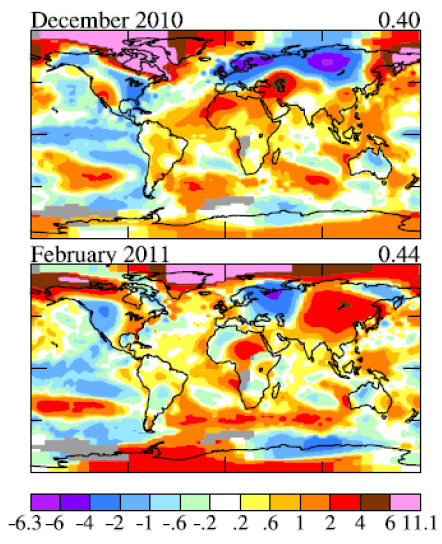
The Arctic is getting so warm in winter that James Hansen had to add a new colour to the standard legend – pink, which is even warmer than dark red:

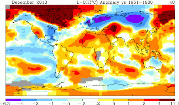
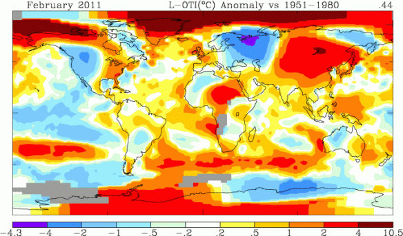
The official NASA maps – the ones you can generate yourself – didn’t add this new colour, though. They simply extended the range of dark red on the legend to whatever the maximum anomaly is – in some cases, as much as 11.1 C:

The legend goes up in small, smooth steps: a range of 0.3 C, 0.5 C, 1 C, 2 C. Then, suddenly, 6 or 7 C.

I’m sure this is a result of algorithms that haven’t been updated to accommodate such extreme anomalies. However, since very few people examine the legend beyond recognizing that red is warm and blue is cold, the current legend seems sort of misleading. Am I the only one who feels this way?

What’s the Warmest Year – and Does it Matter?

Cross-posted from NextGenJournal

Climate change is a worrying phenomenon, but watching it unfold can be fascinating. The beginning of a new year brings completed analysis of what last year’s conditions were like. Perhaps the most eagerly awaited annual statistic is global temperature.

This year was no different – partway through 2010, scientists could tell that it had a good chance of being the warmest year on record. It turned out to be more or less tied for first, as top temperature analysis centres recently announced:

Why the small discrepancy in the order of  1998, 2005, and 2010? The answer is mainly due to the Arctic. Weather stations in the Arctic region are few and far between, as it’s difficult to have a permanent station on ice floes that move around, and are melting away. Scientists, then, have two choices in their analyses: extrapolate Arctic temperature anomalies from the stations they do have, or just leave the missing areas out, assuming that they’re warming at the global average rate. The first choice might lead to results that are off in either direction…but the second choice almost certainly underestimates warming, as it’s clear that climate change is affecting the Arctic much more and much faster than the global average. Currently, NASA is the only centre to do extrapolation in Arctic data. A more detailed explanation is available here.

But how useful is an annual measurement of global temperature? Not very, as it turns out. Short-term climate variability, most prominently El Nino and La Nina, impact annual temperatures significantly. Furthermore, since this oscillation occurs in the winter, the thermal influence of El Nino or La Nina can fall entirely into one calendar year, or be split between two. The result is a graph that’s rather spiky:

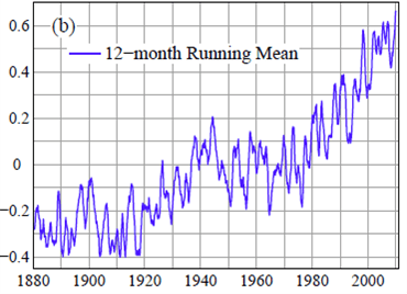
A far more useful analysis involves plotting a 12-month running mean. Instead of measuring only from January to December, measurements are also compiled from February to January, March to February, and so on. This results in twelve times more data points, and prevents El Nino and La Nina events from being exaggerated:

This graph is better, but still not that useful. The natural spikiness of the El Nino cycle can, in the short term, get in the way of understanding the underlying trend. Since the El Nino cycle takes between 3 and 7 years to complete, a 60-month (5-year) running mean allows the resulting ups and downs to cancel each other out. Another cycle that impacts short-term temperature is the sunspot cycle, which operates on an 11-year cycle. A 132-month running mean smooths out that influence too. Both 60- and 132- month running means are shown below:

A statistic every month that shows the average global temperature over the last 5 or 11 years may not be as exciting as an annual measurement regarding the previous year. But that’s the reality of climate change. It doesn’t make every month or even every year warmer than the last, and a short-term trend line means virtually nothing. In the climate system, trends are always obscured by noise, and the nature of human psychology means we pay far more attention to noise. Nonetheless, the long-term warming trend since around 1975 is irrefutable when one is presented with the data. A gradual, persistent change might not make the greatest headline, but that doesn’t mean it’s worth ignoring.

Odds and Ends

I must thank Michael Tobis for two pieces of reading that his blog recently pointed me to. First, a fantastic article by Bill McKibben, which everyone should print out and stick to their fridge. Here’s a taste:

Read the comments on one of the representative websites: Global warming is a “fraud” or a “plot.” Scientists are liars out to line their pockets with government grants. Environmentalism is nothing but a money-spinning “scam.” These people aren’t reading the science and thinking, I have some questions about this. They’re convinced of a massive conspiracy.

The odd and troubling thing about this stance is not just that it prevents action. It’s also profoundly unconservative. If there was ever a radical project, monkeying with the climate would surely qualify. Had the Soviet Union built secret factories to pour carbon dioxide into the atmosphere and threatened to raise the sea level and subvert the Grain Belt, the prevailing conservative response would have been: Bomb them. Bomb them back to the Holocene—to the 10,000-year period of climatic stability now unraveling, the period that underwrote the rise of human civilization that conservatism has taken as its duty to protect. Conservatism has always stressed stability and continuity; since Burke, the watchwords have been tradition, authority, heritage. The globally averaged temperature of the planet has been 57 degrees, give or take, for most of human history; we know that works, that it allows the world we have enjoyed. Now, the finest minds, using the finest equipment, tell us that it’s headed toward 61 or 62 or 63 degrees unless we rapidly leave fossil fuel behind, and that, in the words of NASA scientists, this new world won’t be “similar to that on which civilization developed and to which life on earth is adapted.” Conservatives should be leading the desperate fight to preserve the earth we were born on.

Read the rest of the article here. Highly recommended to all.

The other link I wanted to share was a new publication entitled “Science and the Media”, just released by the American Academy of Arts and Sciences (not to be confused with the American Association for the Advancement of Science – why all the acronym duplication?)

With contributions from everyone from Donald Kennedy to Alan Alda, and essays with titles from “The Scientist as Citizen” to “Civic Scientific Literacy: The Role of the Media in the Electronic Era”, I’m virtually certain that I will enjoy this one (sorry, I can’t bring myself to say things like “certain” without caveats any more). The 109-page pdf is available free of charge and can be accessed from this page, which also includes information on ordering hard copies.

In other news, the La Niña conditions in the eastern Pacific (see anomaly map above) have bumped this year’s temperatures down a bit, so January-September 2010 is now tied for the warmest on record, rather than being a clear winner. This analysis is from NCDC, however, and I’m not sure how they deal with sparse data in the Arctic (for background, see this post – a summary of one of the most interesting papers I’ve read this year). Does anyone know if GISS has an up-to-date estimate for 2010 temperatures that we could compare it to? All I can find on their website are lines and lines of raw data, and I’m not really sure how to process it myself.

That’s all for today. Enjoy the week, everyone.

Global Surface Temperature Change

I really enjoyed reading “Global Surface Temperature Change“, by James Hansen and his team at GISS. Keep in mind that it’s still in the draft stages – they haven’t submitted to a journal yet, but they certainly plan to, and it’s a very credible team of scientists that will almost definitely get it published.

The paper is mostly about the methods of global temperature analysis. It’s more of a review paper than an account of a single experiment. However, their main discussion point was that even by using the same data, problems can be addressed in different ways. The two main problems with temperature analysis are:

  • “incomplete spatial and temporal coverage” (sparse data)
  • “non-climatic influences on measurement station environment” (urban heat island effect).

The authors explain the methods they use and why, and explore the impacts that different methods have on their results.

GISS measures anomalies in the temperatures, largely because they are much smoother and more consistent, geographically, than absolute temperatures. In 1987, they determined that anomalies could be safely extrapolated for a radius of 1200 km from a station and still be accurate. GISS smooths the whole map out by extrapolating everything and averaging the overlapping bits.

Extrapolating is also very useful in areas with very few stations, such as the polar regions and parts of Africa. In this map, grey indicates missing data:


The Arctic is particularly problematic, not only because its data is so sparse, but also because it has the largest anomaly of any region in the world. If you have incomplete coverage of an area that is warming so dramatically, it won’t pull its full weight in the global trend, and your result will almost certainly be too low.

This difficulty with the Arctic is the reason that GISS says 2005 is the warmest year on record, while HadCRUT, the team in England, says that 1998 is. GISS extrapolates from the stations they have, and end up getting pretty good coverage of the Arctic:

They’re assuming that areas with missing data have the same anomaly as whatever temperature stations are within 1200 km, which, as they determined in 1987, is a pretty fair assumption.

However, HadCRUT doesn’t do this extrapolating thing. When they don’t have data for an area, they just leave it out:

This might sound safer, in a way, but this method also makes an assumption. It assumes that the area has the same anomaly as the global average. And as we all know, the Arctic is warming a lot more and a lot faster than the global average. So it’s quite possible that GISS is right on this one.

Another adjustment that NASA makes is for local, anthropogenic, non-climatic effects on temperature data. The most obvious of these is the urban heat island effect. As an area becomes more urban, it gets more pavement, less vegetation, and its albedo goes down – it absorbs more heat. This often makes cities substantially warmer than the surrounding rural areas, which can obviously contaminate the temperature record. However, there are ways of eliminating urban influences from the data so we can see what the real trend is.

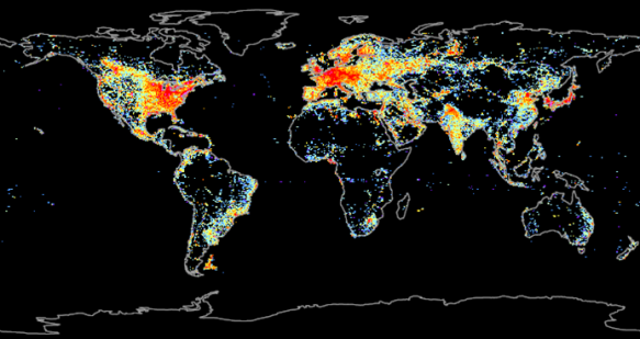
The first step is determining what stations are considered urban. The obvious way to do this is through population, but that’s actually not very accurate. Think of somewhere like Africa, where, even if there are thousands of people living in a small area, the urban influences such as concrete, absence of vegetation, or exhaust aren’t usually present. A much better indication is energy use, and a good proxy for energy use, that’s easy to measure, is lights at night-time.

So GISS put a bit of code into their analysis that singles out stations where nightlight brightness is greater than 32 µW/m2/sr/µm, and adjusts their trends to agree with rural stations within 1200 km. If there aren’t enough rural stations within that radius, they’ll just exclude the station from the analysis.

They did an even more rigorous test for this paper, to test just how much urban influences were contaminating the long-term trend, and it was pretty interesting.

There were enough stations considered “pitch-dark” at night, where they couldn’t detect any light, to run a global analysis all by themselves. The trend that came out was <0.01 °C/century smaller than GISS’s normal calculation, an amount of error that they described as “immeasurably small”.

The result of all this temperature analysis is a graph, with one new point every year, that is “eagerly awaited by some members of the public and the media”:

However, this graph isn’t actually as useful as this one – the 12-month running mean:

“From a climate standpoint there is nothing special about the time  of year at which the calendar begins”, so instead of only measuring January-December, you can also do February-January, March-February, and so on. This way, you get a data point every month instead of every year, and more data means more accuracy. It also solves problems with short-term influences, such as El Nino, La Nina, and volcanic eruptions, that the annual graph was having. These fleeting, but fairly substantial, influences can fall completely into one calendar year or be split between two – so their influence on global temperature could be overestimated or underestimated, depending on the starting month of the calendar. The 12-month running mean is much less misleading in this fashion.

As it is, we just set a new record for the 12-month running mean, and unless La Nina really takes off, 2010 will likely set a new record for the annual graph as well. But the authors argue that we need to start moving away from the annual graph, because it isn’t as useful.

The authors also discuss public perception of climate change, and media coverage of the issue. They say, “Our comments here about communication of this climate science to the public are our opinion…[We offer it] because it seems inappropriate to ignore the vast range of claims appearing in the media and in hopes that open discussion of these matters may help people distinguish the reality of global change sooner than would otherwise be the case.”

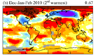
They make the very good point that “Lay people’s perception tends to be strongly influenced by the latest local fluctuation”, and use this winter as a case study, where a strongly negative Arctic Oscillation index caused significantly cooler-than-normal conditions across the United States and Europe. Consequently, a lot of people, especially in the US, began to doubt the reality of global warming – even though, in the world as a whole, it was the second warmest winter on record:

The authors also talk about data sharing. GISS likes to make everything freely available to the public – temperature station data, computer code, everything. However, putting it out there immediately, so that anyone can help check for flaws, has “a practical disadvantage: it allows any data flaws to be interpreted and misrepresented as machinations.” Multiple times in the past few years, when there have been minor errors that didn’t actually change anything, GISS was widely accused of making these mistakes deliberately, to “intentionally exaggerate the magnitude of global warming”. They realized this wasn’t working, so they changed their system: Before releasing the data to everyone, they first put it up on a private site so that only select scientists can examine it for flaws. And, of course, this “has resulted in the criticism that GISS now “hides” their data”.

Personally, I find the range and prevalence of these accusations against scientists absolutely terrifying. Look at what has become mainstream:

Scientific fraud is a very serious allegation, and it’s one thing for citizens to make it without evidence, but it’s another thing altogether for the media to repeat such claims without first investigating their validity:

I have been disgusted by the media coverage of climate science, especially over the past year, especially in the United States, and I worry what this will mean for our ability to solve the problem.

However, there is still fantastic science going on that is absolutely fascinating and essential to our understanding of global climate change. This paper was a very interesting read, and it helped me to better understand a lot of aspects of global temperature analysis.

2010 On Track for the Warmest Year on Record

The data is in from both NASA and NCDC, and NASA’s prediction of 2010 being the warmest year on record is well on its way to coming true, unless La Niña conditions rapidly develop (see page 15 of the NASA document). It has been:

  • the warmest March on record
  • the warmest January-March on record
  • the warmest April on record
  • the warmest January-April on record

Read NCDC’s reports on the March and April global temperatures, NASA’s maps of the January-April temperatures in 2010 as compared to 2005 and 1998 (the warmest years on record, at least until now), and Joe Romm’s excellent summaries.

As Romm says, “After the endless disinformation-based global cooling stories of the past few years, it’s time for the media to start do some serious fact-based global warming stories.” I fully agree. Everyone keep your eyes open, and see whether or not these record-breaking global temperatures are actually covered.