The Arctic Has Barfed

I was scanning my blog stats the other day – partly to see if people were reading my new post on the Blue Mountains bushfires, partly because I just like graphs – when I noticed that an article I wrote nearly two years ago was suddenly getting more views than ever before:

The article in question highlights the scientific inaccuracies of the 2004 film The Day After Tomorrow, in which global warming leads to a new ice age. Now that I’ve taken more courses in thermodynamics I could definitely expand on the original post if I had the time and inclination to watch the film again…

I did a bit more digging in my stats and discovered that most viewers are reaching this article through Google searches such as “is the day after tomorrow true”, “is the day after tomorrow likely to happen”, and “movie review of a day after tomorrow if it is possible or impossible.” The answers are no, no, and impossible, respectively.

But why the sudden surge in interest? I think it is probably related to the record cold temperatures across much of the United States, an event which media outlets have dubbed the “polar vortex”. I prefer “Arctic barf”.

Part of the extremely cold air mass which covers the Arctic has essentially detached and spilled southward over North America. In other words, the Arctic has barfed on the USA. Less sexy terminology than “polar vortex”, perhaps, but I would argue it is more enlightening.

Greg Laden also has a good explanation:

The Polar Vortex, a huge system of swirling air that normally contains the polar cold air has shifted so it is not sitting right on the pole as it usually does. We are not seeing an expansion of cold, an ice age, or an anti-global warming phenomenon. We are seeing the usual cold polar air taking an excursion.

Note that other regions such as Alaska and much of Europe are currently experiencing unusually warm winter weather. On balance, the planet isn’t any colder than normal. The cold patches are just moving around in an unusual way.

Having grown up in the Canadian Prairies, where we experience daily lows below -30°C for at least a few days each year (and for nearly a month straight so far this winter), I can’t say I have a lot of sympathy. Or maybe I’m just bitter because I never got a day off school due to the cold? But seriously, nothing has to shut down if you plug in the cars at night and bundle up like an astronaut. We’ve been doing it for years.

Advertisement

Explorers

On Monday evening, a Canadian research helicopter in northwest Nunavut crashed into the Arctic Ocean. Three men from the CGCS Amundsen research vessel were on board, examining the sea ice from above to determine the best route for the ship to take. All three were killed in the crash: climate scientist Klaus Hochheim, commanding officer Marc Thibault, and pilot Daniel Dubé.

The Amundsen recovered the bodies, which will be entrusted to the RCMP as soon as the ship reaches land. The helicopter remains at the bottom of the Arctic Ocean (~400 m deep); until it can be retrieved, the cause of the crash will remain unknown.

Klaus Hochheim

During my first two years of university, I worked on and off in the same lab as Klaus. He was often in the field, and I was often rushing off to class, so we only spoke a few times. He was very friendly and energetic, and I regret not getting to know him better. My thoughts are with the families, friends, and close colleagues of these three men, who have far more to mourn than I do.

Perhaps some solace can be found in the thought that they died doing what they loved best. All of the Arctic scientists I know are incredibly passionate about their field work: bring them down south for too long, and they start itching to get back on the ship. In the modern day, field scientists are perhaps the closest thing we have to explorers. Such a demanding job comes with immense personal and societal rewards, but also with risks.

These events remind me of another team of explorers that died while pursuing their calling, at the opposite pole and over a hundred years ago: the Antarctic expedition of 1912 led by Robert Falcon Scott. While I was travelling in New Zealand, I visited the Scott Memorial in the Queenstown public gardens. Carved into a stone tablet and set into the side of a boulder is an excerpt from Scott’s last diary entry. I thought the words were relevant to Monday night’s tragedy, so I have reproduced them below.

click to enlarge

We arrived within eleven miles of our old One Ton camp with fuel for one hot meal and food for two days. For four days we have been unable to leave the tent, the gale is howling about us. We are weak, writing is difficult, but, for my own sake, I do not regret this journey, which has shown that Englishmen can endure hardships, help one another, and meet death with as great a fortitude as ever in the past.

We took risks; we knew we took them. Things have come out against us, and therefore we have no cause for complaint, but bow to the will of providence, determined still to do our best to the last.

Had we lived I should have had a tale to tell of the hardihood, endurance, and courage of my companions which would have stirred the heart of every Englishman.

These rough notes and our dead bodies must tell the tale.

Climate change and the jet stream

Here in the northern mid-latitudes (much of Canada and the US, Europe, and the northern half of Asia) our weather is governed by the jet stream. This high-altitude wind current, flowing rapidly from west to east, separates cold Arctic air (to the north) from warmer temperate air (to the south). So on a given day, if you’re north of the jet stream, the weather will probably be cold; if you’re to the south, it will probably be warm; and if the jet stream is passing over you, you’re likely to get rain or snow.

The jet stream isn’t straight, though; it’s rather wavy in the north-south direction, with peaks and troughs. So it’s entirely possible for Calgary to experience a cold spell (sitting in a trough of the jet stream) while Winnipeg, almost directly to the east, has a heat wave (sitting in a peak). The farther north and south these peaks and troughs extend, the more extreme these temperature anomalies tend to be.

Sometimes a large peak or trough will hang around for weeks on end, held in place by certain air pressure patterns. This phenomenon is known as “blocking”, and is often associated with extreme weather. For example, the 2010 heat wave in Russia coincided with a large, stationary, long-lived peak in the polar jet stream. Wildfires, heat stroke, and crop failure ensued. Not a pretty picture.

As climate change adds more energy to the atmosphere, it would be naive to expect all the wind currents to stay exactly the same. Predicting the changes is a complicated business, but a recent study by Jennifer Francis and Stephen Vavrus made headway on the polar jet stream. Using North American and North Atlantic atmospheric reanalyses (models forced with observations rather than a spin-up) from 1979-2010, they found that Arctic amplification – the faster rate at which the Arctic warms, compared to the rest of the world – makes the jet stream slower and wavier. As a result, blocking events become more likely.

Arctic amplification occurs because of the ice-albedo effect: there is more snow and ice available in the Arctic to melt and decrease the albedo of the region. (Faster-than-average warming is not seen in much of Antarctica, because a great deal of thermal inertia is provided to the continent in the form of strong circumpolar wind and ocean currents.) This amplification is particularly strong in autumn and winter.

Now, remembering that atmospheric pressure is directly related to temperature, and pressure decreases with height, warming a region will increase the height at which pressure falls to 500 hPa. (That is, it will raise the 500 hPa “ceiling”.) Below that, the 1000 hPa ceiling doesn’t rise very much, because surface pressure doesn’t usually go much above 1000 hPa anyway. So in total, the vertical portion of the atmosphere that falls between 1000 and 500 hPa becomes thicker as a result of warming.

Since the Arctic is warming faster than the midlatitudes to the south, the temperature difference between these two regions is smaller. Therefore, the difference in 1000-500 hPa thickness is also smaller. Running through a lot of complicated physics equations, this has two main effects:

  1. Winds in the east-west direction (including the jet stream) travel more slowly.
  2. Peaks of the jet stream are pulled farther north, making the current wavier.

Also, both of these effects reinforce each other: slow jet streams tend to be wavier, and wavy jet streams tend to travel more slowly. The correlation between relative 1000-500 hPa thickness and these two effects is not statistically significant in spring, but it is in the other three seasons. Also, melting sea ice and declining snow cover on land are well correlated to relative 1000-500 hPa thickness, which makes sense because these changes are the drivers of Arctic amplification.

Consequently, there is now data to back up the hypothesis that climate change is causing more extreme fall and winter weather in the mid-latitudes, and in both directions: unusual cold as well as unusual heat. Saying that global warming can cause regional cold spells is not a nefarious move by climate scientists in an attempt to make every possible outcome support their theory, as some paranoid pundits have claimed. Rather, it is another step in our understanding of a complex, non-linear system with high regional variability.

Many recent events, such as record snowfalls in the US during the winters of 2009-10 and 2010-11, are consistent with this mechanism – it’s easy to see that they were caused by blocking in the jet stream when Arctic amplification was particularly high. They may or may not have happened anyway, if climate change wasn’t in the picture. However, if this hypothesis endures, we can expect more extreme weather from all sides – hotter, colder, wetter, drier – as climate change continues. Don’t throw away your snow shovels just yet.

Permafrost Projections

During my summer at UVic, two PhD students at the lab (Andrew MacDougall and Chris Avis) as well as my supervisor (Andrew Weaver) wrote a paper modelling the permafrost carbon feedback, which was recently published in Nature Geoscience. I read a draft version of this paper several months ago, and am very excited to finally share it here.

Studying the permafrost carbon feedback is at once exciting (because it has been left out of climate models for so long) and terrifying (because it has the potential to be a real game-changer). There is about twice as much carbon frozen into permafrost than there is floating around in the entire atmosphere. As high CO2 levels cause the world to warm, some of the permafrost will thaw and release this carbon as more CO2 – causing more warming, and so on. Previous climate model simulations involving permafrost have measured the CO2 released during thaw, but haven’t actually applied it to the atmosphere and allowed it to change the climate. This UVic study is the first to close that feedback loop (in climate model speak we call this “fully coupled”).

The permafrost part of the land component was already in place – it was developed for Chris’s PhD thesis, and implemented in a previous paper. It involves converting the existing single-layer soil model to a multi-layer model where some layers can be frozen year-round. Also, instead of the four RCP scenarios, the authors used DEPs (Diagnosed Emission Pathways): exactly the same as RCPs, except that CO2 emissions, rather than concentrations, are given to the model as input. This was necessary so that extra emissions from permafrost thaw would be taken into account by concentration values calculated at the time.

As a result, permafrost added an extra 44, 104, 185, and 279 ppm of CO2 to the atmosphere for DEP 2.6, 4.5, 6.0, and 8.5 respectively. However, the extra warming by 2100 was about the same for each DEP, with central estimates around 0.25 °C. Interestingly, the logarithmic effect of CO2 on climate (adding 10 ppm to the atmosphere causes more warming when the background concentration is 300 ppm than when it is 400 ppm) managed to cancel out the increasing amounts of permafrost thaw. By 2300, the central estimates of extra warming were more variable, and ranged from 0.13 to 1.69 °C when full uncertainty ranges were taken into account. Altering climate sensitivity (by means of an artificial feedback), in particular, had a large effect.

As a result of the thawing permafrost, the land switched from a carbon sink (net CO2 absorber) to a carbon source (net CO2 emitter) decades earlier than it would have otherwise – before 2100 for every DEP. The ocean kept absorbing carbon, but in some scenarios the carbon source of the land outweighed the carbon sink of the ocean. That is, even without human emissions, the land was emitting more CO2 than the ocean could soak up. Concentrations kept climbing indefinitely, even if human emissions suddenly dropped to zero. This is the part of the paper that made me want to hide under my desk.

This scenario wasn’t too hard to reach, either – if climate sensitivity was greater than 3°C warming per doubling of CO2 (about a 50% chance, as 3°C is the median estimate by scientists today), and people followed DEP 8.5 to at least 2013 before stopping all emissions (a very intense scenario, but I wouldn’t underestimate our ability to dig up fossil fuels and burn them really fast), permafrost thaw ensured that CO2 concentrations kept rising on their own in a self-sustaining loop. The scenarios didn’t run past 2300, but I’m sure that if you left it long enough the ocean would eventually win and CO2 would start to fall. The ocean always wins in the end, but things can be pretty nasty until then.

As if that weren’t enough, the paper goes on to list a whole bunch of reasons why their values are likely underestimates. For example, they assumed that all emissions from permafrost were  CO2, rather than the much stronger CH4 which is easily produced in oxygen-depleted soil; the UVic model is also known to underestimate Arctic amplification of climate change (how much faster the Arctic warms than the rest of the planet). Most of the uncertainties – and there are many – are in the direction we don’t want, suggesting that the problem will be worse than what we see in the model.

This paper went in my mental “oh shit” folder, because it made me realize that we are starting to lose control over the climate system. No matter what path we follow – even if we manage slightly negative emissions, i.e. artificially removing CO2 from the atmosphere – this model suggests we’ve got an extra 0.25°C in the pipeline due to permafrost. It doesn’t sound like much, but add that to the 0.8°C we’ve already seen, and take technological inertia into account (it’s simply not feasible to stop all emissions overnight), and we’re coming perilously close to the big nonlinearity (i.e. tipping point) that many argue is between 1.5 and 2°C. Take political inertia into account (most governments are nowhere near even creating a plan to reduce emissions), and we’ve long passed it.

Just because we’re probably going to miss the the first tipping point, though, doesn’t mean we should throw up our hands and give up. 2°C is bad, but 5°C is awful, and 10°C is unthinkable. The situation can always get worse if we let it, and how irresponsible would it be if we did?

Since I Last Wrote…

Since I last wrote, I finished my summer research at Andrew Weaver’s lab (more on that in the weeks and months to come, as our papers work through peer review). I moved back home to the Prairies, which seem unnaturally hot, flat and dry compared to BC. Perhaps what I miss most is the ocean – the knowledge that the nearest coastline is more than a thousand kilometres away gives me an uncomfortable feeling akin to claustrophobia.

During that time, the last story I covered has developed significantly. Before September even began, Arctic sea ice extent reached record low levels. It’s currently well below the previous record, held in 2007, and will continue to decline for two or three more weeks before it levels off:

Finally, El Niño conditions are beginning to emerge in the Pacific Ocean. In central Canada we are celebrating, because El Niño tends to produce warmer-than-average winters (although last winter was mysteriously warm despite the cooling influence of La Niña – not a day below -30 C!) The impacts of El Niño are different all over the world, but overall it tends to boost global surface temperatures. Combine this effect with the current ascent from a solar minimum and the stronger-than-ever greenhouse gas forcing, and it looks likely that 2013 will break global temperature records. That’s still a long way away, though, and who knows what will happen before then?

A Bad Situation in the Arctic

Arctic sea ice is in the midst of a record-breaking melt season. This is yet another symptom of human-caused climate change progressing much faster than scientists anticipated.

Every year, the frozen surface of the Arctic Ocean waxes and wanes, covering the largest area in February or March and the smallest in September. Over the past few decades, these September minima have been getting smaller and smaller. The lowest sea ice extent on record occurred in 2007, followed closely by 2011, 2008, 2010, and 2009. That is, the five lowest years on record all happened in the past five years. While year-to-year weather conditions, like summer storms, impact the variability of Arctic sea ice cover, the undeniable downward trend can only be explained by human-caused climate change.

The 2012 melt season started off hopefully, with April sea ice extent near the 1979-2000 average. Then things took a turn for the worse, and sea ice was at record or near-record low conditions for most of the summer. In early August, a storm spread out the remaining ice, exacerbating the melt. Currently, sea ice is significantly below the previous record for this time of year. See the light blue line in the figure below:

The 2012 minimum is already the fifth-lowest on record for any day of the year – and the worst part is, it will keep melting for about another month. At this rate, it’s looking pretty likely that we’ll break the 2007 record and hit an all-time low in September. Sea ice volume, rather than extent, is in the same situation.

Computer models of the climate system have a difficult time reproducing this sudden melt. As recently as 2007, the absolute worst-case projections showed summer Arctic sea ice disappearing around 2100. Based on observations, scientists are now confident that will happen well before 2050, and possibly within a decade. Climate models, which many pundits like to dismiss as “alarmist,” actually underestimated the severity of the problem. Uncertainty cuts both ways.

The impacts of an ice-free Arctic Ocean will be wide-ranging and severe. Luckily, melting sea ice does not contribute to sea level rise (only landlocked ice does, such as the Greenland and Antarctic ice sheets), but many other problems remain. The Inuit peoples of the north, who depend on sea ice for hunting, will lose an essential source of food and culture. Geopolitical tensions regarding ownership of the newly-accessible Arctic waters are likely. Changes to the Arctic food web, from blooming phytoplankton to dwindling polar bears, will irreversibly alter the ecosystem. While scientists don’t know exactly what this new Arctic will look like, it is certain to involve a great deal of disruption and suffering.

Daily updates on Arctic sea ice conditions are available from the NSIDC website.

How do climate models work?

Also published at Skeptical Science

This is a climate model:

T = [(1-α)S/(4εσ)]1/4

(T is temperature, α is the albedo, S is the incoming solar radiation, ε is the emissivity, and σ is the Stefan-Boltzmann constant)

An extremely simplified climate model, that is. It’s one line long, and is at the heart of every computer model of global warming. Using basic thermodynamics, it calculates the temperature of the Earth based on incoming sunlight and the reflectivity of the surface. The model is zero-dimensional, treating the Earth as a point mass at a fixed time. It doesn’t consider the greenhouse effect, ocean currents, nutrient cycles, volcanoes, or pollution.

If you fix these deficiencies, the model becomes more and more complex. You have to derive many variables from physical laws, and use empirical data to approximate certain values. You have to repeat the calculations over and over for different parts of the Earth. Eventually the model is too complex to solve using pencil, paper and a pocket calculator. It’s necessary to program the equations into a computer, and that’s what climate scientists have been doing ever since computers were invented.

A pixellated Earth

Today’s most sophisticated climate models are called GCMs, which stands for General Circulation Model or Global Climate Model, depending on who you talk to. On average, they are about 500 000 lines of computer code long, and mainly written in Fortran, a scientific programming language. Despite the huge jump in complexity, GCMs have much in common with the one-line climate model above: they’re just a lot of basic physics equations put together.

Computers are great for doing a lot of calculations very quickly, but they have a disadvantage: computers are discrete, while the real world is continuous. To understand the term “discrete”, think about a digital photo. It’s composed of a finite number of pixels, which you can see if you zoom in far enough. The existence of these indivisible pixels, with clear boundaries between them, makes digital photos discrete. But the real world doesn’t work this way. If you look at the subject of your photo with your own eyes, it’s not pixellated, no matter how close you get – even if you look at it through a microscope. The real world is continuous (unless you’re working at the quantum level!)

Similarly, the surface of the world isn’t actually split up into three-dimensional cells (you can think of them as cubes, even though they’re usually wedge-shaped) where every climate variable – temperature, pressure, precipitation, clouds – is exactly the same everywhere in that cell. Unfortunately, that’s how scientists have to represent the world in climate models, because that’s the only way computers work. The same strategy is used for the fourth dimension, time, with discrete “timesteps” in the model, indicating how often calculations are repeated.

It would be fine if the cells could be really tiny – like a high-resolution digital photo that looks continuous even though it’s discrete – but doing calculations on cells that small would take so much computer power that the model would run slower than real time. As it is, the cubes are on the order of 100 km wide in most GCMs, and timesteps are on the order of hours to minutes, depending on the calculation. That might seem huge, but it’s about as good as you can get on today’s supercomputers. Remember that doubling the resolution of the model won’t just double the running time – instead, the running time will increase by a factor of sixteen (one doubling for each dimension).

Despite the seemingly enormous computer power available to us today, GCMs have always been limited by it. In fact, early computers were developed, in large part, to facilitate atmospheric models for weather and climate prediction.

Cracking the code

A climate model is actually a collection of models – typically an atmosphere model, an ocean model, a land model, and a sea ice model. Some GCMs split up the sub-models (let’s call them components) a bit differently, but that’s the most common arrangement.

Each component represents a staggering amount of complex, specialized processes. Here are just a few examples from the Community Earth System Model, developed at the National Center for Atmospheric Research in Boulder, Colorado:

  • Atmosphere: sea salt suspended in the air, three-dimensional wind velocity, the wavelengths of incoming sunlight
  • Ocean: phytoplankton, the iron cycle, the movement of tides
  • Land: soil hydrology, forest fires, air conditioning in cities
  • Sea Ice: pollution trapped within the ice, melt ponds, the age of different parts of the ice

Each component is developed independently, and as a result, they are highly encapsulated (bundled separately in the source code). However, the real world is not encapsulated – the land and ocean and air are very interconnected. Some central code is necessary to tie everything together. This piece of code is called the coupler, and it has two main purposes:

  1. Pass data between the components. This can get complicated if the components don’t all use the same grid (system of splitting the Earth up into cells).
  2. Control the main loop, or “time stepping loop”, which tells the components to perform their calculations in a certain order, once per time step.

For example, take a look at the IPSL (Institut Pierre Simon Laplace) climate model architecture. In the diagram below, each bubble represents an encapsulated piece of code, and the number of lines in this code is roughly proportional to the bubble’s area. Arrows represent data transfer, and the colour of each arrow shows where the data originated:
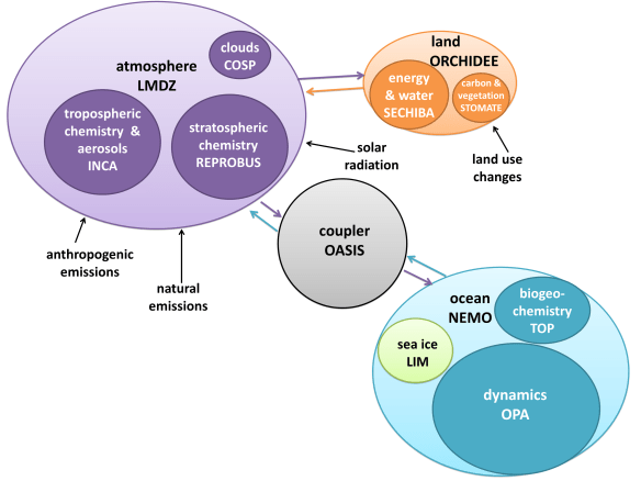
We can see that IPSL’s major components are atmosphere, land, and ocean (which also contains sea ice). The atmosphere is the most complex model, and land is the least. While both the atmosphere and the ocean use the coupler for data transfer, the land model does not – it’s simpler just to connect it directly to the atmosphere, since it uses the same grid, and doesn’t have to share much data with any other component. Land-ocean interactions are limited to surface runoff and coastal erosion, which are passed through the atmosphere in this model.

You can see diagrams like this for seven different GCMs, as well as a comparison of their different approaches to software architecture, in this summary of my research.

Show time

When it’s time to run the model, you might expect that scientists initialize the components with data collected from the real world. Actually, it’s more convenient to “spin up” the model: start with a dark, stationary Earth, turn the Sun on, start the Earth spinning, and wait until the atmosphere and ocean settle down into equilibrium. The resulting data fits perfectly into the cells, and matches up really nicely with observations. It fits within the bounds of the real climate, and could easily pass for real weather.

Scientists feed input files into the model, which contain the values of certain parameters, particularly agents that can cause climate change. These include the concentration of greenhouse gases, the intensity of sunlight, the amount of deforestation, and volcanoes that should erupt during the simulation. It’s also possible to give the model a different map to change the arrangement of continents. Through these input files, it’s possible to recreate the climate from just about any period of the Earth’s lifespan: the Jurassic Period, the last Ice Age, the present day…and even what the future might look like, depending on what we do (or don’t do) about global warming.

The highest resolution GCMs, on the fastest supercomputers, can simulate about 1 year for every day of real time. If you’re willing to sacrifice some complexity and go down to a lower resolution, you can speed things up considerably, and simulate millennia of climate change in a reasonable amount of time. For this reason, it’s useful to have a hierarchy of climate models with varying degrees of complexity.

As the model runs, every cell outputs the values of different variables (such as atmospheric pressure, ocean salinity, or forest cover) into a file, once per time step. The model can average these variables based on space and time, and calculate changes in the data. When the model is finished running, visualization software converts the rows and columns of numbers into more digestible maps and graphs. For example, this model output shows temperature change over the next century, depending on how many greenhouse gases we emit:

Predicting the past

So how do we know the models are working? Should we trust the predictions they make for the future? It’s not reasonable to wait for a hundred years to see if the predictions come true, so scientists have come up with a different test: tell the models to predict the past. For example, give the model the observed conditions of the year 1900, run it forward to 2000, and see if the climate it recreates matches up with observations from the real world.

This 20th-century run is one of many standard tests to verify that a GCM can accurately mimic the real world. It’s also common to recreate the last ice age, and compare the output to data from ice cores. While GCMs can travel even further back in time – for example, to recreate the climate that dinosaurs experienced – proxy data is so sparse and uncertain that you can’t really test these simulations. In fact, much of the scientific knowledge about pre-Ice Age climates actually comes from models!

Climate models aren’t perfect, but they are doing remarkably well. They pass the tests of predicting the past, and go even further. For example, scientists don’t know what causes El Niño, a phenomenon in the Pacific Ocean that affects weather worldwide. There are some hypotheses on what oceanic conditions can lead to an El Niño event, but nobody knows what the actual trigger is. Consequently, there’s no way to program El Niños into a GCM. But they show up anyway – the models spontaneously generate their own El Niños, somehow using the basic principles of fluid dynamics to simulate a phenomenon that remains fundamentally mysterious to us.

In some areas, the models are having trouble. Certain wind currents are notoriously difficult to simulate, and calculating regional climates requires an unaffordably high resolution. Phenomena that scientists can’t yet quantify, like the processes by which glaciers melt, or the self-reinforcing cycles of thawing permafrost, are also poorly represented. However, not knowing everything about the climate doesn’t mean scientists know nothing. Incomplete knowledge does not imply nonexistent knowledge – you don’t need to understand calculus to be able to say with confidence that 9 x 3 = 27.

Also, history has shown us that when climate models make mistakes, they tend to be too stable, and underestimate the potential for abrupt changes. Take the Arctic sea ice: just a few years ago, GCMs were predicting it would completely melt around 2100. Now, the estimate has been revised to 2030, as the ice melts faster than anyone anticipated:

Answering the big questions

At the end of the day, GCMs are the best prediction tools we have. If they all agree on an outcome, it would be silly to bet against them. However, the big questions, like “Is human activity warming the planet?”, don’t even require a model. The only things you need to answer those questions are a few fundamental physics and chemistry equations that we’ve known for over a century.

You could take climate models right out of the picture, and the answer wouldn’t change. Scientists would still be telling us that the Earth is warming, humans are causing it, and the consequences will likely be severe – unless we take action to stop it.

The Pitfalls of General Reporting: A Case Study

Today’s edition of Nature included an alarming paper, indicating record ozone loss in the Arctic due to an unusually long period of cold temperatures in the lower stratosphere.

On the same day, coverage of the story by the Canadian Press included a fundamental error that is already contributing to public confusion about the reality of climate change.

Counter-intuitively, while global warming causes temperatures in the troposphere (the lowest layer of the atmosphere) to rise, it causes temperatures in the stratosphere (the next layer up), as well as every layer above that, to fall. The exact mechanics are complex, but the pattern of a warming troposphere and a cooling stratosphere has been both predicted and observed.

This pattern was observed in the Arctic this year. As the Nature paper mentions, the stratosphere was unusually cold in early 2011. The surface temperatures, however, were unusually warm, as data from NASA shows:

Mar-May 2011

Dec-Feb 2011

While we can’t know for sure whether or not the unusual stratospheric conditions were caused by climate change, this chain of cause and effect is entirely consistent with what we can expect in a warming world.

However, if all you read was an article by the Canadian Press, you could be forgiven for thinking differently.

The article states that the ozone loss was “caused by an unusually prolonged period of extremely low temperatures.” I’m going to assume that means surface temperatures, because nothing else is specified – and virtually every member of the public would assume that too. As we saw from the NASA maps, though, cold surface temperatures couldn’t be further from the truth.

The headline, which was probably written by the Winnipeg Free Press, rather than the Canadian Press, tops off the glaring misconception nicely:

Record Ozone loss over the Arctic caused by extremely cold weather: scientists

No, no, no. Weather happens in the troposphere, not the stratosphere. While the stratosphere was extremely cold, the troposphere certainly was not. It appears that the reporters assumed the word “stratosphere” in the paper’s abstract was completely unimportant. In fact, it changes the meaning of the story entirely.

The reaction to this article, as seen in the comments section, is predictable:

So with global warming our winters are colder?

First it’s global warming that is destroying Earth, now it’s being too cold?! I’m starting to think these guys know as much about this as weather guys know about forecasting the weather!

Al gore the biggest con man since the beginning of mankind!! This guys holdings leave a bigger carbon footprint than most small countries!!

I’m confused. I thought the north was getting warmer and that’s why the polar bears are roaming around Churchill looking for food. There isn’t ice for them to go fishing.

People are already confused, and deniers are already using this journalistic error as evidence that global warming is fake. All because a major science story was written by a general reporter who didn’t understand the study they were covering.

In Manitoba, high school students learn about the different layers of the atmosphere in the mandatory grade 10 science course. Now, reporters who can’t recall this information are writing science stories for the Canadian Press.

News

Two pieces of bad news:

  • Mountain pine beetles, whose range is expanding due to warmer winters, are beginning to infest jack pines as well as lodgepole pines. To understand the danger from this transition, one only needs to look at the range maps for each species:

    Lodgepole Pine

    Jack Pine

    A study from Molecular Ecology, published last April, has the details.

  • Arctic sea ice extent was either the lowest on record or the second lowest on record, depending on how you collect and analyze the data. Sea ice volume, a much more important metric for climate change, was the lowest on record:

And one piece of good news:

  • Our abstract was accepted to AGU! I have been wanting to go to this conference for two years, and now I will get to!

Open Thread

Again, I am getting sloppy on publishing these regularly…

Possible topics for discussion:

Enjoy!