
Near the end of my summer at the UVic Climate Lab, all the scientists seemed to go on vacation at the same time and us summer students were left to our own devices. I was instructed to teach Jeremy, Andrew Weaver’s other summer student, how to use the UVic climate model – he had been working with weather station data for most of the summer, but was interested in Earth system modelling too.
Jeremy caught on quickly to the basics of configuration and I/O, and after only a day or two, we wanted to do something more exciting than the standard test simulations. Remembering an old post I wrote, I dug up this paper (open access) by Damon Matthews and Ken Caldeira, which modelled geoengineering by reducing incoming solar radiation uniformly across the globe. We decided to replicate their method on the newest version of the UVic ESCM, using the four RCP scenarios in place of the old A2 scenario. We only took CO2 forcing into account, though: other greenhouse gases would have been easy enough to add in, but sulphate aerosols are spatially heterogeneous and would complicate the algorithm substantially.
Since we were interested in the carbon cycle response to geoengineering, we wanted to prescribe CO2 emissions, rather than concentrations. However, the RCP scenarios prescribe concentrations, so we had to run the model with each concentration trajectory and find the equivalent emissions timeseries. Since the UVic model includes a reasonably complete carbon cycle, it can “diagnose” emissions by calculating the change in atmospheric carbon, subtracting contributions from land and ocean CO2 fluxes, and assigning the residual to anthropogenic sources.
After a few failed attempts to represent geoengineering without editing the model code (e.g., altering the volcanic forcing input file), we realized it was unavoidable. Model development is always a bit of a headache, but it makes you feel like a superhero when everything falls into place. The job was fairly small – just a few lines that culminated in equation 1 from the original paper – but it still took several hours to puzzle through the necessary variable names and header files! Essentially, every timestep the model calculates the forcing from CO2 and reduces incoming solar radiation to offset that, taking changing planetary albedo into account. When we were confident that the code was working correctly, we ran all four RCPs from 2006-2300 with geoengineering turned on. The results were interesting (see below for further discussion) but we had one burning question: what would happen if geoengineering were suddenly turned off?
By this time, having completed several thousand years of model simulations, we realized that we were getting a bit carried away. But nobody else had models in the queue – again, they were all on vacation – so our simulations were running three times faster than normal. Using restart files (written every 100 years) as our starting point, we turned off geoengineering instantaneously for RCPs 6.0 and 8.5, after 100 years as well as 200 years.
Results
Similarly to previous experiments, our representation of geoengineering still led to sizable regional climate changes. Although average global temperatures fell down to preindustrial levels, the poles remained warmer than preindustrial while the tropics were cooler:
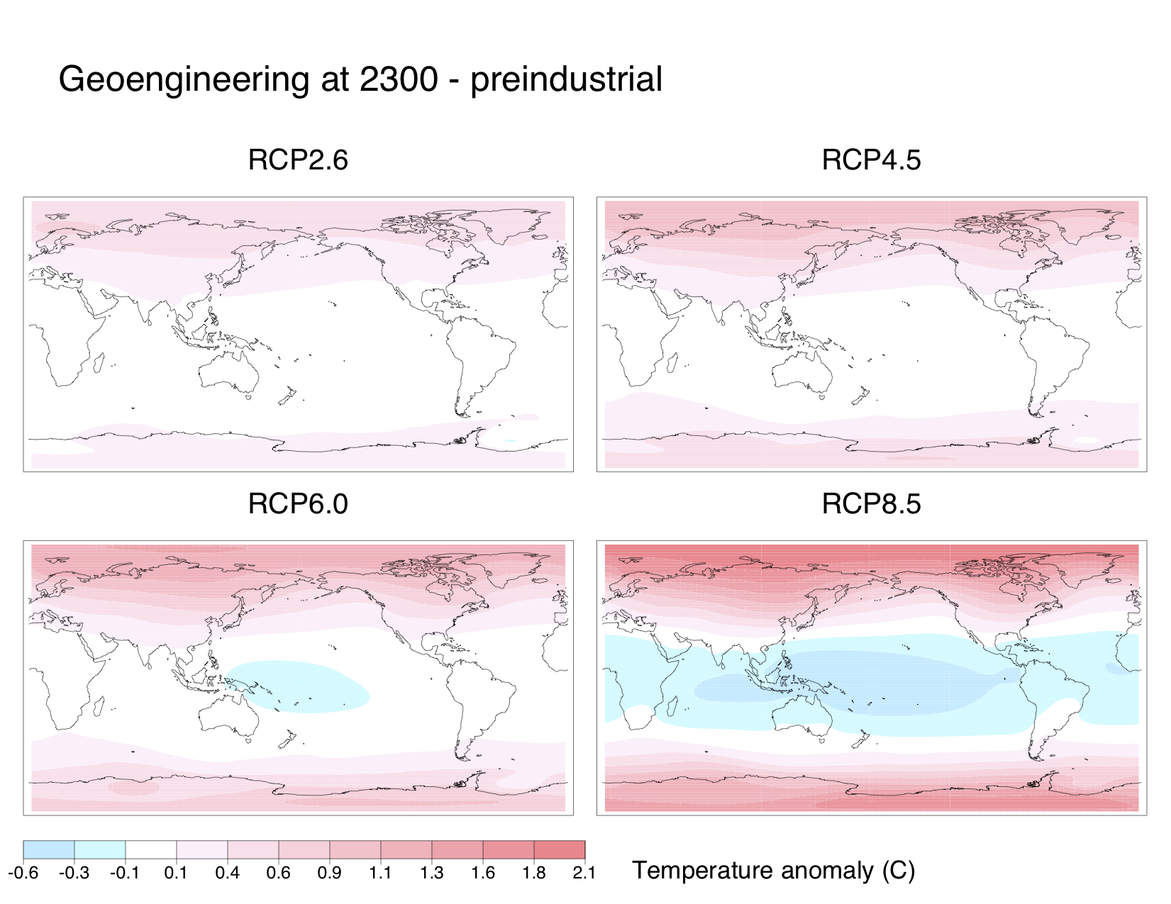
Also, nearly everywhere on the globe became drier than in preindustrial times. Subtropical areas were particularly hard-hit. I suspect that some of the drying over the Amazon and the Congo is due to deforestation since preindustrial times, though:

Jeremy also made some plots of key one-dimensional variables for RCP8.5, showing the results of no geoengineering (i.e. the regular RCP – yellow), geoengineering for the entire simulation (red), and geoengineering turned off in 2106 (green) or 2206 (blue):
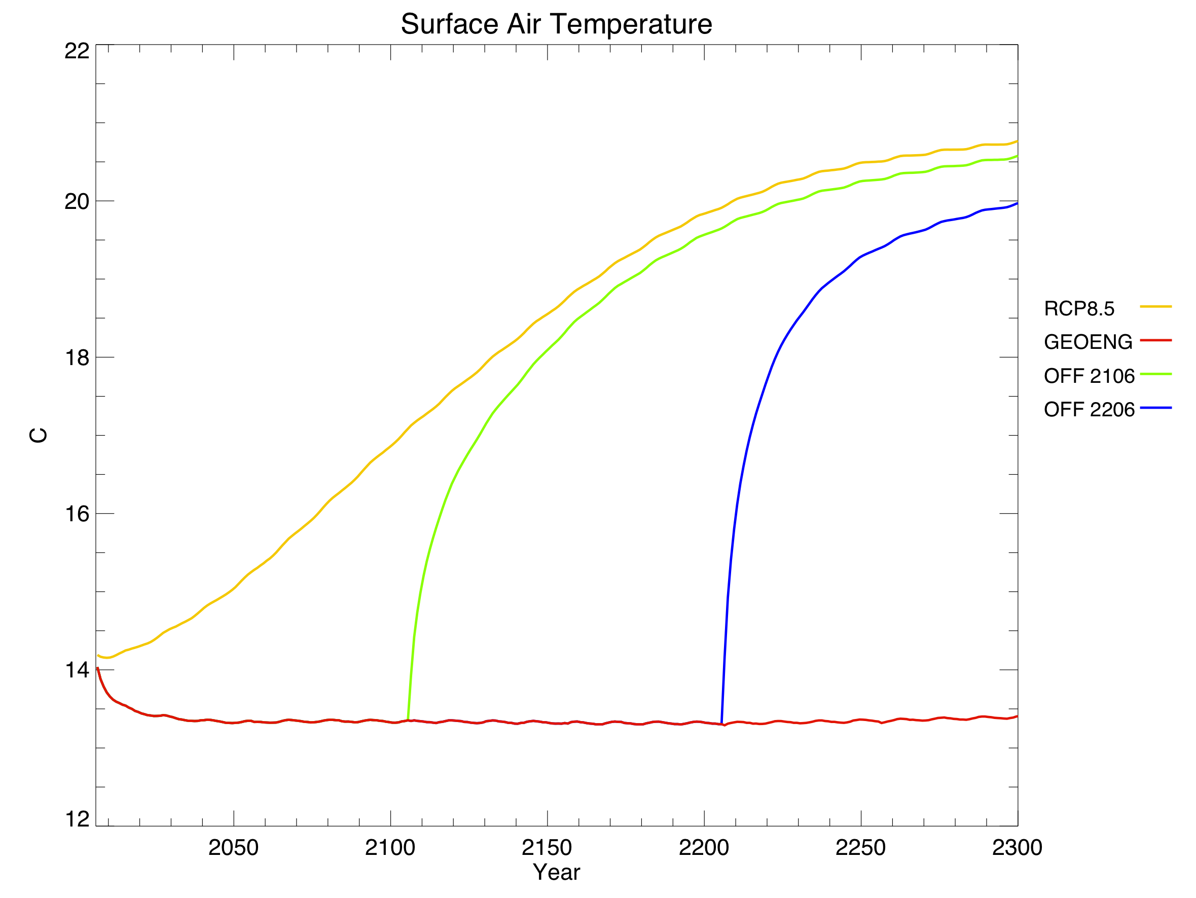
It only took about 20 years for average global temperature to fall back to preindustrial levels. Changes in solar radiation definitely work quickly. Unfortunately, changes in the other direction work quickly too: shutting off geoengineering overnight led to rates of warming up to 5 C / decade, as the climate system finally reacted to all the extra CO2. To put that in perspective, we’re currently warming around 0.2 C / decade, which far surpasses historical climate changes like the Ice Ages.
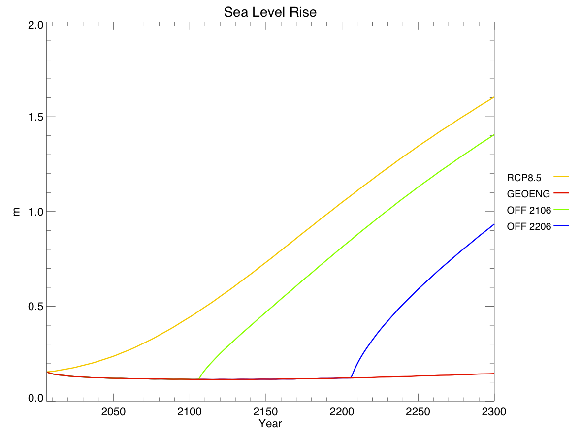
Sea level rise (due to thermal expansion only – the ice sheet component of the model isn’t yet fully implemented) is directly related to temperature, but changes extremely slowly. When geoengineering is turned off, the reversals in sea level trajectory look more like linear offsets from the regular RCP.
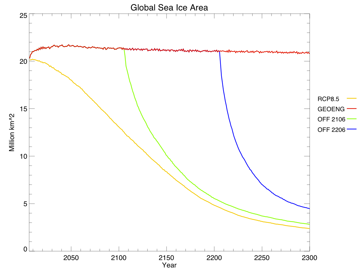
Sea ice area, in contrast, reacts quite quickly to changes in temperature. Note that this data gives annual averages, rather than annual minimums, so we can’t tell when the Arctic Ocean first becomes ice-free. Also, note that sea ice area is declining ever so slightly even with geoengineering – this is because the poles are still warming a little bit, while the tropics cool.

Things get really interesting when you look at the carbon cycle. Geoengineering actually reduced atmospheric CO2 concentrations compared to the regular RCP. This was expected, due to the dual nature of carbon cycle feedbacks. Geoengineering allows natural carbon sinks to enjoy all the benefits of high CO2 without the associated drawbacks of high temperatures, and these sinks become stronger as a result. From looking at the different sinks, we found that the sequestration was due almost entirely to the land, rather than the ocean:
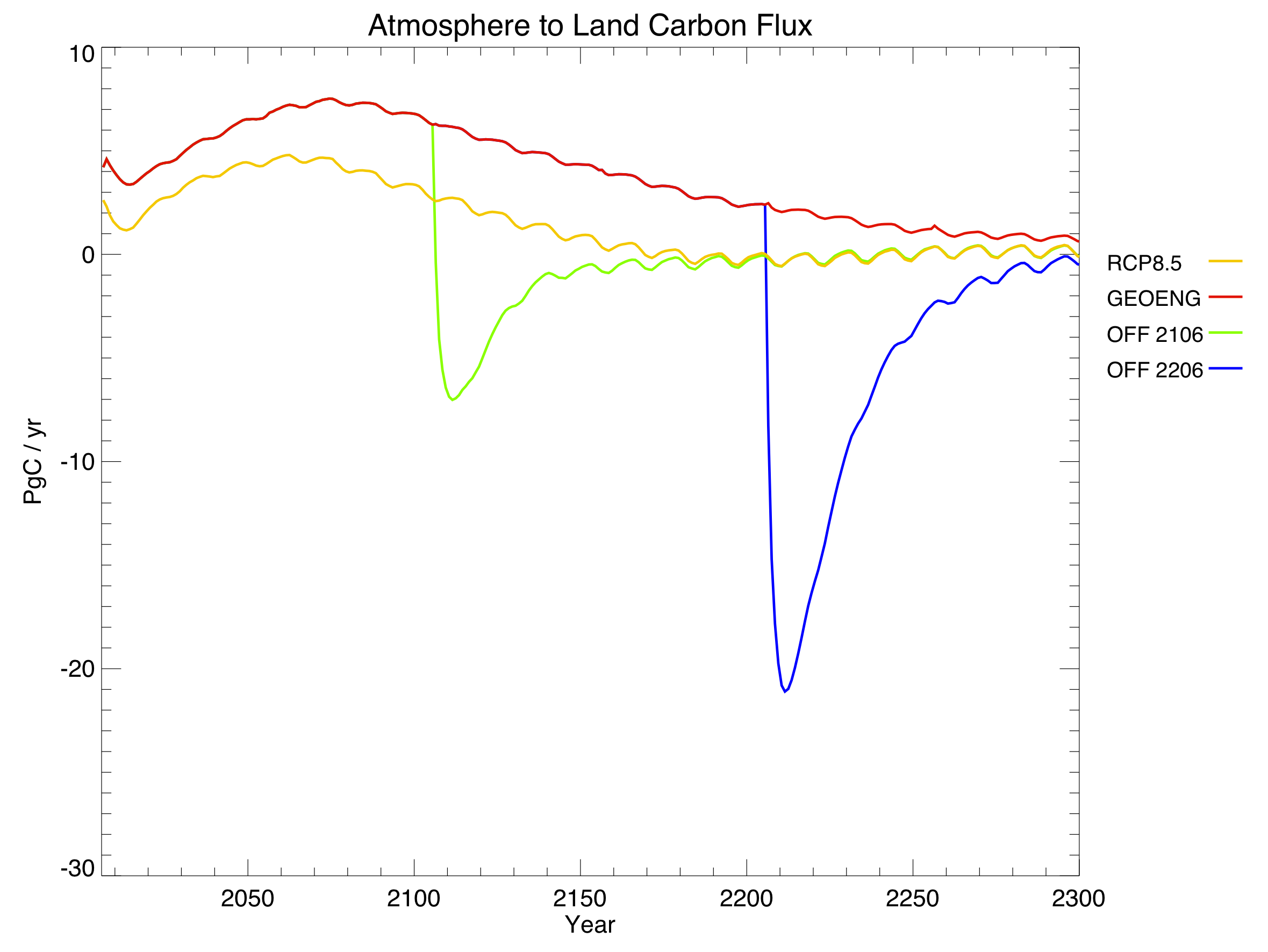
In this graph, positive values mean that the land is a net carbon sink (absorbing CO2), while negative values mean it is a net carbon source (releasing CO2). Note the large negative spikes when geoengineering is turned off: the land, adjusting to the sudden warming, spits out much of the carbon that it had previously absorbed.
Within the land component, we found that the strengthening carbon sink was due almost entirely to soil carbon, rather than vegetation:
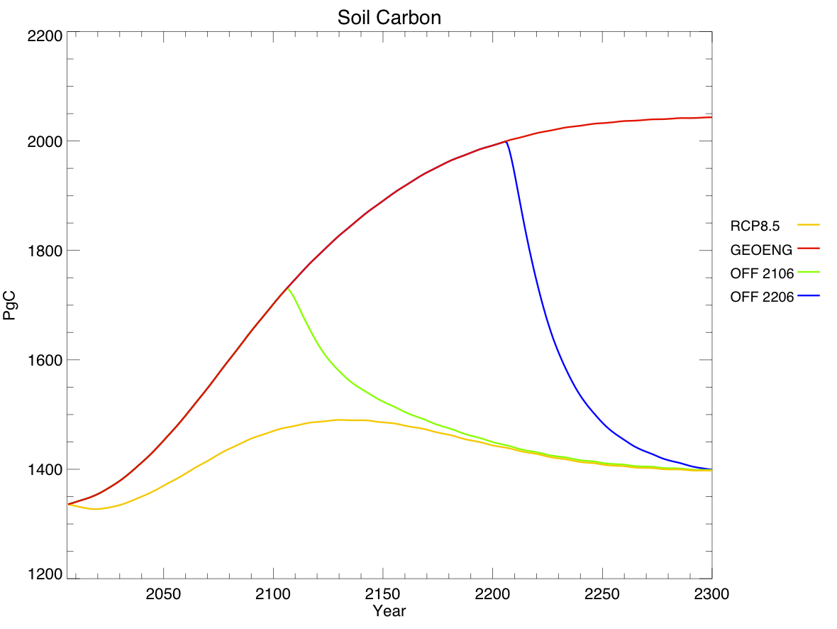
This graph shows total carbon content, rather than fluxes – think of it as the integral of the previous graph, but discounting vegetation carbon.
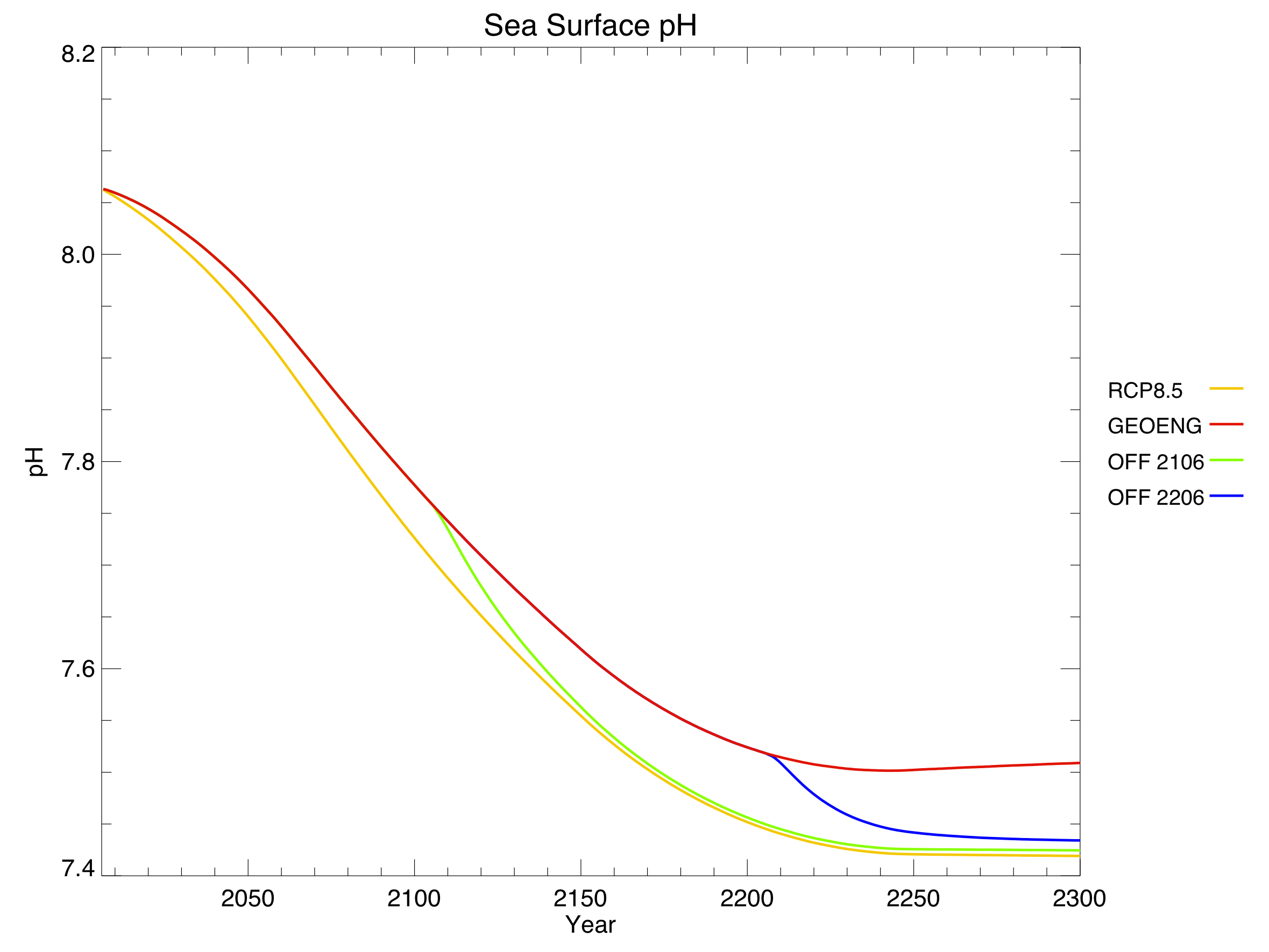
Finally, the lower atmospheric CO2 led to lower dissolved CO2 in the ocean, and alleviated ocean acidification very slightly. Again, this benefit quickly went away when geoengineering was turned off.
Conclusions
Is geoengineering worth it? I don’t know. I can certainly imagine scenarios in which it’s the lesser of two evils, and find it plausible (even probable) that we will reach such a scenario within my lifetime. But it’s not something to undertake lightly. As I’ve said before, desperate governments are likely to use geoengineering whether or not it’s safe, so we should do as much research as possible ahead of time to find the safest form of implementation.
The modelling of geoengineering is in its infancy, and I have a few ideas for improvement. In particular, I think it would be interesting to use a complex atmospheric chemistry component to allow for spatial variation in the forcing reduction through sulphate aerosols: increase the aerosol optical depth over one source country, for example, and let it disperse over time. I’d also like to try modelling different kinds of geoengineering – sulphate aerosols as well as mirrors in space and iron fertilization of the ocean.
Jeremy and I didn’t research anything that others haven’t, so this project isn’t original enough for publication, but it was a fun way to stretch our brains. It was also a good topic for a post, and hopefully others will learn something from our experiments.
Above all, leave over-eager summer students alone at your own risk. They just might get into something like this.
