Future projections of Antarctic ice shelf melting

Climate change will increase ice shelf melt rates around Antarctica. That’s the not-very-surprising conclusion of my latest modelling study, done in collaboration with both Australian and German researchers, which was just published in Journal of Climate. Here’s the less intuitive result: much of the projected increase in melt rates is actually linked to a decrease in sea ice formation.

That’s a lot of different kinds of ice, so let’s back up a bit. Sea ice is just frozen seawater. But ice shelves (as well as ice sheets and icebergs) are originally formed of snow. Snow falls on the Antarctic continent, and over many years compacts into a system of interconnected glaciers that we call an ice sheet. These glaciers flow downhill towards the coast. If they hit the coast and keep going, floating on the ocean surface, the floating bits are called ice shelves. Sometimes the edges of ice shelves will break off and form icebergs, but they don’t really come into this story.

Climate models don’t typically include ice sheets, or ice shelves, or icebergs. This is one reason why projections of sea level rise are so uncertain. But some standalone ocean models do include ice shelves. At least, they include the little pockets of ocean beneath the ice shelves – we call them ice shelf cavities – and can simulate the melting and refreezing that happens on the ice shelf base.

We took one of these ocean/ice-shelf models and forced it with the atmospheric output of regular climate models, which periodically make projections of climate change from now until the end of the century. We completed four different simulations, consisting of two different greenhouse gas emissions scenarios (“Representative Concentration Pathways” or RCPs) and two different choices of climate model (“ACCESS 1.0”, or “MMM” for the multi-model mean). Each simulation required 896 processors on the supercomputer in Canberra. By comparison, your laptop or desktop computer probably has about 4 processors. These are pretty sizable models!

In every simulation, and in every region of Antarctica, ice shelf melting increased over the 21st century. The total increase ranged from 41% to 129% depending on the scenario. The largest increases occurred in the Amundsen Sea region, marked with red circles in the maps below, which happens to be the region exhibiting the most severe melting in recent observations. In the most extreme scenario, ice shelf melting in this region nearly quadrupled.

Percent change in ice shelf melting, caused by the ocean, during the four future projections. The values are shown for all of Antarctica (written on the centre of the continent) as well as split up into eight sectors (colour-coded, written inside the circles). Figure 3 of Naughten et al., 2018, © American Meteorological Society.

So what processes were causing this melting? This is where the sea ice comes in. When sea ice forms, it spits out most of the salt from the seawater (brine rejection), leaving the remaining water saltier than before. Salty water is denser than fresh water, so it sinks. This drives a lot of vertical mixing, and the heat from warmer, deeper water is lost to the atmosphere. The ocean surrounding Antarctica is unusual in that the deep water is generally warmer than the surface water. We call this warm, deep water Circumpolar Deep Water, and it’s currently the biggest threat to the Antarctic Ice Sheet. (I say “warm” – it’s only about 1°C, so you wouldn’t want to go swimming in it, but it’s plenty warm enough to melt ice.)

In our simulations, warming winters caused a decrease in sea ice formation. So there was less brine rejection, causing fresher surface waters, causing less vertical mixing, and the warmth of Circumpolar Deep Water was no longer lost to the atmosphere. As a result, ocean temperatures near the bottom of the Amundsen Sea increased. This better-preserved Circumpolar Deep Water found its way into ice shelf cavities, causing large increases in melting.

Slices through the Amundsen Sea – you’re looking at the ocean sideways, like a slice of birthday cake, so you can see the vertical structure. Temperature is shown on the top row (blue is cold, red is warm); salinity is shown on the bottom row (blue is fresh, red is salty). Conditions at the beginning of the simulation are shown in the left 2 panels, and conditions at the end of the simulation are shown in the right 2 panels. At the beginning of the simulation, notice how the warm, salty Circumpolar Deep Water rises onto the continental shelf from the north (right side of each panel), but it gets cooler and fresher as it travels south (towards the left) due to vertical mixing. At the end of the simulation, the surface water has freshened and the vertical mixing has weakened, so the warmth of the Circumpolar Deep Water is preserved. Figure 8 of Naughten et al., 2018, © American Meteorological Society.

This link between weakened sea ice formation and increased ice shelf melting has troubling implications for sea level rise. The next step is to simulate the sea level rise itself, which requires some model development. Ocean models like the one we used for this study have to assume that ice shelf geometry stays constant, so no matter how much ice shelf melting the model simulates, the ice shelves aren’t allowed to thin or collapse. Basically, this design assumes that any ocean-driven melting is exactly compensated by the flow of the upstream glacier such that ice shelf geometry remains constant.

Of course this is not a good assumption, because we’re observing ice shelves thinning all over the place, and a few have even collapsed. But removing this assumption would necessitate coupling with an ice sheet model, which presents major engineering challenges. We’re working on it – at least ten different research groups around the world – and over the next few years, fully coupled ice-sheet/ocean models should be ready to use for the most reliable sea level rise projections yet.

A modified version of this post appeared on the EGU Cryospheric Sciences Blog.

Advertisement

On model development, and sanity

When I was a brand-new PhD student, full of innocence and optimism, I loved solving bugs. I loved the challenge of it and the rush I felt when I succeeded. I knew that if I threw all of my energy at a bug, I could solve it in two days, three days tops. I was full of confidence and hope. I had absolutely no idea what I was in for.

Now I am in the final days of my PhD, slightly jaded and a bit cynical, and I still love solving bugs. I love slowly untangling the long chain of cause and effect that is making my model do something weird. I love methodically ruling out possible sources of the problem until I eventually have a breakthrough. I am still full of confidence and hope. But it’s been a long road for me to come around full circle like this.

As part of my PhD, I took a long journey into the world of model coupling. This basically consisted of taking an ocean model and a sea ice model and bashing them together until they got along. The coupling code had already been written by the Norwegian Meteorological Institute for Arctic domains, but it was my job to adapt the model for an Antarctic domain with ice shelf cavities, and to help the master development team find and fix any problems in their beta code. The goal was to develop a model configuration that was sufficiently realistic for published simulations, to help us understand processes on the Antarctic continental shelf and in ice shelf cavities. Spoiler alert, I succeeded. (Paper #1! Paper #2!) But this outcome was far from obvious for most of my PhD. I spent about two and a half years gripped by the fear that my model would never be good enough, that I would never have any publishable results, that my entire PhD would be a failure, etc., etc. My wonderful supervisor insisted that she had absolute confidence in my success at every step along the way. I was afraid to believe her.

Model coupling is a shitfight, and anyone who tells you otherwise has never tried it. There is a big difference between a model that compiles and runs with no errors, and a model that produces results in the same galaxy as reality. For quite a while my model output did seem to be from another galaxy. Transport through Drake Passage – how we measure the strongest ocean current in the world – was going backwards. In a few model cells near the Antarctic coast, sea ice grew and grew and grew until it was more than a kilometre thick. Full-depth convection, from the ocean surface to the seafloor, was active through most of the Southern Ocean. Sea ice refused to export from the continental shelf, where it got thicker and thicker and older and older, while completely disappearing offshore.

How did I fix these bugs? Slowly. Carefully. Methodically. And once in a while, frantically trying everything I could think of at the same time, flailing in all directions. (Sometimes this works! But not usually.) My colleagues (who seem to regard me as The Fixer of Bugs) sometimes ask what my strategy is, if there is a fixed framework they can follow to solve bugs of their own. But I don’t really have a strategy. It’s different every time.

It’s very hard to switch off from model development, as the bugs sit in the back of your brain and follow you around day and night. Sometimes this constant, low-level mulling-over is helpful – the solutions to several bugs have come to me while in the shower, or walking to the shops, or sitting in a lecture theatre waiting for a seminar to start. But usually bug-brain just gets in the way and prevents you from fully relaxing. I remember one night when I didn’t sleep a wink because every time I closed my eyes all I could see were contour plots of sea ice concentration. Another day, at the pub with my colleagues to celebrate a friend’s PhD submission, I stirred my mojito with a straw and thought about stratification of Southern Ocean water masses.

***

When you spend all your time working towards a goal, you start to glorify the way you will feel when that goal is reached. The Day When This Bug Is Fixed. Or even better, The Day When All The Bugs Are Fixed. The clouds will part, and the angels will sing, and the happiness you feel will far outweigh all the strife and struggle it took to get there.

I’m going to spoil it for you: that’s not how it feels. That is just a fiction we tell ourselves to get through the difficult days. When my model was finally “good enough”, I didn’t really feel anything. It’s like when your paper is finally accepted after many rounds of peer review and you’re so tired of the whole thing that you’re just happy to see the back of it. Another item checked off the list. Time to move on to the next project. And the nihilism descends.

But here’s the most important thing. I regret nothing. Model development has been painful and difficult and all-consuming, but it’s also one of the most worthwhile and strangely joyful experiences I’ve had in my life. It’s been fantastic for my career, despite the initial dry spell in publications, because it turns out that employers love to hire model developers. And I think I’ve come out of it tough as nails because the stress of assembling a PhD thesis has been downright relaxing in comparison. Most importantly, model development is fun. I can’t say that enough times. Model development is FUN.

***

A few months ago I visited one of our partner labs for the last time. I felt like a celebrity. Now that I had results, everyone wanted to talk to me. “If you would like to arrange a meeting with Kaitlin, please contact her directly,” the group email said, just like if I were a visiting professor.

I had a meeting with a PhD student who was in the second year of a model development project. “How are you doing?” I asked, with a knowing gaze like a war-weary soldier.

“I’m doing okay,” he said bravely. “I’ve started meditating.” So he had reached the meditation stage. That was a bad sign.

“Try not to worry,” I said. “It gets better, and it will all work out somehow in the end. Would you like to hear about the kinds of bugs I was dealing with when I was in my second year?”

I like to think I gave him hope.

Modelling Geoengineering, Part II

Near the end of my summer at the UVic Climate Lab, all the scientists seemed to go on vacation at the same time and us summer students were left to our own devices. I was instructed to teach Jeremy, Andrew Weaver’s other summer student, how to use the UVic climate model – he had been working with weather station data for most of the summer, but was interested in Earth system modelling too.

Jeremy caught on quickly to the basics of configuration and I/O, and after only a day or two, we wanted to do something more exciting than the standard test simulations. Remembering an old post I wrote, I dug up this paper (open access) by Damon Matthews and Ken Caldeira, which modelled geoengineering by reducing incoming solar radiation uniformly across the globe. We decided to replicate their method on the newest version of the UVic ESCM, using the four RCP scenarios in place of the old A2 scenario. We only took CO2 forcing into account, though: other greenhouse gases would have been easy enough to add in, but sulphate aerosols are spatially heterogeneous and would complicate the algorithm substantially.

Since we were interested in the carbon cycle response to geoengineering, we wanted to prescribe CO2 emissions, rather than concentrations. However, the RCP scenarios prescribe concentrations, so we had to run the model with each concentration trajectory and find the equivalent emissions timeseries. Since the UVic model includes a reasonably complete carbon cycle, it can “diagnose” emissions by calculating the change in atmospheric carbon, subtracting contributions from land and ocean CO2 fluxes, and assigning the residual to anthropogenic sources.

After a few failed attempts to represent geoengineering without editing the model code (e.g., altering the volcanic forcing input file), we realized it was unavoidable. Model development is always a bit of a headache, but it makes you feel like a superhero when everything falls into place. The job was fairly small – just a few lines that culminated in equation 1 from the original paper – but it still took several hours to puzzle through the necessary variable names and header files! Essentially, every timestep the model calculates the forcing from CO2 and reduces incoming solar radiation to offset that, taking changing planetary albedo into account. When we were confident that the code was working correctly, we ran all four RCPs from 2006-2300 with geoengineering turned on. The results were interesting (see below for further discussion) but we had one burning question: what would happen if geoengineering were suddenly turned off?

By this time, having completed several thousand years of model simulations, we realized that we were getting a bit carried away. But nobody else had models in the queue – again, they were all on vacation – so our simulations were running three times faster than normal. Using restart files (written every 100 years) as our starting point, we turned off geoengineering instantaneously for RCPs 6.0 and 8.5, after 100 years as well as 200 years.

Results

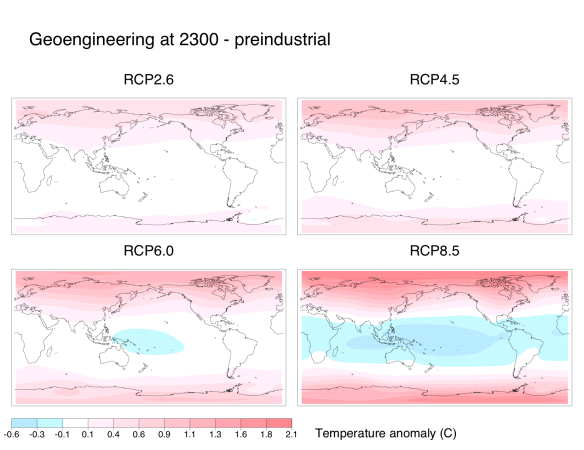
Similarly to previous experiments, our representation of geoengineering still led to sizable regional climate changes. Although average global temperatures fell down to preindustrial levels, the poles remained warmer than preindustrial while the tropics were cooler:

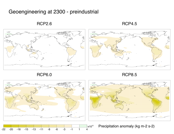
Also, nearly everywhere on the globe became drier than in preindustrial times. Subtropical areas were particularly hard-hit. I suspect that some of the drying over the Amazon and the Congo is due to deforestation since preindustrial times, though:

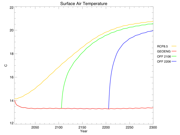
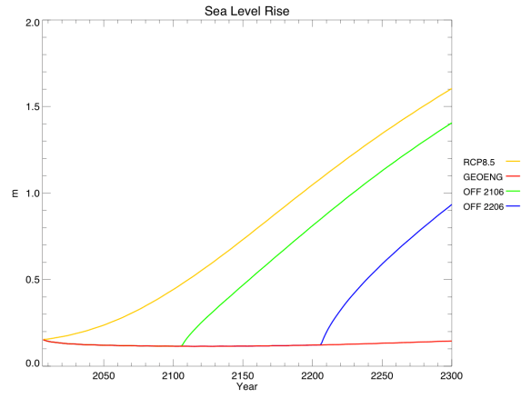
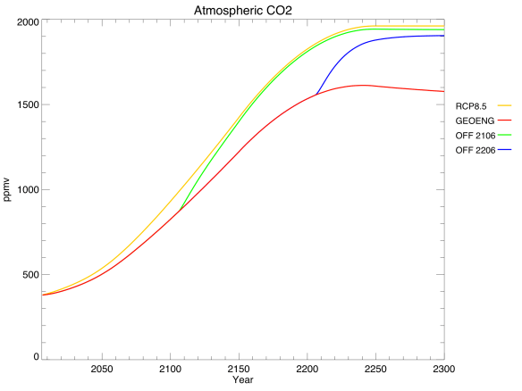
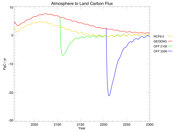
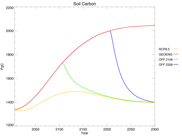
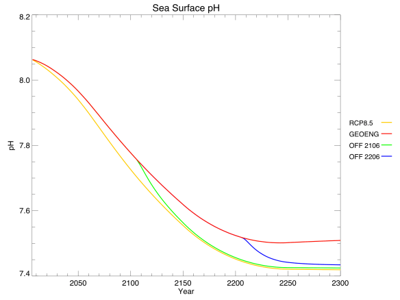
Jeremy also made some plots of key one-dimensional variables for RCP8.5, showing the results of no geoengineering (i.e. the regular RCP – yellow), geoengineering for the entire simulation (red), and geoengineering turned off in 2106 (green) or 2206 (blue):

It only took about 20 years for average global temperature to fall back to preindustrial levels. Changes in solar radiation definitely work quickly. Unfortunately, changes in the other direction work quickly too: shutting off geoengineering overnight led to rates of warming up to 5 C / decade, as the climate system finally reacted to all the extra CO2. To put that in perspective, we’re currently warming around 0.2 C / decade, which far surpasses historical climate changes like the Ice Ages.

Sea level rise (due to thermal expansion only – the ice sheet component of the model isn’t yet fully implemented) is directly related to temperature, but changes extremely slowly. When geoengineering is turned off, the reversals in sea level trajectory look more like linear offsets from the regular RCP.

Sea ice area, in contrast, reacts quite quickly to changes in temperature. Note that this data gives annual averages, rather than annual minimums, so we can’t tell when the Arctic Ocean first becomes ice-free. Also, note that sea ice area is declining ever so slightly even with geoengineering – this is because the poles are still warming a little bit, while the tropics cool.

Things get really interesting when you look at the carbon cycle. Geoengineering actually reduced atmospheric CO2 concentrations compared to the regular RCP. This was expected, due to the dual nature of carbon cycle feedbacks. Geoengineering allows natural carbon sinks to enjoy all the benefits of high CO2 without the associated drawbacks of high temperatures, and these sinks become stronger as a result. From looking at the different sinks, we found that the sequestration was due almost entirely to the land, rather than the ocean:

In this graph, positive values mean that the land is a net carbon sink (absorbing CO2), while negative values mean it is a net carbon source (releasing CO2). Note the large negative spikes when geoengineering is turned off: the land, adjusting to the sudden warming, spits out much of the carbon that it had previously absorbed.

Within the land component, we found that the strengthening carbon sink was due almost entirely to soil carbon, rather than vegetation:

This graph shows total carbon content, rather than fluxes – think of it as the integral of the previous graph, but discounting vegetation carbon.

Finally, the lower atmospheric CO2 led to lower dissolved CO2 in the ocean, and alleviated ocean acidification very slightly. Again, this benefit quickly went away when geoengineering was turned off.

Conclusions

Is geoengineering worth it? I don’t know. I can certainly imagine scenarios in which it’s the lesser of two evils, and find it plausible (even probable) that we will reach such a scenario within my lifetime. But it’s not something to undertake lightly. As I’ve said before, desperate governments are likely to use geoengineering whether or not it’s safe, so we should do as much research as possible ahead of time to find the safest form of implementation.

The modelling of geoengineering is in its infancy, and I have a few ideas for improvement. In particular, I think it would be interesting to use a complex atmospheric chemistry component to allow for spatial variation in the forcing reduction through sulphate aerosols: increase the aerosol optical depth over one source country, for example, and let it disperse over time. I’d also like to try modelling different kinds of geoengineering – sulphate aerosols as well as mirrors in space and iron fertilization of the ocean.

Jeremy and I didn’t research anything that others haven’t, so this project isn’t original enough for publication, but it was a fun way to stretch our brains. It was also a good topic for a post, and hopefully others will learn something from our experiments.

Above all, leave over-eager summer students alone at your own risk. They just might get into something like this.

Since I Last Wrote…

Since I last wrote, I finished my summer research at Andrew Weaver’s lab (more on that in the weeks and months to come, as our papers work through peer review). I moved back home to the Prairies, which seem unnaturally hot, flat and dry compared to BC. Perhaps what I miss most is the ocean – the knowledge that the nearest coastline is more than a thousand kilometres away gives me an uncomfortable feeling akin to claustrophobia.

During that time, the last story I covered has developed significantly. Before September even began, Arctic sea ice extent reached record low levels. It’s currently well below the previous record, held in 2007, and will continue to decline for two or three more weeks before it levels off:

Finally, El Niño conditions are beginning to emerge in the Pacific Ocean. In central Canada we are celebrating, because El Niño tends to produce warmer-than-average winters (although last winter was mysteriously warm despite the cooling influence of La Niña – not a day below -30 C!) The impacts of El Niño are different all over the world, but overall it tends to boost global surface temperatures. Combine this effect with the current ascent from a solar minimum and the stronger-than-ever greenhouse gas forcing, and it looks likely that 2013 will break global temperature records. That’s still a long way away, though, and who knows what will happen before then?

A Bad Situation in the Arctic

Arctic sea ice is in the midst of a record-breaking melt season. This is yet another symptom of human-caused climate change progressing much faster than scientists anticipated.

Every year, the frozen surface of the Arctic Ocean waxes and wanes, covering the largest area in February or March and the smallest in September. Over the past few decades, these September minima have been getting smaller and smaller. The lowest sea ice extent on record occurred in 2007, followed closely by 2011, 2008, 2010, and 2009. That is, the five lowest years on record all happened in the past five years. While year-to-year weather conditions, like summer storms, impact the variability of Arctic sea ice cover, the undeniable downward trend can only be explained by human-caused climate change.

The 2012 melt season started off hopefully, with April sea ice extent near the 1979-2000 average. Then things took a turn for the worse, and sea ice was at record or near-record low conditions for most of the summer. In early August, a storm spread out the remaining ice, exacerbating the melt. Currently, sea ice is significantly below the previous record for this time of year. See the light blue line in the figure below:

The 2012 minimum is already the fifth-lowest on record for any day of the year – and the worst part is, it will keep melting for about another month. At this rate, it’s looking pretty likely that we’ll break the 2007 record and hit an all-time low in September. Sea ice volume, rather than extent, is in the same situation.

Computer models of the climate system have a difficult time reproducing this sudden melt. As recently as 2007, the absolute worst-case projections showed summer Arctic sea ice disappearing around 2100. Based on observations, scientists are now confident that will happen well before 2050, and possibly within a decade. Climate models, which many pundits like to dismiss as “alarmist,” actually underestimated the severity of the problem. Uncertainty cuts both ways.

The impacts of an ice-free Arctic Ocean will be wide-ranging and severe. Luckily, melting sea ice does not contribute to sea level rise (only landlocked ice does, such as the Greenland and Antarctic ice sheets), but many other problems remain. The Inuit peoples of the north, who depend on sea ice for hunting, will lose an essential source of food and culture. Geopolitical tensions regarding ownership of the newly-accessible Arctic waters are likely. Changes to the Arctic food web, from blooming phytoplankton to dwindling polar bears, will irreversibly alter the ecosystem. While scientists don’t know exactly what this new Arctic will look like, it is certain to involve a great deal of disruption and suffering.

Daily updates on Arctic sea ice conditions are available from the NSIDC website.

News

Two pieces of bad news:

  • Mountain pine beetles, whose range is expanding due to warmer winters, are beginning to infest jack pines as well as lodgepole pines. To understand the danger from this transition, one only needs to look at the range maps for each species:

    Lodgepole Pine

    Jack Pine

    A study from Molecular Ecology, published last April, has the details.

  • Arctic sea ice extent was either the lowest on record or the second lowest on record, depending on how you collect and analyze the data. Sea ice volume, a much more important metric for climate change, was the lowest on record:

And one piece of good news:

  • Our abstract was accepted to AGU! I have been wanting to go to this conference for two years, and now I will get to!

Open Thread

Again, I am getting sloppy on publishing these regularly…

Possible topics for discussion:

Enjoy!

Snowstorms and Sea Ice

Cross-posted from NextGen Journal

“That’s some global warming”, Fox News proudly announced. “Rare winter storm dumps several inches of snow across South.” It’s cold outside, and/or it’s snowing, so therefore global warming can’t be happening. Impeccable logic, or rampant misconception?

It happened last winter, and again so far this season: unusual snow and extreme cold thrashed the United States, Europe, and Russia. Climate change deniers, with a response as predictable as Newton’s Laws, trumpeted the conditions as undeniable proof that the world simply could not be warming. Even average people, understandably confused by conflicting media reports, started to wonder if global warming was really such a watertight theory.

But sit and think about it for a minute. If it’s cold right now in the place where you live, that doesn’t mean it’s cold everywhere else. It’s simply not possible to look at your little corner of the world and extrapolate those conditions to the entire planet. There’s a reason it’s called global warming, and not “everywhere-all-the-time warming”. Climate change increases the amount of thermal energy on our planet, but that doesn’t mean the extra energy will be distributed equally.

That said, an interesting weather condition has been prominent over the past month, telling a fascinating story that begins in the Arctic. At the recent American Geophysical Union conference in San Fransisco, the largest annual gathering of geoscientists in the world, NOAA scientist Jim Overland described the situation.

Usually in winter, the air masses above the Arctic have low pressure, and the entire area is surrounded by a circular vortex of wind currents, keeping the frigid polar air contained. Everything is what you’d expect: a cold Arctic and mild continents. These conditions are known as the positive phase of the North Atlantic Oscillation (NAO), an index of fluctuating wind and temperature patterns that impacts weather on both sides of the Atlantic.

The negative phase is different, and quite rare: high pressure over the Arctic forces the cold air to spill out over North America and Eurasia, allowing warm air to rush in to the polar region. Meteorologist Jeff Masters has a great analogy for a negative NAO: it’s “kind of like leaving the refrigerator door ajar–the refrigerator warms up, but all of the cold air spills out into the house.” The Arctic becomes unusually warm, and the temperate regions of the surrounding continents become unusually cold. Nobody visually depicts this pattern better than freelance journalist Peter Sinclair:

So what’s been causing this rare shift to the negative NAO the past two winters? In fact, global warming itself could easily be the culprit. Strong warming over the Arctic is melting the sea ice, not just in the summer, but year-round. Open water in the Arctic Ocean during the winter allows heat to flow from the ocean to the atmosphere, creating the high pressure needed for a negative NAO to materialize. Paradoxically, the cold, snowy weather many of us are experiencing could be the result of a warming planet.

An emerging debate among scientists questions which force will win out over winters in Europe and North America: the cooling influence of more negative NAO conditions, or the warming influence of climate change itself? A recent study in the Journal of Geophysical Research predicts a threefold increase in the likelihood of cold winters over “large areas including Europe” as global warming develops. On the other hand, scientists at GISS, the climate change team at NASA, counter that extreme lows in sea ice over the past decade have not always led to cold winters in Europe, as 7 out the past 10 winters there have been warmer than average.

Amid this new frontier in climate science, one thing is virtually certain: global warming has not stopped, despite what Fox News tells you. In fact, despite localized record cold, 2010 is expected to be either the warmest year on record or tied for first with 2005 (final analysis is not yet complete). What you see in your backyard isn’t always a representative sample.

The Associated Press Gets it Right

It’s been quite the summer. Moscow has experienced several months of weather more akin to Texas, and is literally burning up. Floods in China have killed more than a thousand and left countless others displaced. Pakistan has experienced similar floods due to a massive monsoon season, and now they have to deal with cholera, too. The Arctic sea ice extent is not much larger than 2007, and, so far, it’s been the warmest year on record globally.

We can’t tie a single extreme event to climate change. We can tie long-term trends, like 30 years of declining Arctic sea ice, to a warming world, but we don’t yet have the technology to attribute a single anomalous season to a particular cause. In 2007, for example, factors other than high temperatures contributed to the lowest Arctic sea ice extent on record.

However, these events are exactly what we expect from anthropogenic climate change. We shouldn’t look at them as evidence for global warming, but as examples of what is to come. This is an important warning that most newspapers have been shying away from. After nearly a year of terrible climate change journalism across the board, they didn’t even mention the connection between extreme events and climate change, or the fact that this summer is a very real glimpse into our future.

I gave up on my local newspaper months ago, and I don’t regret that decision. On the handful of mornings that I’ve flipped through the paper instead of reading the Globe and Mail on the Internet (journalism of much higher quality, and it saves money and paper), I’ve seen far too many op-eds and letters to the editor saying very strange things about climate science.

However, a headline yesterday caught my eye. A fantastic article by Charles J. Hanley, a Pulitzer Prize winning journalist, was distributed by the Associated Press and, consequently, picked up by dozens of newspapers across the continent – including my local paper.

I became more and more pleasantly surprised as I began to read through the article:

Floods, fires, melting ice and feverish heat: From smoke-choked Moscow to water-soaked Iowa and the High Arctic, the planet seems to be having a midsummer breakdown. It’s not just a portent of things to come, scientists say, but a sign of troubling climate change already under way.
The weather-related cataclysms of July and August fit patterns predicted by climate scientists, the Geneva-based World Meteorological Organization says – although those scientists always shy from tying individual disasters directly to global warming.

Read the whole article here.

Hanley does a fantastic job of distinguishing between weather and climate, and stressing that we can’t yet attribute extreme events to specific causes while acknowledging that this summer’s wild weather fits with IPCC predictions and will become a lot more common in the future. He interviews our good friend Gavin Schmidt, and explains how rising greenhouse gases are “loading the climate dice” – changing the relative odds of different extremes, rather than eliminating all cold days entirely.

I stood there and clapped. I was so proud of the Associated Press, and of my local paper, that I clapped for them. I feel like there is a smidgen of hope for climate change journalism and public understanding of this issue again. Or perhaps it just comes in waves, and we’re riding our way to the top again.