On model development, and sanity

When I was a brand-new PhD student, full of innocence and optimism, I loved solving bugs. I loved the challenge of it and the rush I felt when I succeeded. I knew that if I threw all of my energy at a bug, I could solve it in two days, three days tops. I was full of confidence and hope. I had absolutely no idea what I was in for.

Now I am in the final days of my PhD, slightly jaded and a bit cynical, and I still love solving bugs. I love slowly untangling the long chain of cause and effect that is making my model do something weird. I love methodically ruling out possible sources of the problem until I eventually have a breakthrough. I am still full of confidence and hope. But it’s been a long road for me to come around full circle like this.

As part of my PhD, I took a long journey into the world of model coupling. This basically consisted of taking an ocean model and a sea ice model and bashing them together until they got along. The coupling code had already been written by the Norwegian Meteorological Institute for Arctic domains, but it was my job to adapt the model for an Antarctic domain with ice shelf cavities, and to help the master development team find and fix any problems in their beta code. The goal was to develop a model configuration that was sufficiently realistic for published simulations, to help us understand processes on the Antarctic continental shelf and in ice shelf cavities. Spoiler alert, I succeeded. (Paper #1! Paper #2!) But this outcome was far from obvious for most of my PhD. I spent about two and a half years gripped by the fear that my model would never be good enough, that I would never have any publishable results, that my entire PhD would be a failure, etc., etc. My wonderful supervisor insisted that she had absolute confidence in my success at every step along the way. I was afraid to believe her.

Model coupling is a shitfight, and anyone who tells you otherwise has never tried it. There is a big difference between a model that compiles and runs with no errors, and a model that produces results in the same galaxy as reality. For quite a while my model output did seem to be from another galaxy. Transport through Drake Passage – how we measure the strongest ocean current in the world – was going backwards. In a few model cells near the Antarctic coast, sea ice grew and grew and grew until it was more than a kilometre thick. Full-depth convection, from the ocean surface to the seafloor, was active through most of the Southern Ocean. Sea ice refused to export from the continental shelf, where it got thicker and thicker and older and older, while completely disappearing offshore.

How did I fix these bugs? Slowly. Carefully. Methodically. And once in a while, frantically trying everything I could think of at the same time, flailing in all directions. (Sometimes this works! But not usually.) My colleagues (who seem to regard me as The Fixer of Bugs) sometimes ask what my strategy is, if there is a fixed framework they can follow to solve bugs of their own. But I don’t really have a strategy. It’s different every time.

It’s very hard to switch off from model development, as the bugs sit in the back of your brain and follow you around day and night. Sometimes this constant, low-level mulling-over is helpful – the solutions to several bugs have come to me while in the shower, or walking to the shops, or sitting in a lecture theatre waiting for a seminar to start. But usually bug-brain just gets in the way and prevents you from fully relaxing. I remember one night when I didn’t sleep a wink because every time I closed my eyes all I could see were contour plots of sea ice concentration. Another day, at the pub with my colleagues to celebrate a friend’s PhD submission, I stirred my mojito with a straw and thought about stratification of Southern Ocean water masses.

***

When you spend all your time working towards a goal, you start to glorify the way you will feel when that goal is reached. The Day When This Bug Is Fixed. Or even better, The Day When All The Bugs Are Fixed. The clouds will part, and the angels will sing, and the happiness you feel will far outweigh all the strife and struggle it took to get there.

I’m going to spoil it for you: that’s not how it feels. That is just a fiction we tell ourselves to get through the difficult days. When my model was finally “good enough”, I didn’t really feel anything. It’s like when your paper is finally accepted after many rounds of peer review and you’re so tired of the whole thing that you’re just happy to see the back of it. Another item checked off the list. Time to move on to the next project. And the nihilism descends.

But here’s the most important thing. I regret nothing. Model development has been painful and difficult and all-consuming, but it’s also one of the most worthwhile and strangely joyful experiences I’ve had in my life. It’s been fantastic for my career, despite the initial dry spell in publications, because it turns out that employers love to hire model developers. And I think I’ve come out of it tough as nails because the stress of assembling a PhD thesis has been downright relaxing in comparison. Most importantly, model development is fun. I can’t say that enough times. Model development is FUN.

***

A few months ago I visited one of our partner labs for the last time. I felt like a celebrity. Now that I had results, everyone wanted to talk to me. “If you would like to arrange a meeting with Kaitlin, please contact her directly,” the group email said, just like if I were a visiting professor.

I had a meeting with a PhD student who was in the second year of a model development project. “How are you doing?” I asked, with a knowing gaze like a war-weary soldier.

“I’m doing okay,” he said bravely. “I’ve started meditating.” So he had reached the meditation stage. That was a bad sign.

“Try not to worry,” I said. “It gets better, and it will all work out somehow in the end. Would you like to hear about the kinds of bugs I was dealing with when I was in my second year?”

I like to think I gave him hope.

Advertisement

My Research with Steve

Almost four years ago I took a job as a summer student of Dr. Steve Easterbrook, in the software engineering lab of the University of Toronto. This was my first time taking part in research, but also my first time living away from home and my first time using a Unix terminal (both of which are challenging, but immensely rewarding, life skills).

While working with Steve I discovered that climate model output is really pretty (an opinion which hasn’t changed in the four years since) and that climate models are really hard to install (that hasn’t changed either).

At Steve’s suggestion I got a hold of the code for various climate models and started to pick it apart. By the end of the summer I had created a series of standardised diagrams showing the software architecture of each model.

These diagrams proved to be really useful communication tools: we presented our work at AGU the following December, and at NCAR about a year after that, to very positive feedback. Many climate modellers we met at these conferences were pleased to have a software diagram of the model they used (which is very useful to show during presentations), but they were generally more interested in the diagrams for other models, to see how other research groups used different software structures to solve the same problems. “I had no idea they did it like that,” was a remark I heard more than a few times.

Between my undergrad and PhD, I went back to Toronto for a month where I analysed the model code more rigorously. We made a new set of diagrams which was more accurate: the code was sorted into components based on dependency structure, and the area of each component in a given diagram was exactly proportional to the line count of its source code.

Here is the diagram we made for the GFDL-ESM2M model, which is developed at the Geophysical Fluid Dynamics Laboratory in Princeton:

We wrote this all up into a paper, submitted it to GMD, and after several months and several rounds of revision it was published just yesterday! The paper is open access, and can be downloaded for free here. It’s my first paper as lead author which is pretty exciting.

I could go on about all the interesting things we discovered while comparing the diagrams, but that’s all in the paper. Instead I wanted to talk about what’s not in the paper: the story of the long and winding journey we took to get there, from my first day as a nervous summer student in Toronto to the final publication yesterday. These are the stories you don’t read about in scientific papers, which out of necessity detail the methodology as if the authors knew exactly where they were going and got there using the shortest possible path. Science doesn’t often work like that. Science is about messing around and exploring and getting a bit lost and eventually figuring it out and feeling like a superhero when you do. And then writing it up as if it was easy.

I also wanted to express my gratitude to Steve, who has been an amazing source of support, advice, conversations, book recommendations, introductions to scientists, and career advice. I’m so happy that I got to be your student. See you before long on one continent or another!

A Simple Stochastic Climate Model: Introduction

This winter I took a course in computational physics, which has probably been my favourite undergraduate course to date. Essentially it was an advanced numerical methods course, but from a very practical point of view. We got a lot of practice using numerical techniques to solve realistic problems, rather than just analysing error estimates and proving conditions of convergence. As a math student I found this refreshing, and incredibly useful for my research career.

We all had to complete a term project of our choice, and I decided to build a small climate model. I was particularly interested in the stochastic techniques taught in the course, and given that modern GCMs and EMICs are almost entirely deterministic, it was possible that I could contribute something original to the field.

The basic premise of my model is this: All anthropogenic forcings are deterministic, and chosen by the user. Everything else is determined stochastically: parameters such as climate sensitivity are sampled from probability distributions, whereas natural forcings are randomly generated but follow the same general pattern that exists in observations. The idea is to run this model with the same anthropogenic input hundreds of times and build up a probability distribution of future temperature trajectories. The spread in possible scenarios is entirely due to uncertainty in the natural processes involved.

This approach mimics the real world, because the only part of the climate system we have full control over is our own actions. Other influences on climate are out of our control, sometimes poorly understood, and often unpredictable. It is just begging to be modelled as a stochastic system. (Not that it is actually stochastic, of course; in fact, I understand that nothing is truly stochastic, even random number generators – unless you can find a counterexample using quantum mechanics? But that’s a discussion for another time.)

A word of caution: I built this model in about eight weeks. As such, it is highly simplified and leaves out a lot of processes. You should never ever use it for real climate projections. This project is purely an exercise in numerical methods, and an exploration of the possible role of stochastic techniques in climate modelling.

Over the coming weeks, I will write a series of posts that explains each component of my simple stochastic climate model in detail. I will show the results from some sample simulations, and discuss how one might apply these stochastic techniques to existing GCMs. I also plan to make the code available to anyone who’s interested – it’s written in Matlab, although I might translate it to a free language like Python, partly because I need an excuse to finally learn Python.

I am very excited to finally share this project with you all! Check back soon for the next installment.

Climate Change and Atlantic Circulation

Today my very first scientific publication is appearing in Geophysical Research Letters. During my summer at UVic, I helped out with a model intercomparison project regarding the effect of climate change on Atlantic circulation, and was listed as a coauthor on the resulting paper. I suppose I am a proper scientist now, rather than just a scientist larva.

The Atlantic meridional overturning circulation (AMOC for short) is an integral part of the global ocean conveyor belt. In the North Atlantic, a massive amount of water near the surface, cooling down on its way to the poles, becomes dense enough to sink. From there it goes on a thousand-year journey around the world – inching its way along the bottom of the ocean, looping around Antarctica – before finally warming up enough to rise back to the surface. A whole multitude of currents depend on the AMOC, most famously the Gulf Stream, which keeps Europe pleasantly warm.

Some have hypothesized that climate change might shut down the AMOC: the extra heat and freshwater (from melting ice) coming into the North Atlantic could conceivably lower the density of surface water enough to stop it sinking. This happened as the world was coming out of the last ice age, in an event known as the Younger Dryas: a huge ice sheet over North America suddenly gave way, drained into the North Atlantic, and shut down the AMOC. Europe, cut off from the Gulf Stream and at the mercy of the ice-albedo feedback, experienced another thousand years of glacial conditions.

A shutdown today would not lead to another ice age, but it could cause some serious regional cooling over Europe, among other impacts that we don’t fully understand. Today, though, there’s a lot less ice to start with. Could the AMOC still shut down? If not, how much will it weaken due to climate change? So far, scientists have answered these two questions with “probably not” and “something like 25%” respectively. In this study, we analysed 30 climate models (25 complex CMIP5 models, and 5 smaller, less complex EMICs) and came up with basically the same answer. It’s important to note that none of the models include dynamic ice sheets (computational glacial dynamics is a headache and a half), which might affect our results.

Models ran the four standard RCP experiments from 2006-2100. Not every model completed every RCP, and some extended their simulations to 2300 or 3000. In total, there were over 30 000 model years of data. We measured the “strength” of the AMOC using the standard unit Sv (Sverdrups), where each Sv is 1 million cubic metres of water per second.

Only two models simulated an AMOC collapse, and only at the tail end of the most extreme scenario (RCP8.5, which quite frankly gives me a stomachache). Bern3D, an EMIC from Switzerland, showed a MOC strength of essentially zero by the year 3000; CNRM-CM5, a GCM from France, stabilized near zero by 2300. In general, the models showed only a moderate weakening of the AMOC by 2100, with best estimates ranging from a 22% drop for RCP2.6 to a 40% drop for RCP8.5 (with respect to preindustrial conditions).

Are these somewhat-reassuring results trustworthy? Or is the Atlantic circulation in today’s climate models intrinsically too stable? Our model intercomparison also addressed that question, using a neat little scalar metric known as Fov: the net amount of freshwater travelling from the AMOC to the South Atlantic.

The current thinking in physical oceanography is that the AMOC is more or less binary – it’s either “on” or “off”. When AMOC strength is below a certain level (let’s call it A), its only stable state is “off”, and the strength will converge to zero as the currents shut down. When AMOC strength is above some other level (let’s call it B), its only stable state is “on”, and if you were to artificially shut it off, it would bounce right back up to its original level. However, when AMOC strength is between A and B, both conditions can be stable, so whether it’s on or off depends on where it started. This phenomenon is known as hysteresis, and is found in many systems in nature.

This figure was not part of the paper. I made it just now in MS Paint.

Here’s the key part: when AMOC strength is less than A or greater than B, Fov is positive and the system is monostable. When AMOC strength is between A and B, Fov is negative and the system is bistable. The physical justification for Fov is its association with the salt advection feedback, the sign of which is opposite Fov: positive Fov means the salt advection feedback is negative (i.e. stabilizing the current state, so monostable); a negative Fov means the salt advection feedback is positive (i.e. reinforcing changes in either direction, so bistable).

Most observational estimates (largely ocean reanalyses) have Fov as slightly negative. If models’ AMOCs really were too stable, their Fov‘s should be positive. In our intercomparison, we found both positives and negatives – the models were kind of all over the place with respect to Fov. So maybe some models are overly stable, but certainly not all of them, or even the majority.

As part of this project, I got to write a new section of code for the UVic model, which calculated Fov each timestep and included the annual mean in the model output. Software development on a large, established project with many contributors can be tricky, and the process involved a great deal of head-scratching, but it was a lot of fun. Programming is so satisfying.

Beyond that, my main contribution to the project was creating the figures and calculating the multi-model statistics, which got a bit unwieldy as the model count approached 30, but we made it work. I am now extremely well-versed in IDL graphics keywords, which I’m sure will come in handy again. Unfortunately I don’t think I can reproduce any figures here, as the paper’s not open-access.

I was pretty paranoid while coding and doing calculations, though – I kept worrying that I would make a mistake, never catch it, and have it dredged out by contrarians a decade later (“Kate-gate”, they would call it). As a climate scientist, I suppose that comes with the job these days. But I can live with it, because this stuff is just so darned interesting.

Modelling Geoengineering, Part II

Near the end of my summer at the UVic Climate Lab, all the scientists seemed to go on vacation at the same time and us summer students were left to our own devices. I was instructed to teach Jeremy, Andrew Weaver’s other summer student, how to use the UVic climate model – he had been working with weather station data for most of the summer, but was interested in Earth system modelling too.

Jeremy caught on quickly to the basics of configuration and I/O, and after only a day or two, we wanted to do something more exciting than the standard test simulations. Remembering an old post I wrote, I dug up this paper (open access) by Damon Matthews and Ken Caldeira, which modelled geoengineering by reducing incoming solar radiation uniformly across the globe. We decided to replicate their method on the newest version of the UVic ESCM, using the four RCP scenarios in place of the old A2 scenario. We only took CO2 forcing into account, though: other greenhouse gases would have been easy enough to add in, but sulphate aerosols are spatially heterogeneous and would complicate the algorithm substantially.

Since we were interested in the carbon cycle response to geoengineering, we wanted to prescribe CO2 emissions, rather than concentrations. However, the RCP scenarios prescribe concentrations, so we had to run the model with each concentration trajectory and find the equivalent emissions timeseries. Since the UVic model includes a reasonably complete carbon cycle, it can “diagnose” emissions by calculating the change in atmospheric carbon, subtracting contributions from land and ocean CO2 fluxes, and assigning the residual to anthropogenic sources.

After a few failed attempts to represent geoengineering without editing the model code (e.g., altering the volcanic forcing input file), we realized it was unavoidable. Model development is always a bit of a headache, but it makes you feel like a superhero when everything falls into place. The job was fairly small – just a few lines that culminated in equation 1 from the original paper – but it still took several hours to puzzle through the necessary variable names and header files! Essentially, every timestep the model calculates the forcing from CO2 and reduces incoming solar radiation to offset that, taking changing planetary albedo into account. When we were confident that the code was working correctly, we ran all four RCPs from 2006-2300 with geoengineering turned on. The results were interesting (see below for further discussion) but we had one burning question: what would happen if geoengineering were suddenly turned off?

By this time, having completed several thousand years of model simulations, we realized that we were getting a bit carried away. But nobody else had models in the queue – again, they were all on vacation – so our simulations were running three times faster than normal. Using restart files (written every 100 years) as our starting point, we turned off geoengineering instantaneously for RCPs 6.0 and 8.5, after 100 years as well as 200 years.

Results

Similarly to previous experiments, our representation of geoengineering still led to sizable regional climate changes. Although average global temperatures fell down to preindustrial levels, the poles remained warmer than preindustrial while the tropics were cooler:

Also, nearly everywhere on the globe became drier than in preindustrial times. Subtropical areas were particularly hard-hit. I suspect that some of the drying over the Amazon and the Congo is due to deforestation since preindustrial times, though:

Jeremy also made some plots of key one-dimensional variables for RCP8.5, showing the results of no geoengineering (i.e. the regular RCP – yellow), geoengineering for the entire simulation (red), and geoengineering turned off in 2106 (green) or 2206 (blue):

It only took about 20 years for average global temperature to fall back to preindustrial levels. Changes in solar radiation definitely work quickly. Unfortunately, changes in the other direction work quickly too: shutting off geoengineering overnight led to rates of warming up to 5 C / decade, as the climate system finally reacted to all the extra CO2. To put that in perspective, we’re currently warming around 0.2 C / decade, which far surpasses historical climate changes like the Ice Ages.

Sea level rise (due to thermal expansion only – the ice sheet component of the model isn’t yet fully implemented) is directly related to temperature, but changes extremely slowly. When geoengineering is turned off, the reversals in sea level trajectory look more like linear offsets from the regular RCP.

Sea ice area, in contrast, reacts quite quickly to changes in temperature. Note that this data gives annual averages, rather than annual minimums, so we can’t tell when the Arctic Ocean first becomes ice-free. Also, note that sea ice area is declining ever so slightly even with geoengineering – this is because the poles are still warming a little bit, while the tropics cool.

Things get really interesting when you look at the carbon cycle. Geoengineering actually reduced atmospheric CO2 concentrations compared to the regular RCP. This was expected, due to the dual nature of carbon cycle feedbacks. Geoengineering allows natural carbon sinks to enjoy all the benefits of high CO2 without the associated drawbacks of high temperatures, and these sinks become stronger as a result. From looking at the different sinks, we found that the sequestration was due almost entirely to the land, rather than the ocean:

In this graph, positive values mean that the land is a net carbon sink (absorbing CO2), while negative values mean it is a net carbon source (releasing CO2). Note the large negative spikes when geoengineering is turned off: the land, adjusting to the sudden warming, spits out much of the carbon that it had previously absorbed.

Within the land component, we found that the strengthening carbon sink was due almost entirely to soil carbon, rather than vegetation:

This graph shows total carbon content, rather than fluxes – think of it as the integral of the previous graph, but discounting vegetation carbon.

Finally, the lower atmospheric CO2 led to lower dissolved CO2 in the ocean, and alleviated ocean acidification very slightly. Again, this benefit quickly went away when geoengineering was turned off.

Conclusions

Is geoengineering worth it? I don’t know. I can certainly imagine scenarios in which it’s the lesser of two evils, and find it plausible (even probable) that we will reach such a scenario within my lifetime. But it’s not something to undertake lightly. As I’ve said before, desperate governments are likely to use geoengineering whether or not it’s safe, so we should do as much research as possible ahead of time to find the safest form of implementation.

The modelling of geoengineering is in its infancy, and I have a few ideas for improvement. In particular, I think it would be interesting to use a complex atmospheric chemistry component to allow for spatial variation in the forcing reduction through sulphate aerosols: increase the aerosol optical depth over one source country, for example, and let it disperse over time. I’d also like to try modelling different kinds of geoengineering – sulphate aerosols as well as mirrors in space and iron fertilization of the ocean.

Jeremy and I didn’t research anything that others haven’t, so this project isn’t original enough for publication, but it was a fun way to stretch our brains. It was also a good topic for a post, and hopefully others will learn something from our experiments.

Above all, leave over-eager summer students alone at your own risk. They just might get into something like this.

A New Kind of Science

Cross-posted from NextGen Journal

Ask most people to picture a scientist at work, and they’ll probably imagine someone in a lab coat and safety goggles, surrounded by test tubes and Bunsen burners. If they’re fans of The Big Bang Theory, maybe they’ll picture complicated equations being scribbled on whiteboards. Others might think of the Large Hadron Collider, or people wading through a swamp taking water samples.

All of these images are pretty accurate – real scientists, in one field or another, do these things as part of their job. But a large and growing approach to science, which is present in nearly every field, replaces the lab bench or swamp with a computer. Mathematical modelling, which essentially means programming the complicated equations from the whiteboard into a computer and solving them many times, is the science of today.

Computer models are used for all sorts of research questions. Epidemiologists build models of an avian flu outbreak, to see how the virus might spread through the population. Paleontologists build biomechanical models of different dinosaurs, to figure out how fast they could run or how high they could stretch their necks. I’m a research student in climate science, where we build models of the entire planet, to study the possible effects of global warming.

All of these models simulate systems which aren’t available in the real world. Avian flu hasn’t taken hold yet, and no sane scientist would deliberately start an outbreak just so they could study it! Dinosaurs are extinct, and playing around with their fossilized bones to see how they might move would be heavy and expensive. Finally, there’s only one Earth, and it’s currently in use. So models don’t replace lab and field work – rather, they add to it. Mathematical models let us perform controlled experiments that would otherwise be impossible.

If you’re interested in scientific modelling, spend your college years learning a lot of math, particularly calculus, differential equations, and numerical methods. The actual application of the modelling, like paleontology or climatology, is less important for now – you can pick that up later, or read about it on your own time. It might seem counter-intuitive to neglect the very system you’re planning to spend your life studying, but it’s far easier this way. A few weeks ago I was writing some computer code for our lab’s climate model, and I needed to calculate a double integral of baroclinic velocity in the Atlantic Ocean. I didn’t know what baroclinic velocity was, but it only took a few minutes to dig up a paper that defined it. My work would have been a lot harder if, instead, I hadn’t known what a double integral was.

It’s also important to become comfortable with computer programming. You might think it’s just the domain of software developers at Google or Apple, but it’s also the main tool of scientists all over the world. Two or three courses in computer science, where you’ll learn a multi-purpose language like C or Java, are all you need. Any other languages you need in the future will take you days, rather than months, to master. If you own a Mac or run Linux on a PC, spend a few hours learning some basic UNIX commands – it’ll save you a lot of time down the road. (Also, if the science plan falls through, computer science is one of the only majors which will almost definitely get you a high-paying job straight out of college.)

Computer models might seem mysterious, or even untrustworthy, when the news anchor mentions them in passing. In fact, they’re no less scientific than the equations that Sheldon Cooper scrawls on his whiteboard. They’re just packaged together in a different form.

Ten Things I Learned in the Climate Lab

  1. Scientists do not blindly trust their own models of global warming. In fact, nobody is more aware of a model’s specific weaknesses than the developers themselves. Most of our time is spent comparing model output to observations, searching for discrepancies, and hunting down bugs.
  2. If 1.5 C global warming above preindustrial temperatures really does represent the threshold for “dangerous climate change” (rather than 2 C, as some have argued), then we’re in trouble. Stabilizing global temperatures at this level isn’t just climatically difficult, it’s also mathematically difficult. Given current global temperatures, and their current rate of change, it’s nearly impossible to smoothly extend the curve to stabilize at 1.5 C without overshooting.
  3. Sometimes computers do weird things. Some bugs appear for the most illogical reasons (last week, the act of declaring a variable altered every single metric of the model output). Other bugs show up once, then disappear before you can track down the source, and you’re never able to reproduce them. It’s not uncommon to fix a problem without ever understanding why the problem occurred in the first place.
  4. For anyone working with climate model output, one of the best tools to have in your arsenal is the combination of IDL and NetCDF. Hardly an hour of work goes by when I don’t use one or both of these programming tools in some way.
  5. Developing model code for the first time is a lot like moving to a new city. At first you wander around aimlessly, clutching your map and hesitantly asking for directions. Then you begin to recognize street names and orient yourself around landmarks. Eventually you’re considered a resident of the city, as your little house is there on the map with your name on it. You feel inordinately proud of the fact that you managed to build that house without burning the entire city down in the process.
  6. The RCP 8.5 scenario is really, really scary. Looking at the output from that experiment is enough to give me a stomachache. Let’s just not let that scenario happen, okay?
  7. It’s entirely possible to get up in the morning and just decide to be enthusiastic about your work. You don’t have to pretend, or lie to yourself – all you do is consciously choose to revel in the interesting discoveries, and to view your setbacks as challenges rather than chores. It works really well, and everything is easier and more fun as a result.
  8. Climate models are fabulous experimental subjects. If you run the UVic model twice with the same code, data, options, and initial state, you get exactly the same results. (I’m not sure if this holds for more complex GCMs which include elements of random weather variation.) For this reason, if you change one factor, you can be sure that the model is reacting only to that factor. Control runs are completely free of external influences, and deconstructing confounding variables is only a matter of CPU time. Most experimental scientists don’t have this element of perfection in their subjects – it makes me feel very lucky.
  9. The permafrost is in big trouble, and scientists are remarkably calm about it.
  10. Tasks that seem impossible at first glance are often second nature by the end of the day. No bug lasts forever, and no problem goes unsolved if you exert enough effort.

Summer Research

I recently started working for the summer, with Andrew Weaver’s research group at the University of Victoria. If you’re studying climate modelling in Canada, this is the place to be. They are a fairly small group, but continually churn out world-class research.

Many of the projects here use the group’s climate model, the UVic ESCM (Earth System Climate Model). I am working with the ESCM this summer, and have previously read most of the code, so I feel pretty well acquainted with it.

The climate models that most people are familiar with are the really complex ones. GCMs (General Circulation Models or Global Climate Models, depending on who you talk to) use high resolution, a large number of physical processes, and relatively few parameterizations to emulate the climate system as realistically as possible. These are the models that take weeks to run on the world’s most powerful supercomputers.

EMICs (Earth System Models of Intermediate Complexity) are a step down in complexity. They run at a lower resolution than GCMs and have more paramaterizations. Individual storms and wind patterns (and sometimes ocean currents as well) typically are not resolved – instead, the model predicts the statistics of these phenomena. Often, at least one component (such as sea ice) is two-dimensional.

The UVic ESCM is one of the most complex EMICs – it really sits somewhere between a GCM and an EMIC. It has a moderately high resolution, with a grid of 3.6° longitude by 1.8° latitude (ten thousand squares in all), and 19 vertical layers in the ocean. Its ocean, land, and sea ice component would all belong in a GCM. It even has a sediment component, which simulates processes that most GCMs ignore.

The only reason that the UVic model is considered an EMIC is because of its atmosphere component. This part of the model is two-dimensional and parameterizes most processes. For example, clouds aren’t explicitly simulated – instead, as soon as the relative humidity of a region reaches 85%, the atmospheric moisture falls out as rain (or snow). You would never see this kind of atmosphere in a GCM, and it might seem strange for scientists to deliberately build an unrealistic model. However, this simplified atmosphere gives the UVic ESCM a huge advantage over GCMs: speed.

For example, today I tested out the model with an example simulation. It ran on a Linux cluster with 32 cores, which I accessed remotely from a regular desktop. It took about 7 minutes of real time to simulate each year and record annual averages for several dozen variables. In comparison, many GCMs take an entire day of real time to simulate a year, while running on a machine with thousands of cores. Most of this work is coming from the atmospheric component, which requires short time steps. Consequently, cutting down on complexity in the atmosphere gives the best return on model efficiency.

Because the UVic model is so fast, it’s suitable for very long runs. Simulating a century is an “overnight job”, and several millennia is no big deal (especially if you run it on WestGrid). As a result, long-term processes have come to dominate the research in this lab: carbon cycle feedbacks, sensitivity studies, circulation in the North Atlantic. It simply isn’t feasible to simulate these millennial-scale processes on a GCM – so, by sacrificing complexity, we’re able to open up brand new areas of research. Perfectly emulating the real world isn’t actually the goal of most climate modelling.

Of course, the UVic ESCM is imperfect. Like all models, it has its quirks – an absolute surface temperature that’s a bit too low, projections of ocean heat uptake that are a bit too high. It doesn’t give reliable projections of regional climate, so you can only really use globally or hemispherically averaged quantities. It’s not very good at decadal-scale projection. However, other models are suitable for these short-term and small-scale simulations: the same GCMs that suffer when it comes to speed. In this way, climate models perform “division of labour”. By developing many different models of varying complexity, we can make better use of the limited computer power available to us.

I have several projects lined up for the summer, and right now I’m reading a lot of papers to familiarize myself with the relevant sub-fields. There have been some really cool discoveries in the past few years that I wasn’t aware of. I have lots of ideas for posts to write about these papers, as well as the projects I’m involved in, so check back often!

How do climate models work?

Also published at Skeptical Science

This is a climate model:

T = [(1-α)S/(4εσ)]1/4

(T is temperature, α is the albedo, S is the incoming solar radiation, ε is the emissivity, and σ is the Stefan-Boltzmann constant)

An extremely simplified climate model, that is. It’s one line long, and is at the heart of every computer model of global warming. Using basic thermodynamics, it calculates the temperature of the Earth based on incoming sunlight and the reflectivity of the surface. The model is zero-dimensional, treating the Earth as a point mass at a fixed time. It doesn’t consider the greenhouse effect, ocean currents, nutrient cycles, volcanoes, or pollution.

If you fix these deficiencies, the model becomes more and more complex. You have to derive many variables from physical laws, and use empirical data to approximate certain values. You have to repeat the calculations over and over for different parts of the Earth. Eventually the model is too complex to solve using pencil, paper and a pocket calculator. It’s necessary to program the equations into a computer, and that’s what climate scientists have been doing ever since computers were invented.

A pixellated Earth

Today’s most sophisticated climate models are called GCMs, which stands for General Circulation Model or Global Climate Model, depending on who you talk to. On average, they are about 500 000 lines of computer code long, and mainly written in Fortran, a scientific programming language. Despite the huge jump in complexity, GCMs have much in common with the one-line climate model above: they’re just a lot of basic physics equations put together.

Computers are great for doing a lot of calculations very quickly, but they have a disadvantage: computers are discrete, while the real world is continuous. To understand the term “discrete”, think about a digital photo. It’s composed of a finite number of pixels, which you can see if you zoom in far enough. The existence of these indivisible pixels, with clear boundaries between them, makes digital photos discrete. But the real world doesn’t work this way. If you look at the subject of your photo with your own eyes, it’s not pixellated, no matter how close you get – even if you look at it through a microscope. The real world is continuous (unless you’re working at the quantum level!)

Similarly, the surface of the world isn’t actually split up into three-dimensional cells (you can think of them as cubes, even though they’re usually wedge-shaped) where every climate variable – temperature, pressure, precipitation, clouds – is exactly the same everywhere in that cell. Unfortunately, that’s how scientists have to represent the world in climate models, because that’s the only way computers work. The same strategy is used for the fourth dimension, time, with discrete “timesteps” in the model, indicating how often calculations are repeated.

It would be fine if the cells could be really tiny – like a high-resolution digital photo that looks continuous even though it’s discrete – but doing calculations on cells that small would take so much computer power that the model would run slower than real time. As it is, the cubes are on the order of 100 km wide in most GCMs, and timesteps are on the order of hours to minutes, depending on the calculation. That might seem huge, but it’s about as good as you can get on today’s supercomputers. Remember that doubling the resolution of the model won’t just double the running time – instead, the running time will increase by a factor of sixteen (one doubling for each dimension).

Despite the seemingly enormous computer power available to us today, GCMs have always been limited by it. In fact, early computers were developed, in large part, to facilitate atmospheric models for weather and climate prediction.

Cracking the code

A climate model is actually a collection of models – typically an atmosphere model, an ocean model, a land model, and a sea ice model. Some GCMs split up the sub-models (let’s call them components) a bit differently, but that’s the most common arrangement.

Each component represents a staggering amount of complex, specialized processes. Here are just a few examples from the Community Earth System Model, developed at the National Center for Atmospheric Research in Boulder, Colorado:

  • Atmosphere: sea salt suspended in the air, three-dimensional wind velocity, the wavelengths of incoming sunlight
  • Ocean: phytoplankton, the iron cycle, the movement of tides
  • Land: soil hydrology, forest fires, air conditioning in cities
  • Sea Ice: pollution trapped within the ice, melt ponds, the age of different parts of the ice

Each component is developed independently, and as a result, they are highly encapsulated (bundled separately in the source code). However, the real world is not encapsulated – the land and ocean and air are very interconnected. Some central code is necessary to tie everything together. This piece of code is called the coupler, and it has two main purposes:

  1. Pass data between the components. This can get complicated if the components don’t all use the same grid (system of splitting the Earth up into cells).
  2. Control the main loop, or “time stepping loop”, which tells the components to perform their calculations in a certain order, once per time step.

For example, take a look at the IPSL (Institut Pierre Simon Laplace) climate model architecture. In the diagram below, each bubble represents an encapsulated piece of code, and the number of lines in this code is roughly proportional to the bubble’s area. Arrows represent data transfer, and the colour of each arrow shows where the data originated:

We can see that IPSL’s major components are atmosphere, land, and ocean (which also contains sea ice). The atmosphere is the most complex model, and land is the least. While both the atmosphere and the ocean use the coupler for data transfer, the land model does not – it’s simpler just to connect it directly to the atmosphere, since it uses the same grid, and doesn’t have to share much data with any other component. Land-ocean interactions are limited to surface runoff and coastal erosion, which are passed through the atmosphere in this model.

You can see diagrams like this for seven different GCMs, as well as a comparison of their different approaches to software architecture, in this summary of my research.

Show time

When it’s time to run the model, you might expect that scientists initialize the components with data collected from the real world. Actually, it’s more convenient to “spin up” the model: start with a dark, stationary Earth, turn the Sun on, start the Earth spinning, and wait until the atmosphere and ocean settle down into equilibrium. The resulting data fits perfectly into the cells, and matches up really nicely with observations. It fits within the bounds of the real climate, and could easily pass for real weather.

Scientists feed input files into the model, which contain the values of certain parameters, particularly agents that can cause climate change. These include the concentration of greenhouse gases, the intensity of sunlight, the amount of deforestation, and volcanoes that should erupt during the simulation. It’s also possible to give the model a different map to change the arrangement of continents. Through these input files, it’s possible to recreate the climate from just about any period of the Earth’s lifespan: the Jurassic Period, the last Ice Age, the present day…and even what the future might look like, depending on what we do (or don’t do) about global warming.

The highest resolution GCMs, on the fastest supercomputers, can simulate about 1 year for every day of real time. If you’re willing to sacrifice some complexity and go down to a lower resolution, you can speed things up considerably, and simulate millennia of climate change in a reasonable amount of time. For this reason, it’s useful to have a hierarchy of climate models with varying degrees of complexity.

As the model runs, every cell outputs the values of different variables (such as atmospheric pressure, ocean salinity, or forest cover) into a file, once per time step. The model can average these variables based on space and time, and calculate changes in the data. When the model is finished running, visualization software converts the rows and columns of numbers into more digestible maps and graphs. For example, this model output shows temperature change over the next century, depending on how many greenhouse gases we emit:

Predicting the past

So how do we know the models are working? Should we trust the predictions they make for the future? It’s not reasonable to wait for a hundred years to see if the predictions come true, so scientists have come up with a different test: tell the models to predict the past. For example, give the model the observed conditions of the year 1900, run it forward to 2000, and see if the climate it recreates matches up with observations from the real world.

This 20th-century run is one of many standard tests to verify that a GCM can accurately mimic the real world. It’s also common to recreate the last ice age, and compare the output to data from ice cores. While GCMs can travel even further back in time – for example, to recreate the climate that dinosaurs experienced – proxy data is so sparse and uncertain that you can’t really test these simulations. In fact, much of the scientific knowledge about pre-Ice Age climates actually comes from models!

Climate models aren’t perfect, but they are doing remarkably well. They pass the tests of predicting the past, and go even further. For example, scientists don’t know what causes El Niño, a phenomenon in the Pacific Ocean that affects weather worldwide. There are some hypotheses on what oceanic conditions can lead to an El Niño event, but nobody knows what the actual trigger is. Consequently, there’s no way to program El Niños into a GCM. But they show up anyway – the models spontaneously generate their own El Niños, somehow using the basic principles of fluid dynamics to simulate a phenomenon that remains fundamentally mysterious to us.

In some areas, the models are having trouble. Certain wind currents are notoriously difficult to simulate, and calculating regional climates requires an unaffordably high resolution. Phenomena that scientists can’t yet quantify, like the processes by which glaciers melt, or the self-reinforcing cycles of thawing permafrost, are also poorly represented. However, not knowing everything about the climate doesn’t mean scientists know nothing. Incomplete knowledge does not imply nonexistent knowledge – you don’t need to understand calculus to be able to say with confidence that 9 x 3 = 27.

Also, history has shown us that when climate models make mistakes, they tend to be too stable, and underestimate the potential for abrupt changes. Take the Arctic sea ice: just a few years ago, GCMs were predicting it would completely melt around 2100. Now, the estimate has been revised to 2030, as the ice melts faster than anyone anticipated:

Answering the big questions

At the end of the day, GCMs are the best prediction tools we have. If they all agree on an outcome, it would be silly to bet against them. However, the big questions, like “Is human activity warming the planet?”, don’t even require a model. The only things you need to answer those questions are a few fundamental physics and chemistry equations that we’ve known for over a century.

You could take climate models right out of the picture, and the answer wouldn’t change. Scientists would still be telling us that the Earth is warming, humans are causing it, and the consequences will likely be severe – unless we take action to stop it.

The Software Architecture of Global Climate Models

Last week at AGU, I presented the results of the project Steve Easterbrook and I worked on this summer. Click the thumbnail on the left for a full size PDF. Also, you can download the updated versions of our software diagrams:

  • COSMOS (COmmunity earth System MOdelS) 1.2.1
  • Model E: Oct. 11, 2011 snapshot
  • HadGEM3 (Hadley Centre Global Environmental Model, version 3): August 2009 snapshot
  • CESM (Community Earth System Model) 1.0.3
  • GFDL (Geophysical Fluid Dynamics Laboratory), Climate Model 2.1 coupled to MOM (Modular Ocean Model) 4.1
  • IPSL (Institut Pierre Simon Laplace), Climate Model 5A
  • UVic ESCM (Earth System Climate Model) 2.9

And, since the most important part of poster sessions is the schpiel you give and the conversations you have, here is my schpiel:

Steve and I realized that while comparisons of the output of global climate models are very common (for example, CMIP5: Coupled Model Intercomparison Project Phase 5), nobody has really sat down and compared their software structure. We tried to fill this gap in research with a qualitative comparison study of seven models. Six of them are GCMs (General Circulation Models – the most complex climate simulations) in the CMIP5 ensemble; one, the UVic model, is not in CMIP because it’s really more of an EMIC (Earth System Model of Intermediate Complexity – simpler than a GCM). However, it’s one of the most complex EMICs, and contains a full GCM ocean, so we thought it would present an interesting boundary case. (Also, the code was easier to get access to than the corresponding GCM from Environment Canada. When we write this up into a paper we will probably use that model instead.)

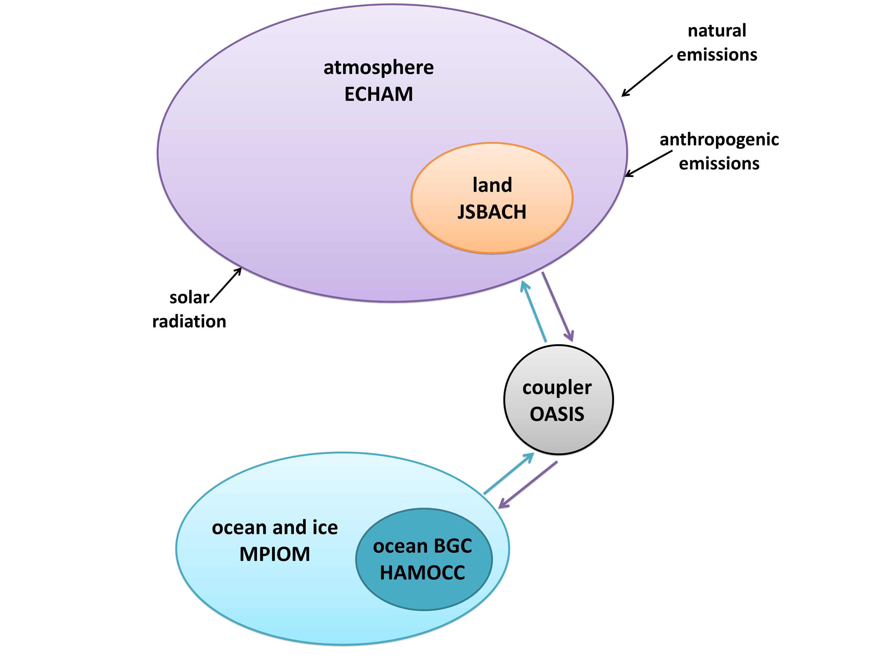
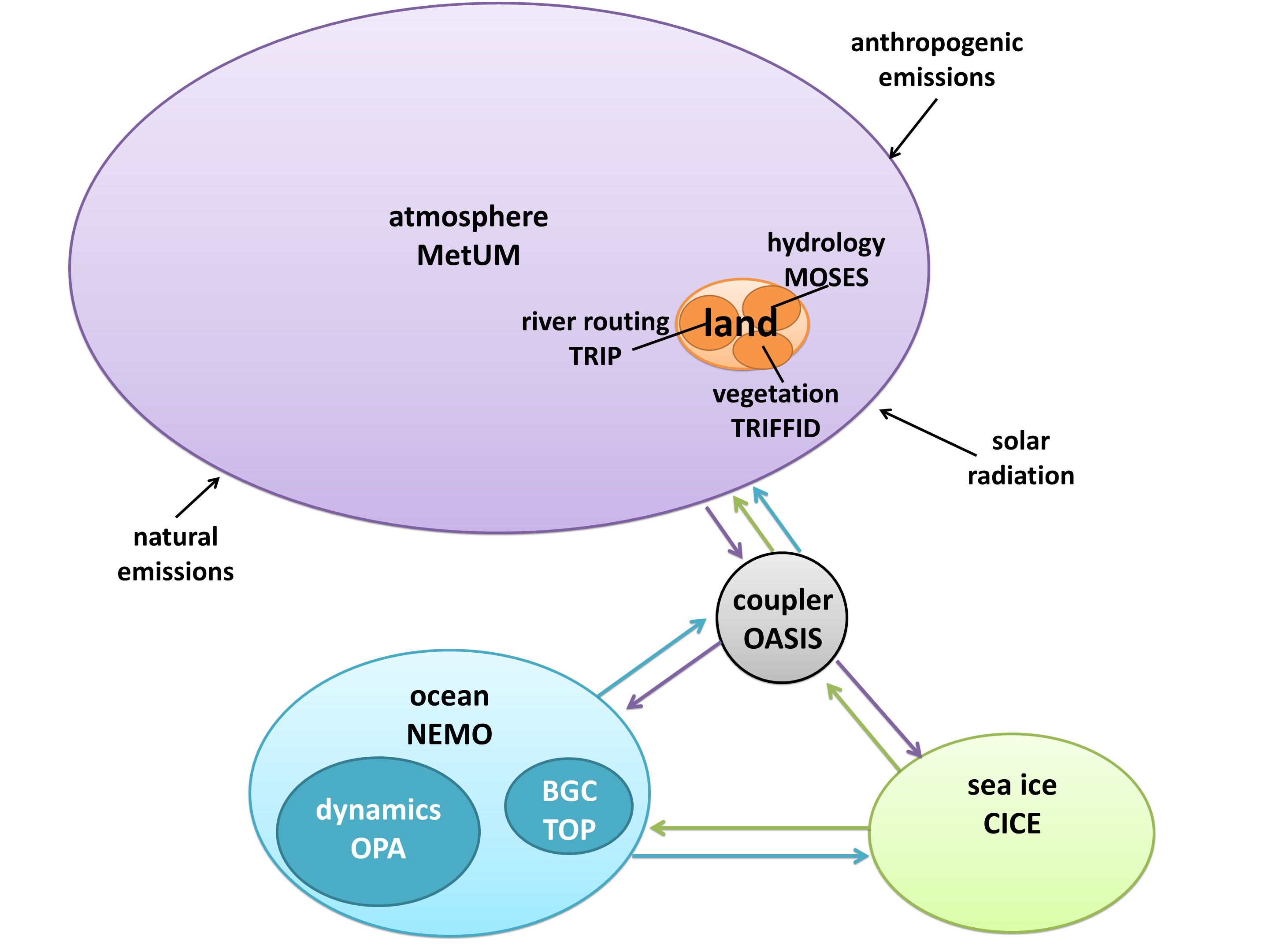
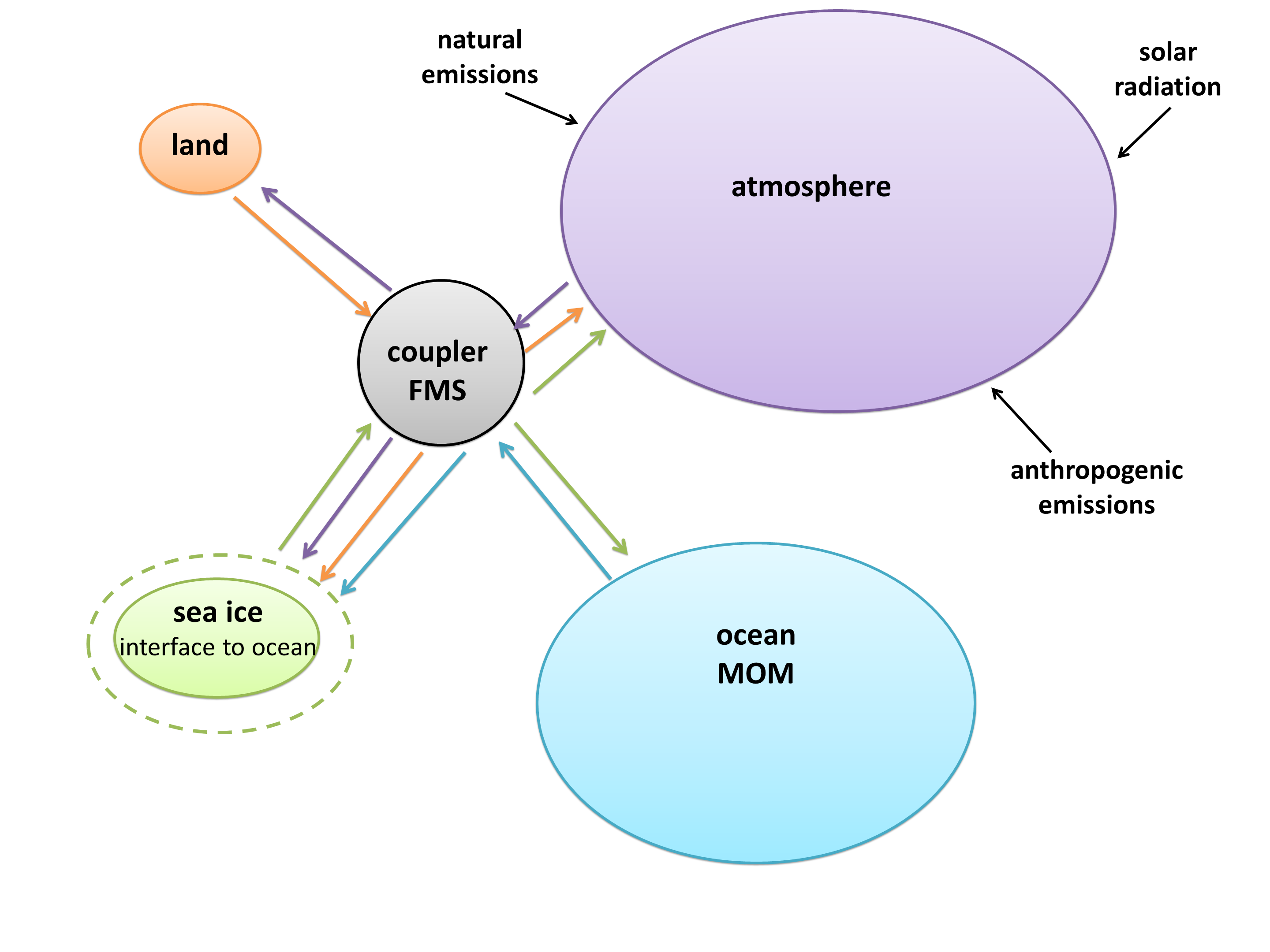
I created a diagram of each model’s architecture. The area of each bubble is roughly proportional to the lines of code in that component, which we think is a pretty good proxy for complexity – a more complex model will have more subroutines and functions than a simple one. The bubbles are to scale within each model, but not between models, as the total lines of code in a model varies by about a factor of 10. A bit difficult to fit on a poster and still make everything readable! Fluxes from each component are represented by coloured arrows (the same colour as the bubble), and often pass through the coupler before reaching another component.

We examined the amount of encapsulation of components, which varies widely between models. CESM, on one end of the spectrum, isolates every component completely, particularly in the directory structure. Model E, on the other hand, places nearly all of its files in the same directory, and has a much higher level of integration between components. This is more difficult for a user to read, but it has benefits for data transfer.

While component encapsulation is attractive from a software engineering perspective, it poses problems because the real world is not so encapsulated. Perhaps the best example of this is sea ice. It floats on the ocean, its extent changing continuously. It breaks up into separate chunks and can form slush with the seawater. How do you split up ocean code and ice code? CESM keeps the two components completely separate, with a transient boundary between them. IPSL represents ice as an encapsulated sub-component of their ocean model, NEMO (Nucleus for European Modeling of the Ocean). COSMOS integrates both ocean and ice code together in MPI-OM (Max Planck Institute Ocean Model).

GFDL took a completely different, and rather innovative, approach. Sea ice in the GFDL model is an interface, a layer over the ocean with boolean flags in each cell indicating whether or not ice is present. All fluxes to and from the ocean must pass through the “sea ice”, even if they’re at the equator and the interface is empty.

Encapsulation requires code to tie components together, since the climate system is so interconnected. Every model has a coupler, which fulfills two main functions: controlling the main time-stepping loop, and passing data between components. Some models, such as CESM, use the coupler for every interaction. However, if two components have the same grid, no interpolation is necessary, so it’s often simpler just to pass them directly. Sometimes this means a component can be completely disconnected from the coupler, such as the land model in IPSL; other times it still uses the coupler for other interactions, such as the HadGEM3 arrangement with direct ocean-ice fluxes but coupler-controlled ocean-atmosphere and ice-atmosphere fluxes.

While it’s easy to see that some models are more complex than others, it’s also interesting to look at the distribution of complexity within a model. Often the bulk of the code is concentrated in one component, due to historical software development as well as the institution’s conscious goals. Most of the models are atmosphere-centric, since they were created in the 1970s when numerical weather prediction was the focus of the Earth system modelling community. Weather models require a very complex atmosphere but not a lot else, so atmospheric routines dominated the code. Over time, other components were added, but the atmosphere remained at the heart of the models. The most extreme example is HadGEM3, which actually uses the same atmosphere model for both weather prediction and climate simulations!

The UVic model is quite different. The University of Victoria is on the west coast of Canada, and does a lot of ocean studies, so the model began as a branch of the MOM ocean model from GFDL. The developers could have coupled it to a complex atmosphere model in an effort to mimic full GCMs, but they consciously chose not to. Atmospheric routines need very short time steps, so they eat up most of the run time, and make very long simulations not feasible. In an effort to keep their model fast, UVic created EMBM (Energy Moisture Balance Model), an extremely simple atmospheric model (for example, it doesn’t include dynamic precipitation – it simply rains as soon as a certain humidity is reached). Since the ocean is the primary moderator of climate over the long run, the UVic ESCM still outputs global long-term averages that match up nicely with GCM results.

Finally, CESM and Model E could not be described as “land-centric”, but land is definitely catching up – it’s even surpassed the ocean model in both cases! These two GCMs are cutting-edge in terms of carbon cycle feedbacks, which are primarily terrestrial, and likely very important in determining how much warming we can expect in the centuries to come. They are currently poorly understood and difficult to model, so they are a new frontier for Earth system modelling. Scientists are moving away from a binary atmosphere-ocean paradigm and towards a more comprehensive climate system representation.

I presented this work to some computer scientists in the summer, and many of them asked, “Why do you need so many models? Wouldn’t it be better to just have one really good one that everyone collaborated on?” It might be simpler from a software engineering perspective, but for the purposes of science, a variety of diverse models is actually better. It means you can pick and choose which model suits your experiment. Additionally, it increases our confidence in climate model output, because if dozens of independent models are saying the same thing, they’re more likely to be accurate than if just one model made a given prediction. Diversity in model architecture arguably produces the software engineering equivalent of perturbed physics, although it’s not systematic or deliberate.

A common question people asked me at AGU was, “Which model do you think is the best?” This question is impossible to answer, because it depends on how you define “best”, which depends on what experiment you are running. Are you looking at short-term, regional impacts at a high resolution? HadGEM3 would be a good bet. Do you want to know what the world will be like in the year 5000? Go for UVic, otherwise you will run out of supercomputer time! Are you studying feedbacks, perhaps the Paleocene-Eocene Thermal Maximum? A good choice would be CESM. So you see, every model is the best at something, and no model can be the best at everything.

You might think the ideal climate model would mimic the real world perfectly. It would still have discrete grid cells and time steps, but it would be like a digital photo, where the pixels are so small that it looks continuous even when you zoom in. It would contain every single Earth system process known to science, and would represent their connections and interactions perfectly.

Such a model would also be a nightmare to use and develop. It would run slower than real time, making predictions of the future useless. The code would not be encapsulated, so organizing teams of programmers to work on certain aspects of the model would be nearly impossible. It would use more memory than computer hardware offers us – despite the speed of computers these days, they’re still too slow for many scientific models!

We need to balance complexity with feasibility. A hierarchy of complexity is important, as is a variety of models to choose from. Perfectly reproducing the system we’re trying to model actually isn’t the ultimate goal.

Please leave your questions below, and hopefully we can start a conversation – sort of a virtual poster session!