I really enjoyed reading “Global Surface Temperature Change“, by James Hansen and his team at GISS. Keep in mind that it’s still in the draft stages – they haven’t submitted to a journal yet, but they certainly plan to, and it’s a very credible team of scientists that will almost definitely get it published.
The paper is mostly about the methods of global temperature analysis. It’s more of a review paper than an account of a single experiment. However, their main discussion point was that even by using the same data, problems can be addressed in different ways. The two main problems with temperature analysis are:
- “incomplete spatial and temporal coverage” (sparse data)
- “non-climatic influences on measurement station environment” (urban heat island effect).
The authors explain the methods they use and why, and explore the impacts that different methods have on their results.
GISS measures anomalies in the temperatures, largely because they are much smoother and more consistent, geographically, than absolute temperatures. In 1987, they determined that anomalies could be safely extrapolated for a radius of 1200 km from a station and still be accurate. GISS smooths the whole map out by extrapolating everything and averaging the overlapping bits.
Extrapolating is also very useful in areas with very few stations, such as the polar regions and parts of Africa. In this map, grey indicates missing data:
The Arctic is particularly problematic, not only because its data is so sparse, but also because it has the largest anomaly of any region in the world. If you have incomplete coverage of an area that is warming so dramatically, it won’t pull its full weight in the global trend, and your result will almost certainly be too low.
This difficulty with the Arctic is the reason that GISS says 2005 is the warmest year on record, while HadCRUT, the team in England, says that 1998 is. GISS extrapolates from the stations they have, and end up getting pretty good coverage of the Arctic:
They’re assuming that areas with missing data have the same anomaly as whatever temperature stations are within 1200 km, which, as they determined in 1987, is a pretty fair assumption.
However, HadCRUT doesn’t do this extrapolating thing. When they don’t have data for an area, they just leave it out:
This might sound safer, in a way, but this method also makes an assumption. It assumes that the area has the same anomaly as the global average. And as we all know, the Arctic is warming a lot more and a lot faster than the global average. So it’s quite possible that GISS is right on this one.
Another adjustment that NASA makes is for local, anthropogenic, non-climatic effects on temperature data. The most obvious of these is the urban heat island effect. As an area becomes more urban, it gets more pavement, less vegetation, and its albedo goes down – it absorbs more heat. This often makes cities substantially warmer than the surrounding rural areas, which can obviously contaminate the temperature record. However, there are ways of eliminating urban influences from the data so we can see what the real trend is.
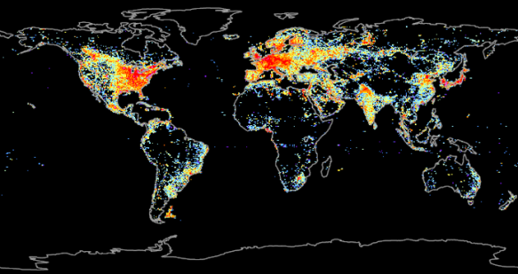
The first step is determining what stations are considered urban. The obvious way to do this is through population, but that’s actually not very accurate. Think of somewhere like Africa, where, even if there are thousands of people living in a small area, the urban influences such as concrete, absence of vegetation, or exhaust aren’t usually present. A much better indication is energy use, and a good proxy for energy use, that’s easy to measure, is lights at night-time.
So GISS put a bit of code into their analysis that singles out stations where nightlight brightness is greater than 32 µW/m2/sr/µm, and adjusts their trends to agree with rural stations within 1200 km. If there aren’t enough rural stations within that radius, they’ll just exclude the station from the analysis.
They did an even more rigorous test for this paper, to test just how much urban influences were contaminating the long-term trend, and it was pretty interesting.
There were enough stations considered “pitch-dark” at night, where they couldn’t detect any light, to run a global analysis all by themselves. The trend that came out was <0.01 °C/century smaller than GISS’s normal calculation, an amount of error that they described as “immeasurably small”.
The result of all this temperature analysis is a graph, with one new point every year, that is “eagerly awaited by some members of the public and the media”:
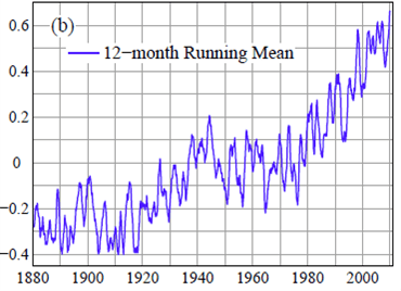
However, this graph isn’t actually as useful as this one – the 12-month running mean:
“From a climate standpoint there is nothing special about the time of year at which the calendar begins”, so instead of only measuring January-December, you can also do February-January, March-February, and so on. This way, you get a data point every month instead of every year, and more data means more accuracy. It also solves problems with short-term influences, such as El Nino, La Nina, and volcanic eruptions, that the annual graph was having. These fleeting, but fairly substantial, influences can fall completely into one calendar year or be split between two – so their influence on global temperature could be overestimated or underestimated, depending on the starting month of the calendar. The 12-month running mean is much less misleading in this fashion.
As it is, we just set a new record for the 12-month running mean, and unless La Nina really takes off, 2010 will likely set a new record for the annual graph as well. But the authors argue that we need to start moving away from the annual graph, because it isn’t as useful.
The authors also discuss public perception of climate change, and media coverage of the issue. They say, “Our comments here about communication of this climate science to the public are our opinion…[We offer it] because it seems inappropriate to ignore the vast range of claims appearing in the media and in hopes that open discussion of these matters may help people distinguish the reality of global change sooner than would otherwise be the case.”
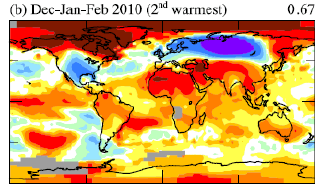
They make the very good point that “Lay people’s perception tends to be strongly influenced by the latest local fluctuation”, and use this winter as a case study, where a strongly negative Arctic Oscillation index caused significantly cooler-than-normal conditions across the United States and Europe. Consequently, a lot of people, especially in the US, began to doubt the reality of global warming – even though, in the world as a whole, it was the second warmest winter on record:
The authors also talk about data sharing. GISS likes to make everything freely available to the public – temperature station data, computer code, everything. However, putting it out there immediately, so that anyone can help check for flaws, has “a practical disadvantage: it allows any data flaws to be interpreted and misrepresented as machinations.” Multiple times in the past few years, when there have been minor errors that didn’t actually change anything, GISS was widely accused of making these mistakes deliberately, to “intentionally exaggerate the magnitude of global warming”. They realized this wasn’t working, so they changed their system: Before releasing the data to everyone, they first put it up on a private site so that only select scientists can examine it for flaws. And, of course, this “has resulted in the criticism that GISS now “hides” their data”.
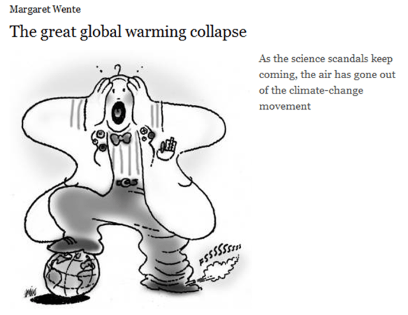
Personally, I find the range and prevalence of these accusations against scientists absolutely terrifying. Look at what has become mainstream:
Scientific fraud is a very serious allegation, and it’s one thing for citizens to make it without evidence, but it’s another thing altogether for the media to repeat such claims without first investigating their validity:
I have been disgusted by the media coverage of climate science, especially over the past year, especially in the United States, and I worry what this will mean for our ability to solve the problem.
However, there is still fantastic science going on that is absolutely fascinating and essential to our understanding of global climate change. This paper was a very interesting read, and it helped me to better understand a lot of aspects of global temperature analysis.


