
I haven’t forgotten about this project! Read the introduction and ODE derivation if you haven’t already.
Last time I derived the following ODE for temperature T at time t:
where S and τ are constants, and F(t) is the net radiative forcing at time t. Eventually I will discuss each of these terms in detail; this post will focus on S.
At equilibrium, when dT/dt = 0, the ODE necessitates T(t) = S F(t). A physical interpretation for S becomes apparent: it measures the equilibrium change in temperature per unit forcing, also known as climate sensitivity.
A great deal of research has been conducted with the aim of quantifying climate sensitivity, through paleoclimate analyses, modelling experiments, and instrumental data. Overall, these assessments show that climate sensitivity is on the order of 3 K per doubling of CO2 (divide by 5.35 ln 2 W/m2 to convert to warming per unit forcing).
The IPCC AR4 report (note that AR5 was not yet published at the time of my calculations) compared many different probability distribution functions (PDFs) of climate sensitivity, shown below. They follow the same general shape of a shifted distribution with a long tail to the right, and average 5-95% confidence intervals of around 1.5 to 7 K per doubling of CO2.

Box 10.2, Figure 1 of the IPCC AR4 WG1: Probability distribution functions of climate sensitivity (a), 5-95% confidence intervals (b).
These PDFs generally consist of discrete data points that are not publicly available. Consequently, sampling from any existing PDF would be difficult. Instead, I chose to create my own PDF of climate sensitivity, modelled as a log-normal distribution (e raised to the power of a normal distribution) with the same shape and bounds as the existing datasets.
The challenge was to find values for μ and σ, the mean and standard deviation of the corresponding normal distribution, such that for any z sampled from the log-normal distribution,


Since erf, the error function, cannot be evaluated analytically, this two-parameter problem must be solved numerically. I built a simple particle swarm optimizer to find the solution, which consistently yielded results of μ = 1.1757, σ = 0.4683.
The upper tail of a log-normal distribution is unbounded, so I truncated the distribution at 10 K, consistent with existing PDFs (see figure above). At the beginning of each simulation, climate sensitivity in my model is sampled from this distribution and held fixed for the entire run. A histogram of 106 sampled points, shown below, has the desired characteristics.
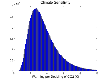
Histogram of 106 points sampled from the log-normal distribution used for climate sensitivity in the model.
Note that in order to be used in the ODE, the sampled points must then be converted to units of Km2/W (warming per unit forcing) by dividing by 5.35 ln 2 W/m2, the forcing from doubled CO2.


