How does the Weddell Polynya affect Antarctic ice shelves?

The Weddell Polynya is a large hole in the sea ice of the Weddell Sea, near Antarctica. It occurs only very rarely in observations, but is extremely common in ocean models, many of which simulate a near-permanent polynya. My new paper published today in Journal of Climate finds that the Weddell Polynya increases melting beneath the nearby Filchner-Ronne Ice Shelf. This means it’s important to fix the polynya problems in ocean models, if we want to use them to study ice shelves.

The Southern Ocean surrounding Antarctica is cold at the surface – often so cold that it freezes to form sea ice – but warmer below. The deep ocean is about 1°C, which might not sound warm to you, but to Antarctic oceanographers this is positively balmy. If regions of the Southern Ocean start to convect, with strong top-to-bottom mixing, the warm deep water will come to the surface and melt the sea ice.

In observations, this doesn’t happen very often, and it only seems to happen in one region: the Weddell Sea, in the Atlantic sector of the Southern Ocean. Satellites spotted a large polynya (about the size of the UK) for three winters in a row, from 1974-1976. But then the Weddell Polynya disappeared until 2017, when a much smaller polynya (about a tenth of the size) showed up for a few months in the spring. We haven’t seen it since.

holland_polynya_1975

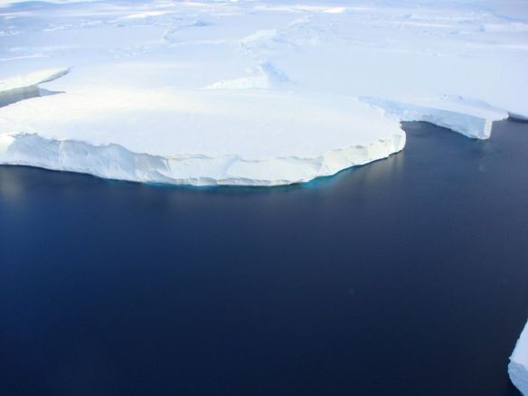
The Weddell Polynya in the winter of 1975. (Holland et al., 2001)

nsidc_polynya_2017

The Weddell Polynya in the spring of 2017. (NSIDC)

By contrast, models of the Southern Ocean simulate Weddell Polynyas very enthusiastically. In many ocean models, it’s a near-permanent feature of the Weddell Sea, and is often much larger than the observed polynya from the 1970s. This can happen very easily if the model’s surface waters are slightly too salty, which makes them dense enough to sink, triggering top-to-bottom convection. We also think it might have something to do with imperfect vertical mixing schemes.

It’s a rite of passage for Southern Ocean modellers that sooner or later you will work with a model that forms massive polynyas, all the time, and you can’t make them go away. I spent months and months on this during my PhD, and eventually I gave up and did “surface salinity restoring” to prevent the salty bias from forming. Basically, I killed it with freshwater. If you throw enough freshwater at this problem, the problem will go away.

So when the little Weddell Polynya of 2017 showed up, I was paying attention. And when the worldwide oceanography community jumped on the idea and started publishing lots of papers about the Weddell Polynya, I was paying attention. But soon I noticed that there was an important question nobody was trying to answer: what does the Weddell Polynya mean for Antarctic ice shelves?

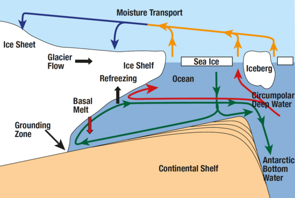
Ice shelves are the floating edges of the Antarctic Ice Sheet. They’re in direct contact with the ocean, and they slow down the flow of the glaciers behind them. Ice shelves are what stand between us and massive sea level rise, so we should give them our respect. But ocean modellers have largely neglected them until now, because ice shelf cavities – the pockets of ocean between the ice shelf and the seafloor – are quite difficult to model. This is changing as supercomputers improve and high resolution becomes more affordable. More and more ocean models are adding ice shelf cavities to their simulations, and calculating melt rates at the ice-ocean interface. So if it turns out that the Weddell Polynya contaminates these ice shelf cavities, it would be even more important to fix the models’ polynya biases. It would also be interesting from an observational perspective, especially if the polynya shows up again soon.

At the time I started wondering about the Weddell Polynya and ice shelves, I was conveniently already setting up a new model of the Weddell Sea, which includes ice shelves. This model doesn’t produce Weddell Polynyas spontaneously, and for that I am eternally grateful. But I found a way to create “idealised” polynyas in the model, by choosing particular regions and forcing the model to convect there, whether or not it wanted to. This way I had control over where the polynyas occurred, how large they were, and how long they stayed open. I could run simulations with polynyas, compare them to a simulation with no polynyas, and see how the ice shelf cavities were affected.

I found that Weddell Polynyas do increase melt rates beneath nearby ice shelves. This happens because the polynyas cause density changes in the ocean, which allows more warm, salty deep water to flow onto the Antarctic continental shelf. The melt rates increase the larger the polynya gets, and the longer it stays open. This is bad news for Southern Ocean models with massive, permanent polynyas.

First I looked at the Filchner-Ronne Ice Shelf (FRIS), the second-largest ice shelf in Antarctica, and the focus of my Weddell Sea research these days. On the continental shelf in front of FRIS, the sea ice formation is so strong that the warm signal from the Weddell Polynya gets wiped out. The water ends up at the surface freezing point anyway, and the extra heat is lost to the atmosphere. But the salty signal is still there, and these salinity changes cause the ocean currents beneath FRIS to speed up. Stronger circulation means stronger ice shelf melting, in this case by up to 30% for the largest Weddell Polynyas.

For smaller ice shelves in the Eastern Weddell Sea, the nearby sea ice formation is weaker. So both the warm signal and the salty signal from the Weddell Polynya are preserved, and the ice shelf cavities are flooded with warmer, saltier water. Melting beneath these ice shelves increases by up to 80%.

The modelled changes are smaller for Weddell Polynyas which match observations, in terms of size as well as duration. So if the Weddell Polynya of the 1970s affected the FRIS cavity, it probably wasn’t by very much. And the effect of the little 2017 polynya was probably so small that we’ll never detect it.

However, these results should send a message to Southern Ocean modellers: you really need to fix your polynya problem if you want to model ice shelf cavities. I’m sorry.

Future projections of Antarctic ice shelf melting

Climate change will increase ice shelf melt rates around Antarctica. That’s the not-very-surprising conclusion of my latest modelling study, done in collaboration with both Australian and German researchers, which was just published in Journal of Climate. Here’s the less intuitive result: much of the projected increase in melt rates is actually linked to a decrease in sea ice formation.

That’s a lot of different kinds of ice, so let’s back up a bit. Sea ice is just frozen seawater. But ice shelves (as well as ice sheets and icebergs) are originally formed of snow. Snow falls on the Antarctic continent, and over many years compacts into a system of interconnected glaciers that we call an ice sheet. These glaciers flow downhill towards the coast. If they hit the coast and keep going, floating on the ocean surface, the floating bits are called ice shelves. Sometimes the edges of ice shelves will break off and form icebergs, but they don’t really come into this story.

Climate models don’t typically include ice sheets, or ice shelves, or icebergs. This is one reason why projections of sea level rise are so uncertain. But some standalone ocean models do include ice shelves. At least, they include the little pockets of ocean beneath the ice shelves – we call them ice shelf cavities – and can simulate the melting and refreezing that happens on the ice shelf base.

We took one of these ocean/ice-shelf models and forced it with the atmospheric output of regular climate models, which periodically make projections of climate change from now until the end of the century. We completed four different simulations, consisting of two different greenhouse gas emissions scenarios (“Representative Concentration Pathways” or RCPs) and two different choices of climate model (“ACCESS 1.0”, or “MMM” for the multi-model mean). Each simulation required 896 processors on the supercomputer in Canberra. By comparison, your laptop or desktop computer probably has about 4 processors. These are pretty sizable models!

In every simulation, and in every region of Antarctica, ice shelf melting increased over the 21st century. The total increase ranged from 41% to 129% depending on the scenario. The largest increases occurred in the Amundsen Sea region, marked with red circles in the maps below, which happens to be the region exhibiting the most severe melting in recent observations. In the most extreme scenario, ice shelf melting in this region nearly quadrupled.

Percent change in ice shelf melting, caused by the ocean, during the four future projections. The values are shown for all of Antarctica (written on the centre of the continent) as well as split up into eight sectors (colour-coded, written inside the circles). Figure 3 of Naughten et al., 2018, © American Meteorological Society.

So what processes were causing this melting? This is where the sea ice comes in. When sea ice forms, it spits out most of the salt from the seawater (brine rejection), leaving the remaining water saltier than before. Salty water is denser than fresh water, so it sinks. This drives a lot of vertical mixing, and the heat from warmer, deeper water is lost to the atmosphere. The ocean surrounding Antarctica is unusual in that the deep water is generally warmer than the surface water. We call this warm, deep water Circumpolar Deep Water, and it’s currently the biggest threat to the Antarctic Ice Sheet. (I say “warm” – it’s only about 1°C, so you wouldn’t want to go swimming in it, but it’s plenty warm enough to melt ice.)

In our simulations, warming winters caused a decrease in sea ice formation. So there was less brine rejection, causing fresher surface waters, causing less vertical mixing, and the warmth of Circumpolar Deep Water was no longer lost to the atmosphere. As a result, ocean temperatures near the bottom of the Amundsen Sea increased. This better-preserved Circumpolar Deep Water found its way into ice shelf cavities, causing large increases in melting.

Slices through the Amundsen Sea – you’re looking at the ocean sideways, like a slice of birthday cake, so you can see the vertical structure. Temperature is shown on the top row (blue is cold, red is warm); salinity is shown on the bottom row (blue is fresh, red is salty). Conditions at the beginning of the simulation are shown in the left 2 panels, and conditions at the end of the simulation are shown in the right 2 panels. At the beginning of the simulation, notice how the warm, salty Circumpolar Deep Water rises onto the continental shelf from the north (right side of each panel), but it gets cooler and fresher as it travels south (towards the left) due to vertical mixing. At the end of the simulation, the surface water has freshened and the vertical mixing has weakened, so the warmth of the Circumpolar Deep Water is preserved. Figure 8 of Naughten et al., 2018, © American Meteorological Society.

This link between weakened sea ice formation and increased ice shelf melting has troubling implications for sea level rise. The next step is to simulate the sea level rise itself, which requires some model development. Ocean models like the one we used for this study have to assume that ice shelf geometry stays constant, so no matter how much ice shelf melting the model simulates, the ice shelves aren’t allowed to thin or collapse. Basically, this design assumes that any ocean-driven melting is exactly compensated by the flow of the upstream glacier such that ice shelf geometry remains constant.

Of course this is not a good assumption, because we’re observing ice shelves thinning all over the place, and a few have even collapsed. But removing this assumption would necessitate coupling with an ice sheet model, which presents major engineering challenges. We’re working on it – at least ten different research groups around the world – and over the next few years, fully coupled ice-sheet/ocean models should be ready to use for the most reliable sea level rise projections yet.

A modified version of this post appeared on the EGU Cryospheric Sciences Blog.

The Most Terrifying Papers I Read Last Year

An ice sheet forms when snow falls on land, compacts into ice, and forms a system of interconnected glaciers which gradually flow downhill like play-dough. In Antarctica, it is so cold that the ice flows right into the ocean before it melts, sometimes hundreds of kilometres from the coast. These giant slabs of ice, floating on the ocean while still attached to the continent, are called ice shelves.

For an ice sheet to have constant size, the mass of ice added from snowfall must equal the mass lost due to melting and calving (when icebergs break off). Since this ice loss mainly occurs at the edges, the rate of ice loss will depend on how fast glaciers can flow towards the edges.

Ice shelves slow down this flow. They hold back the glaciers behind them in what is known as the “buttressing effect”. If the ice shelves were smaller, the glaciers would flow much faster towards the ocean, melting and calving more ice than snowfall inland could replace. This situation is called a “negative mass balance”, which leads directly to global sea level rise.

Photo by Tas van Ommen

Respect the ice shelves. They are holding back disaster.

Ice shelves are perhaps the most important part of the Antarctic ice sheet for its overall stability. Unfortunately, they are also the part of the ice sheet most at risk. This is because they are the only bits touching the ocean. And the Antarctic ice sheet is not directly threatened by a warming atmosphere – it is threatened by a warming ocean.

The atmosphere would have to warm outrageously in order to melt the Antarctic ice sheet from the top down. Snowfall tends to be heaviest when temperatures are just below 0°C, but temperatures at the South Pole rarely go above -20°C, even in the summer. So atmospheric warming will likely lead to a slight increase in snowfall over Antarctica, adding to the mass of the ice sheet. Unfortunately, the ocean is warming at the same time. And a slightly warmer ocean will be very good at melting Antarctica from the bottom up.

This is partly because ice melts faster in water than it does in air, even if the air and the water are the same temperature. But the ocean-induced melting will be exacerbated by some unlucky topography: over 40% of the Antarctic ice sheet (by area) rests on bedrock that is below sea level.

bedmap2

Elevation of the bedrock underlying Antarctica. All of the blue regions are below sea level. (Figure 9 of Fretwell et al.)

This means that ocean water can melt its way in and get right under the ice, and gravity won’t stop it. The grounding lines, where the ice sheet detaches from the bedrock and floats on the ocean as an ice shelf, will retreat. Essentially, a warming ocean will turn more of the Antarctic ice sheet into ice shelves, which the ocean will then melt from the bottom up.

This situation is especially risky on a retrograde bed, where bedrock gets deeper below sea level as you go inland – like a giant, gently sloping bowl. Retrograde beds occur because of isostatic loading (the weight of an ice sheet pushes the crust down, making the tectonic plate sit lower in the mantle) as well as glacial erosion (the ice sheet scrapes away the surface bedrock over time). Ice sheets resting on retrograde beds are inherently unstable, because once the grounding lines reach the edge of the “bowl”, they will eventually retreat all the way to the bottom of the “bowl” even if the ocean water intruding beneath the ice doesn’t get any warmer. This instability occurs because the melting point temperature of water decreases as you go deeper in the ocean, where pressures are higher. In other words, the deeper the ice is in the ocean, the easier it is to melt it. Equivalently, the deeper a grounding line is in the ocean, the easier it is to make it retreat. In a retrograde bed, retreating grounding lines get deeper, so they retreat more easily, which makes them even deeper, and they retreat even more easily, and this goes on and on even if the ocean stops warming.

retrograde_bed

Diagram of an ice shelf on a retrograde bed (“Continental shelf”)

Which brings us to Terrifying Paper #1, by Rignot et al. A decent chunk of West Antarctica, called the Amundsen Sea Sector, is melting particularly quickly. The grounding lines of ice shelves in this region have been rapidly retreating (several kilometres per year), as this paper shows using satellite data. Unfortunately, the Amundsen Sea Sector sits on a retrograde bed, and the grounding lines have now gone past the edge of it. This retrograde bed is so huge that the amount of ice sheet it underpins would cause 1.2 metres of global sea level rise. We’re now committed to losing that ice eventually, even if the ocean stopped warming tomorrow. “Upstream of the 2011 grounding line positions,” Rignot et al., write, “we find no major bed obstacle that would prevent the glaciers from further retreat and draw down the entire basin.”

They look at each source glacier in turn, and it’s pretty bleak:

  • Pine Island Glacier: “A region where the bed elevation is smoothly decreasing inland, with no major hill to prevent further retreat.”
  • Smith/Kohler Glaciers: “Favorable to more vigorous ice shelf melt even if the ocean temperature does not change with time.”
  • Thwaites Glacier: “Everywhere along the grounding line, the retreat proceeds along clear pathways of retrograde bed.”

Only one small glacier, Haynes Glacier, is not necessarily doomed, since there are mountains in the way that cut off the retrograde bed.

From satellite data, you can already see the ice sheet speeding up its flow towards the coast, due to the loss of buttressing as the ice shelves thin: “Ice flow changes are detected hundreds of kilometers inland, to the flanks of the topographic divides, demonstrating that coastal perturbations are felt far inland and propagate rapidly.”

It will probably take a few centuries for the Amundsen Sector to fully disintegrate. But that 1.2 metres of global sea level rise is coming eventually, on top of what we’ve already seen from other glaciers and thermal expansion, and there’s nothing we can do to stop it (short of geoengineering). We’re going to lose a lot of coastal cities because of this glacier system alone.

Terrifying Paper #2, by Mengel & Levermann, examines the Wilkes Basin Sector of East Antarctica. This region contains enough ice to raise global sea level by 3 to 4 metres. Unlike the Amundsen Sector, we aren’t yet committed to losing this ice, but it wouldn’t be too hard to reach that point. The Wilkes Basin glaciers rest on a system of deep troughs in the bedrock. The troughs are currently full of ice, but if seawater got in there, it would melt all the way along the troughs without needing any further ocean warming – like a very bad retrograde bed situation. The entire Wilkes Basin would change from ice sheet to ice shelf, bringing along that 3-4 metres of global sea level rise.

It turns out that the only thing stopping seawater getting in the troughs is a very small bit of ice, equivalent to only 8 centimetres of global sea level rise, which Mengel & Levermann nickname the “ice plug”. As long as the ice plug is there, this sector of the ice sheet is stable; but take the ice plug away, and the whole thing will eventually fall apart even if the ocean stops warming. Simulations from an ice sheet model suggest it would take at least 200 years of increased ocean temperature to melt this ice plug, depending on how much warmer the ocean got. 200 years sounds like a long time for us to find a solution to climate change, but it actually takes much longer than that for the ocean to cool back down after it’s been warmed up.

This might sound like all bad news. And you’re right, it is. But it can always get worse. That means we can always stop it from getting worse. That’s not necessarily good news, but at least it’s empowering. The sea level rise we’re already committed to, whether it’s 1 or 2 or 5 metres, will be awful. But it’s much better than 58 metres, which is what we would get if the entire Antarctic ice sheet melted. Climate change is not an all-or-nothing situation; it falls on a spectrum. We will have to deal with some amount of climate change no matter what. The question of “how much” is for us to decide.

With a Little Help from the Elephant Seals

A problem which has plagued oceanography since the very beginning is a lack of observations. We envy atmospheric scientists with their surface stations and satellite data that monitor virtually the entire atmosphere in real time. Until very recently, all that oceanographers had to work with were measurements taken by ships. This data was very sparse in space and time, and was biased towards certain ship tracks and seasons.

A lack of observations makes life difficult for ocean modellers, because there is very little to compare the simulations to. You can’t have confidence in a model if you have no way of knowing how well it’s performing, and you can’t make many improvements to a model without an understanding of its shortcomings.

Our knowledge of the ocean took a giant leap forward in 2000, when a program called Argo began. “Argo floats” are smallish instruments floating around in the ocean that control their own buoyancy, rising and sinking between the surface and about 2000 m depth. They use a CTD sensor to measure Conductivity (from which you can easily calculate salinity), Temperature, and Depth. Every 10 days they surface and send these measurements to a satellite. Argo floats are battery-powered and last for about 4 years before losing power. After this point they are sacrificed to the ocean, because collecting them would be too expensive.

This is what an Argo float looks like while it’s being deployed:

With at least 27 countries helping with deployment, the number of active Argo floats is steadily rising. At the time of this writing, there were 3748 in operation, with good coverage everywhere except in the polar oceans:

The result of this program is a massive amount of high-quality, high-resolution data for temperature and salinity in the surface and intermediate ocean. A resource like this is invaluable for oceanographers, analogous to the global network of weather stations used by atmospheric scientists. It allows us to better understand the current state of the ocean, to monitor trends in temperature and salinity as climate change continues, and to assess the skill of ocean models.

But it’s still not good enough. There are two major shortcomings to Argo floats. First, they can’t withstand the extreme pressure in the deep ocean, so they don’t sink below about 2000 m depth. Since the average depth of the world’s oceans is around 4000 m, the Argo program is only sampling the upper half. Fortunately, a new program called Deep Argo has developed floats which can withstand pressures down to 6000 m depth, covering all but the deepest ocean trenches. Last June, two prototypes were successfully deployed off the coast of New Zealand, and the data collected so far is looking good. If all future Argo floats were of the Deep Argo variety, in five or ten years we would know as much about the deep ocean’s temperature and salinity structure as we currently know about the surface. To oceanographers, particularly those studying bottom water formation and transport, there is almost nothing more exciting than this prospect.

The other major problem with Argo floats is that they can’t handle sea ice. Even if they manage to get underneath the ice by drifting in sideways, the next time they rise to the surface they will bash into the underside of the ice, get stuck, and stay there until their battery dies. This is a major problem for scientists like me who study the Southern Ocean (surrounding Antarctica), which is largely covered with sea ice for much of the year. This ocean will be incredibly important for sea level rise, because the easiest way to destabilise the Antarctic Ice Sheet is to warm up the ocean and melt the ice shelves (the edges of the ice sheet which extend over the ocean) from below. But we can’t monitor this process using Argo data, because there is a big gap in observations over the region. There’s always the manual option – sending in scientists to take measurements – but this is very expensive, and nobody wants to go there in the winter.

Instead, oceanographers have recently teamed up with biologists to try another method of data collection, which is just really excellent:

They are turning seals into Argo floats that can navigate sea ice.

Southern elephant seals swim incredible distances in the Southern Ocean, and often dive as far as 2000 m below the surface. Scientists are utilising the seals’ natural talents to fill in the gaps in the Argo network, so far with great success. Each seal is tranquilized while a miniature CTD is glued to the fur on its head, after which it is released back into the wild. As the seal swims around, the sensors take measurements and communicate with satellites just like regular Argo floats. The next time the seal sheds its coat (once per year), the CTD falls off and the seal gets on with its life, probably wondering what that whole thing was about.

This project is relatively new and it will be a few years before it’s possible to identify trends in the data. It’s also not clear whether or not the seals tend to swim right underneath the ice shelves, where observations would be most useful. But if this dataset gains popularity among oceanographers, and seals become officially integrated into the Argo network…

…then we will be the coolest scientists of all.

Modelling the Apocalypse

Let’s all put on our science-fiction hats and imagine that humans get wiped off the face of the Earth tomorrow. Perhaps a mysterious superbug kills us all overnight, or maybe we organize a mass migration to live on the moon. In a matter of a day, we’re gone without a trace.

If your first response to this scenario is “What would happen to the climate now that fossil fuel burning has stopped?” then you may be afflicted with Climate Science. (I find myself reacting like this all the time now. I can’t watch The Lord of the Rings without imagining how one would model the climate of Middle Earth.)

A handful of researchers, particularly in Canada, recently became so interested in this question that they started modelling it. Their motive was more than just morbid fascination – in fact, the global temperature change that occurs in such a scenario is a very useful metric. It represents the amount of warming that we’ve already guaranteed, and a lower bound for the amount of warming we can expect.

Initial results were hopeful. Damon Matthews and Andrew Weaver ran the experiment on the UVic ESCM and published the results. In their simulations, global average temperature stabilized almost immediately after CO2 emissions dropped to zero, and stayed approximately constant for centuries. The climate didn’t recover from the changes we inflicted, but at least it didn’t get any worse. The “zero-emissions commitment” was more or less nothing. See the dark blue line in the graph below:

However, this experiment didn’t take anthropogenic impacts other than CO2 into account. In particular, the impacts of sulfate aerosols and additional (non-CO2) greenhouse gases currently cancel out, so it was assumed that they would keep cancelling and could therefore be ignored.

But is this a safe assumption? Sulfate aerosols have a very short atmospheric lifetime – as soon as it rains, they wash right out. Non-CO2 greenhouse gases last much longer (although, in most cases, not as long as CO2). Consequently, you would expect a transition period in which the cooling influence of aerosols had disappeared but the warming influence of additional greenhouse gases was still present. The two forcings would no longer cancel, and the net effect would be one of warming.

Damon Matthews recently repeated his experiment, this time with Kirsten Zickfeld, and took aerosols and additional greenhouse gases into account. The long-term picture was still the same – global temperature remaining at present-day levels for centuries – but the short-term response was different. For about the first decade after human influences disappeared, the temperature rose very quickly (as aerosols were eliminated from the atmosphere) but then dropped back down (as additional greenhouse gases were eliminated). This transition period wouldn’t be fun, but at least it would be short. See the light blue line in the graph below:

We’re still making an implicit assumption, though. By looking at the graphs of constant global average temperature and saying “Look, the problem doesn’t get any worse!”, we’re assuming that regional temperatures are also constant for every area on the planet. In fact, half of the world could be warming rapidly and the other half could be cooling rapidly, a bad scenario indeed. From a single global metric, you can’t just tell.

A team of researchers led by Nathan Gillett recently modelled regional changes to a sudden cessation of CO2 emissions (other gases were ignored). They used a more complex climate model from Environment Canada, which is better for regional projections than the UVic ESCM.

The results were disturbing: even though the average global temperature stayed basically constant after CO2 emissions (following the A2 scenario) disappeared in 2100, regional temperatures continued to change. Most of the world cooled slightly, but Antarctica and the surrounding ocean warmed significantly. By the year 3000, the coasts of Antarctica were 9°C above preindustrial temperatures. This might easily be enough for the West Antarctic Ice Sheet to collapse.

Why didn’t this continued warming happen in the Arctic? Remember that the Arctic is an ocean surrounded by land, and temperatures over land change relatively quickly in response to a radiative forcing. Furthermore, the Arctic Ocean is small enough that it’s heavily influenced by temperatures on the land around it. In this simulation, the Arctic sea ice actually recovered.

On the other hand, Antarctica is land surrounded by a large ocean that mixes heat particularly well. As a result, it has an extraordinarily high heat capacity, and takes a very long time to fully respond to changes in temperature. So, even by the year 3000, it was still reacting to the radiative forcing of the 21st century. The warming ocean surrounded the land and caused it to warm as well.

As a result of the cooling Arctic and warming Antarctic, the Intertropical Convergence Zone (an important wind current) shifted southward in the simulation. As a result, precipitation over North Africa continued to decrease – a situation that was already bad by 2100. Counterintuitively, even though global warming had ceased, some of the impacts of warming continued to worsen.

These experiments, assuming an overnight apocalypse, are purely hypothetical. By definition, we’ll never be able to test their accuracy in the real world. However, as a lower bound for the expected impacts of our actions, the results are sobering.

Who are the Skeptics?

Part 3 in a series of 5 for NextGen Journal
Adapted from part of an earlier post

As we discussed last time, there is a remarkable level of scientific consensus on the reality and severity of human-caused global warming. However, most members of the public are unaware of this consensus – a topic which we will focus on in the next installment. Anyone with an Internet connection or a newspaper subscription will be able to tell you that many scientists think global warming is natural or nonexistent. As we know, these scientists are in the vast minority, but they have enjoyed widespread media coverage. Let’s look at three of the most prominent skeptics, and examine what they’re saying.

S. Fred Singer is an atmospheric physicist and retired environmental science professor. He has rarely published in scientific journals since the 1960s, but he is very visible in the media. In recent years, he has claimed that the Earth has been cooling since 1998 (in 2006), that the Earth is warming, but it is natural and unstoppable (in 2007), and that the warming is artificial and due to the urban heat island effect (in 2009).

Richard Lindzen, also an atmospheric physicist, is far more active in the scientific community than Singer. However, most of his publications, including the prestigious IPCC report to which he contributed, conclude that climate change is real and caused by humans. He has published two papers stating that climate change is not serious: a 2001 paper hypothesizing that clouds would provide a negative feedback to cancel out global warming, and a 2009 paper claiming that climate sensitivity (the amount of warming caused by a doubling of carbon dioxide) was very low. Both of these ideas were rebutted by the academic community, and Lindzen’s methodology criticized. Lindzen has even publicly retracted his 2001 cloud claim. Therefore, in his academic life, Lindzen appears to be a mainstream climate scientist – contributing to assessment reports, abandoning theories that are disproved, and publishing work that affirms the theory of anthropogenic climate change. However, when Lindzen talks to the media, his statements change. He has implied that the world is not warming by calling attention to the lack of warming in the Antarctic (in 2004) and the thickening of some parts of the Greenland ice sheet (in 2006), without explaining that both of these apparent contradictions are well understood by scientists and in no way disprove warming. He has also claimed that the observed warming is minimal and natural (in 2006).

Finally, Patrick Michaels is an ecological climatologist who occasionally publishes peer-reviewed studies, but none that support his more outlandish claims. In 2009 alone, Michaels said that the observed warming is below what computer models predicted, that natural variations in oceanic cycles such as El Niño explain most of the warming, and that human activity explains most of the warming but it’s nothing to worry about because technology will save us (cached copy, as the original was taken down).

While examining these arguments from skeptical scientists, something quickly becomes apparent: many of the arguments are contradictory. For example, how can the world be cooling if it is also warming naturally? Not only do the skeptics as a group seem unable to agree on a consistent explanation, some of the individuals either change their mind every year or believe two contradictory theories at the same time. Additionally, none of these arguments are supported by the peer-reviewed literature. They are all elementary misconceptions which were proven erroneous long ago. Multiple articles on this site could be devoted to rebutting such claims, but easy-to-read rebuttals for virtually every objection to human-caused climate change are already available on Skeptical Science. Here is a list of rebuttals relevant to the claims of Singer, Lindzen and Michaels:

With a little bit of research, the claims of these skeptics quickly fall apart. It does not seem possible that they are attempting to further our knowledge of science, as their arguments are so weak and inconsistent, and rarely published in scientific venues. However, their pattern of arguments does work as a media strategy, as most people will trust what a scientist says in the newspaper, and not research his reputation or remember his name. Over time, the public will start to remember dozens of so-called problems with the anthropogenic climate change theory.