A Bad Situation in the Arctic

Arctic sea ice is in the midst of a record-breaking melt season. This is yet another symptom of human-caused climate change progressing much faster than scientists anticipated.

Every year, the frozen surface of the Arctic Ocean waxes and wanes, covering the largest area in February or March and the smallest in September. Over the past few decades, these September minima have been getting smaller and smaller. The lowest sea ice extent on record occurred in 2007, followed closely by 2011, 2008, 2010, and 2009. That is, the five lowest years on record all happened in the past five years. While year-to-year weather conditions, like summer storms, impact the variability of Arctic sea ice cover, the undeniable downward trend can only be explained by human-caused climate change.

The 2012 melt season started off hopefully, with April sea ice extent near the 1979-2000 average. Then things took a turn for the worse, and sea ice was at record or near-record low conditions for most of the summer. In early August, a storm spread out the remaining ice, exacerbating the melt. Currently, sea ice is significantly below the previous record for this time of year. See the light blue line in the figure below:

The 2012 minimum is already the fifth-lowest on record for any day of the year – and the worst part is, it will keep melting for about another month. At this rate, it’s looking pretty likely that we’ll break the 2007 record and hit an all-time low in September. Sea ice volume, rather than extent, is in the same situation.

Computer models of the climate system have a difficult time reproducing this sudden melt. As recently as 2007, the absolute worst-case projections showed summer Arctic sea ice disappearing around 2100. Based on observations, scientists are now confident that will happen well before 2050, and possibly within a decade. Climate models, which many pundits like to dismiss as “alarmist,” actually underestimated the severity of the problem. Uncertainty cuts both ways.

The impacts of an ice-free Arctic Ocean will be wide-ranging and severe. Luckily, melting sea ice does not contribute to sea level rise (only landlocked ice does, such as the Greenland and Antarctic ice sheets), but many other problems remain. The Inuit peoples of the north, who depend on sea ice for hunting, will lose an essential source of food and culture. Geopolitical tensions regarding ownership of the newly-accessible Arctic waters are likely. Changes to the Arctic food web, from blooming phytoplankton to dwindling polar bears, will irreversibly alter the ecosystem. While scientists don’t know exactly what this new Arctic will look like, it is certain to involve a great deal of disruption and suffering.

Daily updates on Arctic sea ice conditions are available from the NSIDC website.

More on Phytoplankton

On the heels of my last post about iron fertilization of the ocean, I found another interesting paper on the topic. This one, written by Long Cao and Ken Caldeira in 2010, was much less hopeful.

Instead of a small-scale field test, Cao and Caldeira decided to model iron fertilization using the ocean GCM from Lawrence Livermore National Laboratory. To account for uncertainties, they chose to calculate an upper bound on iron fertilization rather than a most likely scenario. That is, they maxed out phytoplankton growth until something else became the limiting factor – in this case, phosphates. On every single cell of the sea surface, the model phytoplankton were programmed to grow until phosphate concentrations were zero.

A 2008-2100 simulation implementing this method was forced with CO2 emissions data from the A2 scenario. An otherwise identical A2 simulation did not include the ocean fertilization, to act as a control. Geoengineering modelling is strange that way, because there are multiple definitions of “control run”: a non-geoengineered climate that is allowed to warm unabated, as well as preindustrial conditions (the usual definition in climate modelling).

Without any geoengineering, atmospheric CO2 reached 965 ppm by 2100. With the maximum amount of iron fertilization possible, these levels only fell to 833 ppm. The mitigation of ocean acidification was also quite modest: the sea surface pH in 2100 was 7.74 without geoengineering, and 7.80 with. Given the potential side effects of iron fertilization, is such a small improvement worth the trouble?

Unfortunately, the ocean acidification doesn’t end there. Although the problem was lessened somewhat at the surface, deeper layers in the ocean actually became more acidic. There was less CO2 being gradually mixed in from the atmosphere, but another source of dissolved carbon appeared: as the phytoplankton died and sank, they decomposed a little bit and released enough CO2 to cause a net decrease in pH compared to the control run.

In the diagram below, compare the first row (A2 control run) to the second (A2 with iron fertilization). The more red the contours are, the more acidic that layer of the ocean is with respect to preindustrial conditions. The third row contains data from another simulation in which emissions were allowed to increase just enough to offest sequestration by phytoplankton, leading to the same CO2 concentrations as the control run. The general pattern – iron fertilization reduces some acidity at the surface, but increases it at depth – is clear.

depth vs. latitude at 2100 (left); depth vs. time (right)

The more I read about geoengineering, the more I realize how poor the associated cost-benefit ratios might be. The oft-repeated assertion is true: the easiest way to prevent further climate change is, by a long shot, to simply reduce our emissions.

Feeding the Phytoplankton

While many forms of geoengineering involve counteracting global warming with induced cooling, others move closer to the source of the problem and target the CO2 increase. By artificially boosting the strength of natural carbon sinks, it might be possible to suck CO2 emissions right out of the air. Currently around 30% of human emissions are absorbed by these sinks; if we could make this metric greater than 100%, atmospheric CO2 concentrations would decline.

One of the most prominent proposals for carbon sink enhancement involves enlisting phytoplankton, photosynthetic organisms in the ocean which take the carbon out of carbon dioxide and use it to build their bodies. When nutrients are abundant, phytoplankton populations explode and create massive blue or green blooms visible from space. Very few animals enjoy eating these organisms, so they just float there for a while. Then they run out of nutrients, die, and sink to the bottom of the ocean, taking the carbon with them.

Phytoplankton blooms are a massive carbon sink, but they still can’t keep up with human emissions. This is because CO2 is not the limiting factor for their growth. In many parts of the ocean, the limiting factor is actually iron. So this geoengineering proposal, often known as “iron fertilization”, involves dumping iron compounds into the ocean and letting the phytoplankton go to work.

A recent study from Germany (see also the Nature news article) tested out this proposal on a small scale. The Southern Ocean, which surrounds Antarctica, was the location of their field tests, since it has a strong circumpolar current that kept the iron contained. After adding several tonnes of iron sulphate, the research ship tracked the phytoplankton as they bloomed, died, and sank.

Measurements showed that at least half of the phytoplankton sank below 1 km after they died, and “a substantial portion is likely to have reached the sea floor”. At this depth, which is below the mixed layer of the ocean, the water won’t be exposed to the atmosphere for centuries. The carbon from the phytoplankton’s bodies is safely stored away, without the danger of CO2 leakage that carbon capture and storage presents. Unlike in previous studies, the researchers were able to show that iron fertilization could be effective.

However, there are other potential side effects of large-scale iron fertilization. We don’t know what the impacts of so much iron might be on other marine life. Coating the sea surface with phytoplankton would block light from entering the mixed layer, decreasing photosynthesis in aquatic plants and possibly leading to oxygen depletion or “dead zones”. It’s also possible that toxic species of algae would get a hold of the nutrients and create poisonous blooms. On the other hand, the negative impacts of ocean acidification from high levels of CO2 would be lessened, a problem which is not addressed by solar radiation-based forms of geoengineering.

Evidently, the safest way to fix the global warming problem is to stop burning fossil fuels. Most scientists agree that geoengineering should be a last resort, an emergency measure to pull out if the Greenland ice sheet is about to go, rather than an excuse for nations to continue burning coal. And some scientists, myself included, fully expect that geoengineering will be necessary one day, so we might as well figure out the safest approach.

A Summer of Extremes

Because of our emissions of greenhouse gases like carbon dioxide, a little extra energy gets trapped in our atmosphere every day. Over time, this energy builds up. It manifests itself in the form of higher temperatures, stronger storms, larger droughts, and melting ice. Global warming, then, isn’t about temperatures as much as it is about energy.

The extra energy, and its consequences, don’t get distributed evenly around the world. Weather systems, which move heat and moisture around the planet, aren’t very fair: they tend to bully some places more than others. These days, it’s almost as if the weather picks geographical targets each season to bombard with extremes, then moves on to somewhere else. This season, the main target seems to be North America.

The warmest 12 months on record for the United States recently wrapped up with a continent-wide heat wave and drought. Thousands of temperature records were broken, placing millions of citizens in danger. By the end of June, 56% of the country was experiencing at least “moderate” drought levels – the largest drought since 1956. Wildfires took over Colorado, and extreme wind storms on the East Coast knocked out power lines and communication systems for a week. Conditions have been similar throughout much of Canada, although its climate and weather reporting systems are less accessible.

“This is what global warming looks like,”, said Professor Jonathan Overpeck from the University of Arizona, a sentiment that was echoed across the scientific community in the following weeks. By the end of the century, these conditions will be the new normal.

Does that mean that these particular events were caused by climate change? There’s no way of knowing. It could have just been a coincidence, but the extra energy global warming adds to our planet certainly made them more likely. Even without climate change, temperature records get broken all the time.

However, in an unchanging climate, there would be roughly the same amount of record highs as record lows. In a country like the United States, where temperature records are well catalogued and publicly available, it’s easy to see that this isn’t the case. From 2000-2009, there were twice as many record highs as record lows, and so far this year, there have been ten times as many:

The signal of climate change on extreme weather is slowly, but surely, emerging. For those who found this summer uncomfortable, the message from the skies is clear: Get used to it. This is only the beginning.

Climate Model Acronyms

Some climate scientists go overboard when naming their models, in an effort to create really clever acronyms. Here are my favourites.

Modelling Geoengineering

Later in my career as a climate modeller, I expect to spend a lot of time studying geoengineering. Given the near-total absence of policy responses to prevent climate change, I think it’s very likely that governments will soon start thinking seriously about ways to artificially cool the planet. Who will they come to for advice? The climate modellers.

Some scientists are pre-emptively recognizing this need for knowledge, and beginning to run simulations of geoengineering. In fact, there’s an entire model intercomparison project dedicated to this area of study. There’s only a small handful of publications so far, but the results are incredibly interesting. Here I summarize two recent papers that model solar radiation management: the practice of offsetting global warming by partially blocking sunlight, whether by seeding clouds, adding sulfate aerosols to the stratosphere, or placing giant mirrors in space. As an added bonus, both of these papers are open access.

A group of scientists from Europe ran the same experiment on four of the world’s most complex climate models. The simulation involved instantaneously quadrupling CO2 from preindustrial levels, but offsetting it with a reduction in the solar constant, such that the net forcing was close to zero.

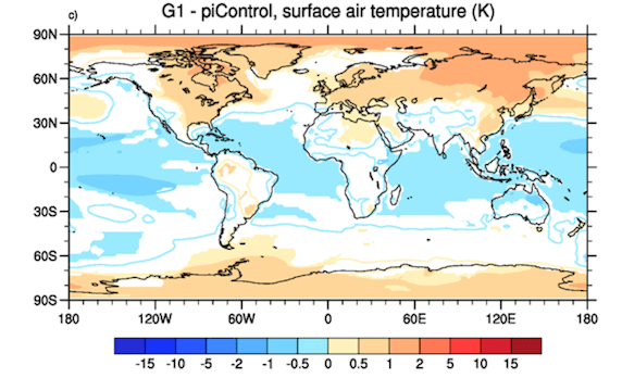
The global mean temperature remained at preindustrial levels. “Great,” you might think, “we’re home free!” However, climate is far more than just one globally averaged metric. Even though the average temperature stayed the same, there were still regional changes, with cooling in the tropics and warming at both poles (particularly in their respective winters):

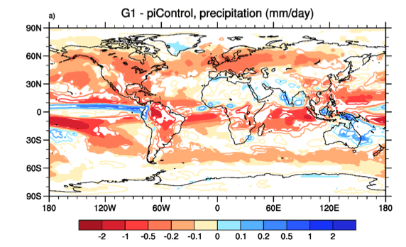
There were regional changes in precipitation, too, but they didn’t all cancel out like with temperature. Global mean precipitation decreased, due to cloud feedbacks which are influenced by sunlight but not greenhouse gases. There were significant changes in the monsoons of south Asia, but the models disagreed as to exactly what those changes would be.

This intercomparison showed that even with geoengineering, we’re still going to get a different climate. We won’t have to worry about some of the big-ticket items like sea level rise, but droughts and forest dieback will remain a major threat. Countries will still struggle to feed their people, and species will still face extinction.

On the other side of the Atlantic, Damon Matthews and Ken Caldeira took a different approach. (By the way, what is it about Damon Matthews? All the awesome papers out of Canada seem to have his name on them.) Using the UVic ESCM, they performed a more realistic experiment in which emissions varied with time. They offset emissions from the A2 scenario with a gradually decreasing solar constant. They found that the climate responds quickly to geoengineering, and their temperature and precipitation results were very similar to the European paper.

They also examined some interesting feedbacks in the carbon cycle. Carbon sinks (ecosystems which absorb CO2, like oceans and forests) respond to climate change in two different ways. First, they respond directly to increases in atmospheric CO2 – i.e., the fertilization effect. These feedbacks (lumped together in a term we call beta) are negative, because they tend to increase carbon uptake. Second, they respond to the CO2-induced warming, with processes like forest dieback and increased respiration. These feedbacks (a term called gamma) are positive, because they decrease uptake. Currently we have both beta and gamma, and they’re partially cancelling each other out. However, with geoengineering, the heat-induced gamma goes away, and beta is entirely unmasked. As a result, carbon sinks became more effective in this experiment, and sucked extra CO2 out of the atmosphere.

The really interesting part of the Matthews and Caldeira paper was when they stopped the geoengineering. This scenario is rather plausible – wars, recessions, or public disapproval could force the world to abandon the project. So, in the experiment, they brought the solar constant back to current levels overnight.

The results were pretty ugly. Global climate rapidly shifted back to the conditions it would have experienced without geoengineering. In other words, all the warming that we cancelled out came back at once. Global average temperature changed at a rate of up to 4°C per decade, or 20 times faster than at present. Given that biological, physical, and social systems worldwide are struggling to keep up with today’s warming, this rate of change would be devastating. To make things worse, gamma came back in full force, and carbon sinks spit out the extra CO2 they had soaked up. Atmospheric concentrations went up further, leading to more warming.

Essentially, if governments want to do geoengineering properly, they have to make a pact to do so forever, no matter what the side effects are or what else happens in the world. Given how much legislation is overturned every time a country has a change in government, such a promise would be almost impossible to uphold. Matthews and Caldeira consider this reality, and come to a sobering conclusion:

In the case of inconsistent or erratic deployment (either because of shifting public opinions or unilateral action by individual nations), there would be the potential for large and rapid temperature oscillations between cold and warm climate states.

Yikes. If that doesn’t scare you, what does?

A New Kind of Science

Cross-posted from NextGen Journal

Ask most people to picture a scientist at work, and they’ll probably imagine someone in a lab coat and safety goggles, surrounded by test tubes and Bunsen burners. If they’re fans of The Big Bang Theory, maybe they’ll picture complicated equations being scribbled on whiteboards. Others might think of the Large Hadron Collider, or people wading through a swamp taking water samples.

All of these images are pretty accurate – real scientists, in one field or another, do these things as part of their job. But a large and growing approach to science, which is present in nearly every field, replaces the lab bench or swamp with a computer. Mathematical modelling, which essentially means programming the complicated equations from the whiteboard into a computer and solving them many times, is the science of today.

Computer models are used for all sorts of research questions. Epidemiologists build models of an avian flu outbreak, to see how the virus might spread through the population. Paleontologists build biomechanical models of different dinosaurs, to figure out how fast they could run or how high they could stretch their necks. I’m a research student in climate science, where we build models of the entire planet, to study the possible effects of global warming.

All of these models simulate systems which aren’t available in the real world. Avian flu hasn’t taken hold yet, and no sane scientist would deliberately start an outbreak just so they could study it! Dinosaurs are extinct, and playing around with their fossilized bones to see how they might move would be heavy and expensive. Finally, there’s only one Earth, and it’s currently in use. So models don’t replace lab and field work – rather, they add to it. Mathematical models let us perform controlled experiments that would otherwise be impossible.

If you’re interested in scientific modelling, spend your college years learning a lot of math, particularly calculus, differential equations, and numerical methods. The actual application of the modelling, like paleontology or climatology, is less important for now – you can pick that up later, or read about it on your own time. It might seem counter-intuitive to neglect the very system you’re planning to spend your life studying, but it’s far easier this way. A few weeks ago I was writing some computer code for our lab’s climate model, and I needed to calculate a double integral of baroclinic velocity in the Atlantic Ocean. I didn’t know what baroclinic velocity was, but it only took a few minutes to dig up a paper that defined it. My work would have been a lot harder if, instead, I hadn’t known what a double integral was.

It’s also important to become comfortable with computer programming. You might think it’s just the domain of software developers at Google or Apple, but it’s also the main tool of scientists all over the world. Two or three courses in computer science, where you’ll learn a multi-purpose language like C or Java, are all you need. Any other languages you need in the future will take you days, rather than months, to master. If you own a Mac or run Linux on a PC, spend a few hours learning some basic UNIX commands – it’ll save you a lot of time down the road. (Also, if the science plan falls through, computer science is one of the only majors which will almost definitely get you a high-paying job straight out of college.)

Computer models might seem mysterious, or even untrustworthy, when the news anchor mentions them in passing. In fact, they’re no less scientific than the equations that Sheldon Cooper scrawls on his whiteboard. They’re just packaged together in a different form.

Ten Things I Learned in the Climate Lab

  1. Scientists do not blindly trust their own models of global warming. In fact, nobody is more aware of a model’s specific weaknesses than the developers themselves. Most of our time is spent comparing model output to observations, searching for discrepancies, and hunting down bugs.
  2. If 1.5 C global warming above preindustrial temperatures really does represent the threshold for “dangerous climate change” (rather than 2 C, as some have argued), then we’re in trouble. Stabilizing global temperatures at this level isn’t just climatically difficult, it’s also mathematically difficult. Given current global temperatures, and their current rate of change, it’s nearly impossible to smoothly extend the curve to stabilize at 1.5 C without overshooting.
  3. Sometimes computers do weird things. Some bugs appear for the most illogical reasons (last week, the act of declaring a variable altered every single metric of the model output). Other bugs show up once, then disappear before you can track down the source, and you’re never able to reproduce them. It’s not uncommon to fix a problem without ever understanding why the problem occurred in the first place.
  4. For anyone working with climate model output, one of the best tools to have in your arsenal is the combination of IDL and NetCDF. Hardly an hour of work goes by when I don’t use one or both of these programming tools in some way.
  5. Developing model code for the first time is a lot like moving to a new city. At first you wander around aimlessly, clutching your map and hesitantly asking for directions. Then you begin to recognize street names and orient yourself around landmarks. Eventually you’re considered a resident of the city, as your little house is there on the map with your name on it. You feel inordinately proud of the fact that you managed to build that house without burning the entire city down in the process.
  6. The RCP 8.5 scenario is really, really scary. Looking at the output from that experiment is enough to give me a stomachache. Let’s just not let that scenario happen, okay?
  7. It’s entirely possible to get up in the morning and just decide to be enthusiastic about your work. You don’t have to pretend, or lie to yourself – all you do is consciously choose to revel in the interesting discoveries, and to view your setbacks as challenges rather than chores. It works really well, and everything is easier and more fun as a result.
  8. Climate models are fabulous experimental subjects. If you run the UVic model twice with the same code, data, options, and initial state, you get exactly the same results. (I’m not sure if this holds for more complex GCMs which include elements of random weather variation.) For this reason, if you change one factor, you can be sure that the model is reacting only to that factor. Control runs are completely free of external influences, and deconstructing confounding variables is only a matter of CPU time. Most experimental scientists don’t have this element of perfection in their subjects – it makes me feel very lucky.
  9. The permafrost is in big trouble, and scientists are remarkably calm about it.
  10. Tasks that seem impossible at first glance are often second nature by the end of the day. No bug lasts forever, and no problem goes unsolved if you exert enough effort.

Modelling the Apocalypse

Let’s all put on our science-fiction hats and imagine that humans get wiped off the face of the Earth tomorrow. Perhaps a mysterious superbug kills us all overnight, or maybe we organize a mass migration to live on the moon. In a matter of a day, we’re gone without a trace.

If your first response to this scenario is “What would happen to the climate now that fossil fuel burning has stopped?” then you may be afflicted with Climate Science. (I find myself reacting like this all the time now. I can’t watch The Lord of the Rings without imagining how one would model the climate of Middle Earth.)

A handful of researchers, particularly in Canada, recently became so interested in this question that they started modelling it. Their motive was more than just morbid fascination – in fact, the global temperature change that occurs in such a scenario is a very useful metric. It represents the amount of warming that we’ve already guaranteed, and a lower bound for the amount of warming we can expect.

Initial results were hopeful. Damon Matthews and Andrew Weaver ran the experiment on the UVic ESCM and published the results. In their simulations, global average temperature stabilized almost immediately after CO2 emissions dropped to zero, and stayed approximately constant for centuries. The climate didn’t recover from the changes we inflicted, but at least it didn’t get any worse. The “zero-emissions commitment” was more or less nothing. See the dark blue line in the graph below:

However, this experiment didn’t take anthropogenic impacts other than CO2 into account. In particular, the impacts of sulfate aerosols and additional (non-CO2) greenhouse gases currently cancel out, so it was assumed that they would keep cancelling and could therefore be ignored.

But is this a safe assumption? Sulfate aerosols have a very short atmospheric lifetime – as soon as it rains, they wash right out. Non-CO2 greenhouse gases last much longer (although, in most cases, not as long as CO2). Consequently, you would expect a transition period in which the cooling influence of aerosols had disappeared but the warming influence of additional greenhouse gases was still present. The two forcings would no longer cancel, and the net effect would be one of warming.

Damon Matthews recently repeated his experiment, this time with Kirsten Zickfeld, and took aerosols and additional greenhouse gases into account. The long-term picture was still the same – global temperature remaining at present-day levels for centuries – but the short-term response was different. For about the first decade after human influences disappeared, the temperature rose very quickly (as aerosols were eliminated from the atmosphere) but then dropped back down (as additional greenhouse gases were eliminated). This transition period wouldn’t be fun, but at least it would be short. See the light blue line in the graph below:

We’re still making an implicit assumption, though. By looking at the graphs of constant global average temperature and saying “Look, the problem doesn’t get any worse!”, we’re assuming that regional temperatures are also constant for every area on the planet. In fact, half of the world could be warming rapidly and the other half could be cooling rapidly, a bad scenario indeed. From a single global metric, you can’t just tell.

A team of researchers led by Nathan Gillett recently modelled regional changes to a sudden cessation of CO2 emissions (other gases were ignored). They used a more complex climate model from Environment Canada, which is better for regional projections than the UVic ESCM.

The results were disturbing: even though the average global temperature stayed basically constant after CO2 emissions (following the A2 scenario) disappeared in 2100, regional temperatures continued to change. Most of the world cooled slightly, but Antarctica and the surrounding ocean warmed significantly. By the year 3000, the coasts of Antarctica were 9°C above preindustrial temperatures. This might easily be enough for the West Antarctic Ice Sheet to collapse.

Why didn’t this continued warming happen in the Arctic? Remember that the Arctic is an ocean surrounded by land, and temperatures over land change relatively quickly in response to a radiative forcing. Furthermore, the Arctic Ocean is small enough that it’s heavily influenced by temperatures on the land around it. In this simulation, the Arctic sea ice actually recovered.

On the other hand, Antarctica is land surrounded by a large ocean that mixes heat particularly well. As a result, it has an extraordinarily high heat capacity, and takes a very long time to fully respond to changes in temperature. So, even by the year 3000, it was still reacting to the radiative forcing of the 21st century. The warming ocean surrounded the land and caused it to warm as well.

As a result of the cooling Arctic and warming Antarctic, the Intertropical Convergence Zone (an important wind current) shifted southward in the simulation. As a result, precipitation over North Africa continued to decrease – a situation that was already bad by 2100. Counterintuitively, even though global warming had ceased, some of the impacts of warming continued to worsen.

These experiments, assuming an overnight apocalypse, are purely hypothetical. By definition, we’ll never be able to test their accuracy in the real world. However, as a lower bound for the expected impacts of our actions, the results are sobering.

Cumulative Emissions and Climate Models

As my summer research continues, I’m learning a lot about previous experiments that used the UVic ESCM (Earth System Climate Model), as well as beginning to run my own. Over the past few years, the UVic model has played an integral role in a fascinating little niche of climate research: the importance of cumulative carbon emissions.

So far, global warming mitigation policies have focused on choosing an emissions pathway: making a graph of desired CO2 emissions vs. time, where emissions slowly reduce to safer levels. However, it turns out that the exact pathway we take doesn’t actually matter. All that matters is the area under the curve: the total amount of CO2 we emit, or “cumulative emissions” (Zickfeld et al, 2009). So if society decides to limit global warming to 2°C (a common target), there is a certain amount of total CO2 that the entire world is allowed to emit. We can use it all up in the first ten years and then emit nothing, or we can spread it out – either way, it will lead to the same amount of warming.

If you delve a little deeper into the science, it turns out that temperature change is directly proportional to cumulative emissions (Matthews et al, 2009). In other words, if you draw a graph of the total amount of warming vs. total CO2 emitted, it will be a straight line.

This is counter-intuitive, because the intermediate processes are definitely not straight lines. Firstly, the graph of warming vs. CO2 concentrations is logarithmic: as carbon dioxide builds up in the atmosphere, each extra molecule added has less and less effect on the climate.

However, as carbon dioxide builds up and the climate warms, carbon sinks (which suck up some of our emissions) become less effective. For example, warmer ocean water can’t hold as much CO2, and trees subjected to heat stress often die and stop photosynthesizing. Processes that absorb CO2 become less effective, so more of our emissions actually stay in the air. Consequently, the graph of CO2 concentrations vs. CO2 emissions is exponential.

These two relationships, warming vs. concentrations and concentrations vs. emissions, more or less cancel each other out, making total warming vs. total emissions linear. It doesn’t matter how much CO2 was in the air to begin with, or how fast the allowable emissions get used up. Once society decides how much warming is acceptable, all we need to do is nail down the proportionality constant (the slope of the straight line) in order to find out how much carbon we have to work with. Then, that number can be handed to economists, who will figure out the best way to spread out those emissions while causing minimal financial disruption.

Finding that slope is a little tricky, though. Best estimates, using models as well as observations, generally fall between 1.5°C and 2°C for every trillion tonnes of carbon emitted (Matthews et al, 2009; Allen et al, 2009; Zickfeld et al, 2009). Keep in mind that we’ve already emitted about 0.6 trillion tonnes of carbon (University of Oxford). Following a theme commonly seen in climate research, the uncertainty is larger on the high end of these slope estimates than on the low end. So if the real slope is actually lower than our best estimate, it’s probably only a little bit lower; if it’s actually higher than our best estimate, it could be much higher, and the problem could be much worse than we thought.

Also, this approach ignores other human-caused influences on global temperature, most prominently sulfate aerosols (which cause cooling) and greenhouse gases other than carbon dioxide (which cause warming). Right now, these two influences basically cancel, which is convenient for scientists because it means we can ignore both of them. Typically, we assume that they will continue to cancel far into the future, which might not be the case – there’s a good chance that developing countries like China and India will reduce their emissions of sulfate aerosols, allowing the non-CO2 greenhouse gases to dominate and cause warming. If this happened, we couldn’t even lump the extra greenhouse gases into the allowable CO2 emissions, because the warming they cause does depend on the exact pathway. For example, methane has such a short atmospheric lifetime that “cumulative methane emissions” is a useless measurement, and certainly isn’t directly proportional to temperature change.

This summer, one of my main projects at UVic is to compare what different models measure the slope of temperature change vs. cumulative CO2 emissions to be. As part of the international EMIC intercomparison project that the lab is coordinating, different modelling groups have sent us their measurements of allowable cumulative emissions for 1.5°C, 2°C, 3°C, and 4°C global warming. Right now (quite literally, as I write this) I’m running the same experiments on the UVic model. It’s very exciting to watch the results trickle in. Perhaps my excitement towards the most menial part of climate modelling, watching as the simulation chugs along, is a sign that I’m on the right career path.